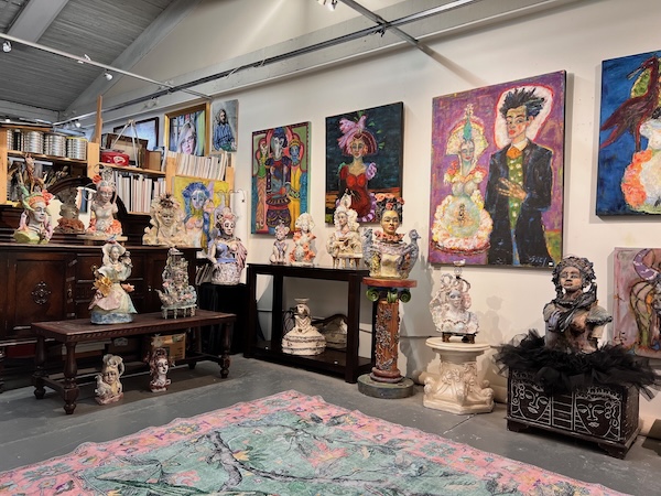
Suzy Birstein, who creates out of Parker Street Studios, is among the many artists – including Esther Rausenberg, Ideet Sharon, Lauren Morris and others – who are opening their doors to the public during the Eastside Culture Crawl Visual Arts, Design & Craft Festival Nov. 20-23. (photo from Suzy Birstein)
More than 500 artists – including Esther Rausenberg, Ideet Sharon, Lauren Morris, Suzy Birstein and other Jewish community members – are participating in the Eastside Arts Society’s 29th annual Eastside Culture Crawl Visual Arts, Design & Craft Festival Nov. 20-23.
The festival will welcome visitors into the studios and workshops of Eastside artists in more than 80 registered buildings, including 20 buildings new to the Crawl – marking a 25% increase in options for exploring all that is on display across the Eastside Arts District (EAD). This year also marks the beginning of a three-year partnership with the Audain Foundation as the Crawl’s presenting partner, recognizing the importance of creative spaces and experimentation to a vibrant and healthy arts ecosystem.
“Vancouver is home to a growing number of artists who continue to create in the face of tremendous economic hardships and reduced access to studio space,” said Rausenberg, who is artistic director of the Eastside Arts Society (EAS). “Their unwavering passion, ingenuity and resourcefulness results in a richness of unique and diverse production and working artist spaces, creating exciting new opportunities for art lovers to explore, to discover and to be inspired.”
Encompassing the region bounded by Columbia Street, 1st Avenue, Victoria Drive and the Waterfront, the festival offers visitors a window into the artistic practices of artists living and/or working in Vancouver’s EAD, representing creators specializing in painting, jewelry, sculpture, furniture, leather goods, photography, glass works, textiles, and more.
As part of the Crawl, EAS will host a series of ancillary events, including the 2025 Preview Exhibition, a multi-venue, salon-style curated exhibition that explores a variety of media, formats, techniques and styles. This year’s theme of “Passion, Reason, Idiocy” invited participating artists to submit works that speak to the emotional, rational and foolish elements of their lived experience as working artists. The exhibition features juried works from 78 artists at three venues – Pendulum Gallery, the Cultch Gallery and Alternative Creations Gallery – until Nov. 30.
The 12th Annual Eastside Culture Crawl Film and Video Exhibition, in partnership with the Lumière Festival, will be projected outdoors nightly Nov. 13-16. Short films from eight participating artists – Ethan White, Garrett Andrew Chong, Cheree Lang, Fatima Travassos, Debra Gloeckler, Rashi Sethi, Isaac Forsland and Nisha Platzer – explore the theme of “Unity,” selected by Moving Art curators Rausenberg, Kate MacDonald and Sierra MacTavish.
This year’s series of Talking Art panels will be shared online, with two remaining. On Nov. 12, curated and moderated by Samantha Mains, artists Mackenzie Perras and Jes Hanzelkova will talk about artist practices that rely on the use of place, whether as a source for their concepts, art medium and materials, or site for performance. On Nov. 13, Mains will moderate while artists Jai Sallay-Carrington and Gina D’Aloisio explore artists whose practices have been changed by the influence of others, through participation in artist residencies or social media.
During the Nov. 20-23 festival, artists’ studios will be open 5-10 p.m. on Thursday and Friday, and 11 a.m.-6 p.m. on Saturday and Sunday. Full details of all the events, artists, talks and locations can be found at culturecrawl.ca.
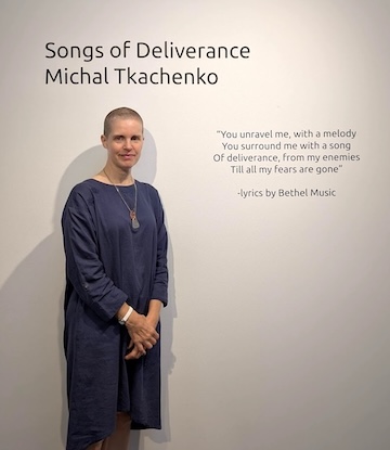
Songs of Deliverance, a solo exhibit by Michal Tkachenko, opened last month at the Zack Gallery and is on display until Nov. 10. While its title is inspired by the lyrics of a Bethel Music song – “You unravel me, with a melody / You surround me with a song / Of deliverance, from my enemies / Till all my fears are gone” – its focus derives from three psalms.
“I really wanted to have a subject for the exhibition that would bind communities together and so I came to rest on the psalms, which span both Judaism and Christianity, but are also used in secular society as a means to reach out to a greater being beyond ourselves,” Tkachenko told the Independent. “For me, this is a huge departure from previous work in both subject and vulnerability. It is my most honest work so far and, as the exhibition falls on the two-year anniversary of everything I saw with my spirit, I feel myself rising from the anguish and am ready to speak about my experience now, to move towards creating what I saw was possible.”
Lacking the exact words to describe it, Tkachenko said she had a near-death, or mystical, experience two years ago, and she was in that state for more than a week.
“It instantly changed my entire outlook on life and death and it completely changed me,” she said. “I was so excited about it until I began to realize how isolated it made me and how those I reached out to didn’t always have a helpful response. I quickly spiraled into the dark night of the soul and have been traveling that road…. Two very deep things came to rest in me during this time. The first was a deep longing in my spirit for something greater than myself, to draw and stay extremely close to God. The second was a deep grief that all that I had seen with my spirit, particularly an unseen solid force of love that is everywhere and how we are meant to love and be vulnerable with each other as our primary purpose in life, were things I could not make happen however hard I tried.”
Psalm 23 – “As I walk through the valley of the shadow of death, I will fear no evil” – was with Tkachenko throughout this two-year period. “For me,” she said, “it was a psalm about my journey and how, in the midst of the darkness, God was always with me and more vivid than I had ever experienced outside of that extraordinary week.”
Michal Tkachenko’s solo exhibit, Songs of Deliverance, is at the Zack Gallery until Nov. 10. (photo by Andrea Lee)
As she approached the one-year anniversary of that week, Tkachenko asked two people to write her a blessing, as she made a vow to God and shaved her head. “One of the blessings,” she said, “included Psalm 63 and it reflected my own deep longing for God, ‘I thirst for you, my whole being longs for you, in a dry parched land where there is no water.’… My hair that I shaved off is part of the exhibition in an aged box that is meant to suggest a holy relic of the past, when people had more vivid experiences with God.
“Psalm 139 is such a beautiful expression of God’s love and absolutely full of beautiful imagery as an artist,” she continued. “It is a psalm that has also kept me company on my two-year journey and moves me every time I read it.
“For this psalm,” she said, “I made a pile of sketches of different verses and the images that came to me. Of those, I chose seven to do larger pieces on mylar. In many of the pieces, the spirit of God is represented by the white negative space. In ‘You Hem Me in Behind and Before, You Lay Your Hand Upon Me,’ the image of a human is abstracted in a long, dark column down the centre of the page, but the figure is not the focus. Instead, the white empty space is the representation of God hemming that figure in from ‘behind and before.’”
Songs of Deliverance marks Tkachenko’s return to drawing and painting after this two-year period, during which she spent a lot of time writing. “My goal is to make short, layered videos using these writings,” she said.
She also took a break from painting during COVID, making art out of dollhouses that people were getting rid of in the decluttering that took place then. In these dollhouses, she created COVID lockdown scenes in miniature.
“My interest is not held by one medium or one style alone, although I do have a style that often emerges naturally,” she said. “The older I get, the less interested I am in creating what I think others will like or want to buy and more about what I want to say and what I am excited about making and expressing through the medium that seems best suited to that particular message.”
Tkachenko was born in Victoria but grew up in Vancouver. Her dad, an architectural technician, builder and musician, was a Ukrainian immigrant to Canada after the Second World War, while her mom, a teacher, music teacher and musician, was a second-generation Canadian with a Scottish/British background.
“My parents were part of the hippy movement in the ’60s and ’70s and, when I was young, we lived in communal housing,” said Tkachenko, who is the oldest of four sisters.
“Growing up in a big creative household, there were always guests and cooking parties (Ukrainian food), live music and all sorts of art projects going on,” she said. “My parents didn’t push the academics as much because they wanted to make sure we found what gave us excitement and joy and they invested in building our self-esteem instead.”
That said, Tkachenko has a bachelor’s and a master’s in fine arts. For her schooling, she has lived in Vancouver, Victoria, Calgary, Toronto, Florence and London (England). She has lived and volunteered in Haiti, Kenya, Malawi and Liberia, among other places. She has studios in both Vancouver and Manchester, as she, her husband and kids travel between Canada and the United Kingdom.
Despite knowing from a young age that she was going to be an artist, it took time for Tkachenko to recognize her skill and justify making art – “I considered it a luxury item, when the poor existed in the world,” she said.
“My hippy parents had driven us down to Mexico a number of times when my sister and I were young children (we are the oldest two) and we had been taken to the slums to understand how most of the world lived and how, despite our modest life in Canada, we were rich compared to rest of the world. It had made a huge and lasting impression on me as a child.”
At 18, she moved to Haiti to volunteer for a year, she said, “but before the year was out, I was in a life-altering car accident in which a friend died, my skull was shattered and my face smashed in on one side. I was flown back to Canada for reconstructive surgery and to recover.”
She volunteered for a spell in Kenya a few years later, but then finally decided to follow her calling in art.
Tkachenko works out of Parker Studios in Vancouver. She is also on the advisory committee for the DTES Small Arts Grant. “Being on this committee and working out of Carnegie [Community Centre] in the Downtown Eastside joins two things I value – the arts and working among the less fortunate,” she said.
Tkachenko’s husband is Jewish on his mother’s side – “her parents fled Czechoslovakia and Germany for the UK during WWII,” Tkachenko shared.
“Although they purposefully lost a lot of their Jewish heritage during the shift for safety reasons, my kids and I have become interested in it,” she said. “I came from a very open faith background because my parents were hippies that were part of the Jesus People Movement. They always encouraged us to find our own way to God and faith and, as a result, the people I am drawn to with my spirit are varied, from Jewish to Muslim, from Buddhist to Eastern Awakenings. The value of community does go beyond a single group [an idea she explores in one of The Journey series videos she is currently working on] and the more open and loving we become with each other, the more we can appreciate the differences that we each were gifted. And the more we see the bigger picture and what we all have in common.”
Eric Goldstein and Jenny Judge are different in their backgrounds and creative philosophies, in their media and techniques, but they have two characteristics in common: their images are abstract, and strings drive their artistic perceptions. (photo by Jenny Judge)
A string is a simple, utilitarian object. Usually, it connects things, but rarely is it associated with beauty. However, String Theory, the current two-artist exhibition at the Zack Gallery, definitely brings beauty to gallery patrons.
The artists participating in the show – Jenny Judge and Eric Goldstein – are different in their backgrounds and creative philosophies, in their media and techniques, but they have two characteristics in common: their images are abstract, and strings drive their artistic perceptions.
Judge has been an installation artist for decades.
“I received a BFA in sculpture and printmaking in 1983 and completed an MFA in sculpture in 1991,” she told the Independent. “I often integrate a variety of craft-based material and processes in my installations, and I have exhibited them in Canada and abroad, but I have never exhibited my drawings before this show. I’ve been drawing for a long time, but my drawings were never the focus of my art. They were for clearing my head, as was my writing, which is also essential to my practice. Both helped me understand my own concepts better. I guess it is time for my drawings to be in the foreground of a show.”
Jenny Judge (photo by Mads Colvin)
Like her installations, Judge’s drawings have depth, displaying multiple layers of texture and meaning.
“The heart of these drawings is transition, the two different sides coming together, connected by lines or strings,” she explained. “Light versus dark. Old age versus youth. Northern hemisphere versus southern. Sky versus water. My family lives in Canada and New Zealand, and I’m often traveling from there to here and back. My drawings help me to make sense of these transitions.”
All her pieces in the show are a wash of muted paint in the background overlaid by a network of strings and nodes in faintly contrasting colours. The web of strings and their junctions is complex and delicate, the lines gossamer-thin, reflecting the artist’s contemplation of belonging to the emotional and physical landscape of both Canada and New Zealand.
“My drawing are like landscapes,” she said. “There is even a horizon line in most of them, the line where two different worlds meet, the areas of constant shifting and negotiations. But there is much more to the story I want to tell. That’s why I paint in the abstract style. A simple landscape is just that – a landscape, a forest or a mountain. But an abstract picture always leaves room for interpretation. Everyone can come up with their own story.”
Like her images, Judge’s titles are also open to interpretation: “Crossing,” “Striations,” “Pass Through,” for example.
“They underscore my feelings of not always knowing where I am in time and space, of always seeking connections,” she said.
Inspired by the concepts of meeting points, of confluence and repetition, Judge also sees parallels between her compositions and knitting.
“I learned to knit from my mother when I was 10. I remember sitting with her as we talked, knitted and counted stitches. I still enjoy knitting. When you knit, you have one string of yarn and you repeat the same pattern over and over again. And, suddenly, you have something else: a scarf or a sweater. That’s what I do when I draw. I repeat endless variations of the same pattern until something meaningful emerges,” she said.
Another link between her drawings and her knitting is the tool she employs. She draws with a bamboo skewer (very like a knitting needle), dipped in acrylic ink. “It is a verydomestic item,” she said. “But it has a sharp point, sharper than any brush. It allows me to draw very thin lines. I build those webs of lines over one another, rows and layers, until I’m satisfied with the result. Sometimes, it takes several layers until the whole starts making sense. Of course, it takes a long time to draw all the lines Ivisualize for even one painting.”
Perhaps the length of time it takes her to create her pieces contributes to the fact that she doesn’t take commissions. “I tried,” she said. “But I didn’t like the clients’ constant demands. I don’t create art for the money.”
Goldstein, however, does take commissions and he relishes seeing his pieces in people’s homes.
“I create mixed media collages,” he said. “I use coloured fibres, gold foil, glass, paint, plaster.”
While Judge’s web-like pictures imply multiple dimensions, Goldstein’s fibre string collages tend to one-directional geometries, either horizontal or vertical, their colour patterns cheerful and dazzlingly bright. The gold foil and the glass fragments provide even more pizzazz to his deceptively simple compositions. “I build my canvasses like an architect builds a building,” he said.
Goldstein came to the visual art from the movie industry. Over the past three decades, he has been the director of photography for more than 75 film projects, from Hollywood features to documentaries. Creating gorgeous, highly decorative fibre collages for the last 15 years has provided him with a different outlet for his artistic vision.
“I’m inspired by nature, by the West Coast landscape,” he said. “Not as it appears on the surface. Instead, I want to capture how it feels to experience it – often chaotic, often incomprehensible. I try to convey feelings. As a mixed-media artist, I delve into the intricate, visual storytelling of people and the world around us.”
The pieces Goldstein presents in this show have rather mundane titles, in contrast to the elaborate poetry of the images themselves. “I call my paintings ‘Poetic narratives with kinetic energy,’” he said.
One of the paintings, “View of the Bay,” is a symphony of blue, where glass tiles twinkle among the strings like windows on the far shore. “No Curtains Needed,” on the other hand, is a subtler image, hinting at an open window and a playful light. The artist offers a short description for every canvas, and this one reads: “The absence of curtains allows for unfiltered light to dance freely upon the walls. It creates a sense of freedom and awe. Reminding us to let go of our barriers, both physical and cerebral, so we can.”
One of his most notable pieces in the exhibit – the white and blue “What Remains” – feels like a scream of the artist’s soul.
“The colours are the deconstructed Israeli flag,” he said. And his description of the image reads like a part of a poem: “This is my way of bearing witness to the horror unfolding in Israel and Gaza. It expresses my profound sense of conflict and loss of a meaningful identity. This piece isn’t about right or wrong or even resolution; it’s about holding space for complexity, for grief and empathy, and hope that something sacred remains.”
Goldstein exhibits a lot, and his works are in demand. “Next month, I’ll have a show at the Queen Elizabeth Theatre,” he said. “I’ll have 12 paintings there.”
Judge and Goldstein didn’t know each other before Sarah Dobbs, the gallery curator, decided that their works were complementary. “Together,” she said, “Judge and Goldstein show that both our lives and the universe are shaped by invisible threads – of memory, matter and meaning. String Theory is … about the poetic links between the personal and the cosmic, reminding us that everything is connected.” Both artists agree.
String Theory is at the ZackGallery until Sept. 22. To learn more, check the artists’ websites: ericgoldsteinart.com and jennyjudge.com.
Olga Livshinis a Vancouver freelance writer. She can be reached at [email protected].
“Delible (poppy, watermelon, wheat, walnut, blackberry)” is on display at the Art Gallery of Greater Victoria until Oct. 26, as part of the Architectures of Protection exhibition. (photo by Toni Hafkenscheid, courtesy Susan Hobbs Gallery)
Beth Stuart’s “Delible (poppy, watermelon, wheat, walnut, blackberry)” is part of the Architectures of Protection exhibition, which opened at the Art Gallery of Greater Victoria (AGGV) on May 24 and ends Oct. 26.
In each of the five “Delible” pieces, a black ledge has replicas of food items on top of it and a length of black mesh suspended below. Stuart used plaster, iron oxide pigment, dyed silk, steel and Sumi ink to create the works. The replicas are casts of halved walnuts, pizza crusts, poppy hulls, blackberries and watermelon seeds. According to the artist, each original mold was made from the source itself, except for the watermelon seeds, which were cast from clay originals.
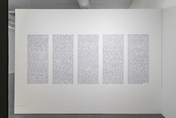
On a wall leading to the five pieces, there is a several-square-foot textual display featuring more than 1,600 words, written entirely in capital letters, with the thoughts seeming to randomly jump from one topic to another; there are no paragraphs, but the words cover five columns. The text, an integral element of the overall artwork, was hand-stenciled by Stuart and relates to the physical pieces.
Beth Stuart’s “Delible (poppy, watermelon, wheat, walnut, blackberry)” installation comprises a wall of text and five structures. (photo by Mike Andrew McLean, courtesy Art Gallery of Greater Victoria)
The text begins with mention of the Himalayan blackberry, an invasive species in British Columbia, and then moves to Luther Burbank, an American botanist, horticulturist and eugenicist, before discussing the Armenian Genocide (1915-16) and Canada’s residential schools.
In the middle portion of the textual display, Stuart describes what she sees as the plight of Gazans and the attitudes of certain Israelis.
“AS I WRITE, THERE HAS BEEN NO AID OF ANY KIND FOR ALMOST TWO MONTHS AND EVERY WATER DESALINATION PLANT HAS BEEN BOMBED,” Stuart writes. “IN EARLY 2024 THERE WAS A CLIP CIRCULATING FROM ISRAELI CHANNEL 14, OF A PUNDIT SAYING EVERY PALESTINIAN OVER THE AGE OF FOUR YEARS IS A POTENTIAL TERRORIST AND A NECESSARY TARGET OF WAR. SINCE THEN TWO KNESSET MEMBERS HAVE DECLARED PUBLICLY THAT EVEN INFANTS ARE TERRORISTS. THE DELIBLES BAGS ARE APPROXIMATELY THE SIZE OF A BAG OF FLOUR OF THE TYPE THAT SOMETIMES ARRIVES IN GAZA, AND ALSO COULD CONTAIN THE BODY OF A FOUR-YEAR-OLD CHILD.”
Stuart then talks about tree-planting, which she apparently did in university, then writes: “THIS IS THE FOURTH VERSION OF THIS TEXT I HAVE WRITTEN OVER THE PAST 20 MONTHS. THIS WEEK THERE ARE MASSIVE WILDFIRES NEAR OCCUPIED JERUSALEM. THEY ARE BURNING IN AYALON CANADA PARK, A SEVEN SQUARE KILOMETER PARK LOCATED IN OCCUPIED PALESTINE. THERE HAD BEEN THREE PALESTINIAN VILLAGES ON THIS LAND IN 1948. AND APPROXIMATELY 10,000 PALESTINIANS WERE KILLED OR EXPELLED FROM THE AREA AND THE VILLAGES RAZED.”
She talks more about “THE ORGANIZATION THAT FUNDED THE PARK” without naming it and then raises the issue of the Canadian government’s involvement with Israel and, specifically, its military.
“BETWEEN OCTOBER 7TH 2023 AND THE FIRST WRITING OF THIS TEXT, MY GOVERNMENT HAD SENT 30 MILLION DOLLARS WORTH OF MILITARY SUPPORT TO ISRAEL,” she writes. “ON SEPTEMBER 10TH 2024 THE CANADIAN GOVERNMENT CLAIMED THAT THEY WERE NO LONGER SENDING ANY ARMS TO ISRAEL. IN FACT, WHILE CONTRACTS FOR ARMS SALES ARE NOT BEING OFFERED, ONLY 12% OF EXISTING CONTRACTS HAVE BEEN CANCELLED, AND MANY PARTS, RAW MATERIALS AND MUNITIONS ARE BEING SOLD TO THE U.S. AND THEN SENT TO ISRAEL. CANADA ALSO BUYS ARMS AND SURVEILLANCE TECHNOLOGY FROM ISRAEL.”
The text moves into Stuart’s comments on residential schools before she concludes with the sentence: “FOR THE SECOND SPRING SINCE OCTOBER 7, 2023 THE BLACKBERRY HEDGES ARE BLOOMING.”
To at least one member of the Victoria Jewish community, Stuart’s work is an example of “artfully coded antisemitism – all the more reprehensible for its coyness.”
“In itself, ‘Delibles’ are very beautiful, evocative works,” Maurice Yacowar, a professor emeritus (English and film studies) of the University of Calgary, wrote in a letter to the art gallery that was also sent to the Independent.
“What renders the work problematic is the full-wall text – in spectral grey – that accompanies the sculptures,” Yacowar said.
He said,“As a whole, the work contrasts the self-renewal of nature’s produce with humans’ murderousness. Unfortunately, the art is undermined by the artist’s ignorance and prejudice in its Palestinian references.”
He said Stuart misrepresents Israel and its media by choosing to reference a news outlet “that even in Israel is considered extremist.” And, he argues,“She omits the Oct. 7 context. A Hamas spokesman flatly stated, ‘There are no civilians in Israel’ – ie., only targets in war.”
Stuart’s exhibit does not include the word “Hamas.”
In a statement to the Independent, the AGGV said:
“The gallery is aware that some members of the community disagree with the subject matter of a current work of art on display. We are always interested to hear how the public, and our members, respond to our exhibitions. We also embrace learning, new ideas and critical perspectives.
“At the AGGV, we respect the artists and curators who work with us to create exceptional exhibitions. As an arts institution, our role is to amplify artists’ voices and create space for conversation and learning. We encourage an exchange of ideas that results in meaningful dialogue and understanding through art.”
The Architectures of Protection exhibition, in the synopsis posted by the AGGV, is supposed to reflect “on ideas and modes of protection and refuge – with regards to oneself, to community, knowledge, culture, identity and land. What are these spaces and practices? What is protection for some and not for others?
Together, in the wake of the COVID-19 pandemic and in the current global social and political climate, the artworks in Architectures of Protection direct critical attention towards systems and structures that shape and impact everyday and sacred environments and encounters, alongside individual and collective relationships with the land.”
The exhibit also features the artwork of Dana Claxton, Jessica Karuhanga, Emilio Rojas and France Trépanier.
Sam Margolishas written for the Globe and Mail, the National Post, UPI and MSNBC.
Kim Rosin, left, and Alejandra Morales’s shared exhibit, Parallel Visions, is at the Zack Gallery until July 21. (photo from the artists)
The double exhibit Parallel Visions opened at the Zack Gallery on June 25. It introduces two artists – Kim Rosin and Alejandra Morales – who have different backgrounds, are different ages and had never met before. But their art is amazingly compatible.
“When Alejandra submitted the photos of her pieces, they were mostly of fruit, along with a fruit stand. I thought that it would be interesting to pair her with Kim’s allotments,” said gallery curator Sarah Dobbs about why she combined both artists in one show. “However, when I saw Alejandra’s work at her studio, there was so much more, so I had to rethink.
“Upon reflection, I realized that both Kim and Alejandra turn to the natural world as more than just subjects of beauty. For Kim, painting from a community garden in West Vancouver becomes a way to reflect on growth, nourishment and the fragility of food systems in times of scarcity. Alejandra, working from northern Mexico, uses natural imagery as well, but in a dreamier way – exploring how Latin America is romanticized by outsiders. Though grounded in different geographies and experiences, both artists explore how abundance can hold layers of tension between beauty and critique, comfort and resistance. Hence the title, Parallel Visions.”
Rosin’s paintings are of her plot in a community garden. “I have always been interested in growing food,” she said. “From nothing, just a little seed, wonderful, nourishing plants grow. It feels almost magical. It makes me happy but also a little sad, because not everybody can grow their own food. Some people have to go without, when they don’t have a garden and can’t buy their vegetables because of high prices. When I look at my plot, I think of the food chain on our planet.”
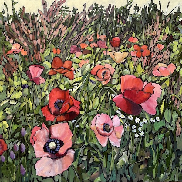
Her paintings are full of edible green things: kale and lettuce, beets and carrots. One can imagine the labour that went into growing such a lush garden and the tasty dishes after the harvest. The images reflect the artist’s love for the plants she grows, as well as her longing to share her cornucopia with everyone. Her painting of red poppies is a worthy companion to the vegetable plots, adding beauty to the nutritional component. “Many people grow poppies in our plots,” she said.
“Plot 5: Poppies and Pollinators” by Kim Rosin. (photo from the artist)
Rosin also enjoys painting still life. “It is like a recording of a moment in time,” she said. “And the decorative element is there, too. People often appreciate such paintings, especially if they could ask me to include their favourite objects in the image.”
She likes working on commissions, which she describes as “collaborations with the clients.”
“Commissions take a different mindset from making art of my own, less creative freedom,” she acknowledged. “Some clients have a certain vision, and my job is to bring that vision to life. One example is dog portraits. Dog owners want them realistic, almost photographic. I don’t have to interpret anything, as I do in my own paintings. It is easier in some way, like a mechanical exercise. My creativity is not as important as my skills as a painter. Of course, it is not that simple. When I paint, the image occasionally changes on its own, it has its own demands. Then I worry. What if the client doesn’t like the end result? What if they won’t buy this painting? Fortunately, that has never happened to me.”
People’s stories have always served as an inspiration for her art. “I’m curious about everything – traveling, music, nature. Before I moved to Vancouver, I lived in Seattle,” she said. “I worked on theatre sets for several fringe theatres there…. After I moved here, I created a set for a musical on Granville Island. Teaming up with theatre companies was always a fabulous experience, despite the low budgets.”
Like Rosin, Morales also likes working on commissions. “Some people are very relaxed. ‘You’re the artist. You know what to do.’ Other people are very involved. They want exactly what they envision and you, the artist, need to give them what they want,” she said.
On the other hand, unlike the serene greenery in Rosin’s paintings, Morales’s paintings emphasize her unease with society’s contradictions and paradoxes. Her flowers are colourful and gorgeous, but unrealistic. “I wanted them too beautiful for this world, almost uncomfortable,” she said. “And the animals in my paintings – they fight, like humans do. There are conflicts there.”
In her self-portrait, which is on display, the dichotomy between the pastel tones, the elaborate, narcissistic flowers, the birds in the middle of an angry confrontation and the pensive woman facing the painting echoes the artist’s contemplation on the incongruities of life.
The self-portrait is titled “Will Happiness Find Me?” Many of Morales’s other paintings also sport titles that add a verbal facet to the art’s visual impact. “My titles come from books or songs. Or, I remember someone saying something, and it is relevant for this painting. Or a title could be a quote from an old show,” she said. Her tranquil landscape of a Vancouver shoreline is called “Nothing Mattered More Than Anything Else.”
“Will Happiness Find Me?” by Alejandra Morales. (photo from the artist)
Morales moved to Vancouver four years ago from Mexico. “I received my BA from McGill University in 2016 and studied for my master’s degree in visual arts at UBC.”
Besides Canada, she studied art in Spain and in her native Mexico. “When I took art classes in Mexico, many students were housewives,” she recalled. “North Mexican culture is different than here. Women are supposed to follow a traditional path of a wife and a mother. The women that took art classes were anxious because they deviated from that path. I wanted to show their anxiety, their inner struggle in my paintings.”
According to Morales, women are freer here in Canada, the entire society more relaxed, and her art reflects the difference. “I painted a jungle in Mexico – and it was very bright and colourful. But when I painted a jungle here, the colours became less vivid, more muted. Maybe because it was raining outside,” she said.
Morales taught fine art as a teacher’s assistant, while she studied at UBC. “I liked teaching. I would like to do more of that,” she said.
Her latest artistic project is rather unusual. She painted a series of cityscapes featuring dumpsters around Vancouver. “Some of them have amazing graffiti. It was such fun,” she said.
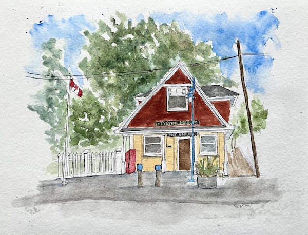
Roxsane Tanner’s watercolours are on exhibit at the Steveston Museum and Post Office (painted here by Tanner) this month.
“Steveston is such a beautiful place,” artist Roxsane Tanner told the Independent. Her first solo show of watercolours features quaint houses of the village, where she has lived and worked for many years. The exhibit opened at the Steveston Museum and Post Office on June 1 and will be on display for the month.
Roxsane Tanner (photo courtesy)
Born in Holland soon after the Second World War, Tanner came to Canada with her family in 1951.
“My father was in the resistance, and my mother was in hiding during the war. They were both Jewish and wouldn’t have survived otherwise,” she said.
Her older sister was born during the German occupation, and her mother had to hide her baby with a local family. “My sister was 3 years old when my mom came for her after the war, to take her back. That was the first time she saw her mother.”
After the family came to Canada, her parents moved a lot. “They were very entrepreneurial,” said Tanner. “We lived in many small towns in Ontario and Quebec. Sometimes, my parents had several businesses open at the same time in the same town: a pet shop, a fabric shop, some others. They always worked hard. When I was 19, my parents and I moved to Vancouver. In the beginning, we lived in a trailer, the same one we drove here from across Canada.”
Tanner inherited her parents’ work ethic and their courage to try new things. “After high school, I wanted to study nursing, but soon after I started classes, I hurt my knees and had to come home – I couldn’t walk.”
After she healed, she became a dental assistant and worked as one for several years. “Until I met my first husband,” she recalled with a smile. “He was a wallpaper hanger. I fell in love with the man, married him, and joined his business. We worked together for several decades.”
Even after her first husband’s untimely death from cancer, she continued their business on her own. Many houses in Richmond and Vancouver feature wallpaper installed by Roxsane Tanner. By now, she has been a wallpaper hanger for more than 50 years. “But I’m slowing down,” she said. “I’m not accepting many new clients, not anymore.”
Now, she is becoming more and more absorbed in various artistic endeavours. Art was always on the periphery of her life. “I always dabbled,” she said. “Then, about 15 years ago, my second husband, Fred, and I visited Italy. He was a high school counselor before he retired; we were chaperoning a group of kids on that trip. I saw some beautiful jewelry local artisans sold on the street. I liked it, but it was too expensive. I thought maybe I could make something like that, and Fred encouraged me. When we returned home, I enrolled in a course on silversmithing and started making my own jewelry. Fred built a silversmithing studio for me in our backyard.”
She took more classes in different techniques, many of them on YouTube. “I can spend hours watching educational videos on YouTube,” she said. “There is always something new. Thousands of talented artists offer classes there. The good thing about YouTube: once you subscribe, you can watch the same lesson several times, until you really get it.”
She sells her jewelry – earrings, bracelets and necklaces – in a local Steveston shop. Occasionally, she offers her own classes in jewelry-making, to children and adults. What started as a hobby from a casual observation in Florence ended up becoming a small business, as many of Tanner’s hobbies tend to do: sewing, for example.
“My mother taught me to sew, knit and crochet,” she said. And, wanting to pass the skills on to others, she started, out of her home, to teach children how to sew. “We buy special kits and make hats and scarves for the homeless,” she said.
But that was not enough for her. Her creativity needed another outlet. About the same time as she embarked on jewelry-making, she also started painting in watercolours. “I took classes, of course, some on YouTube, others at the local Phoenix Art Workshop here in Steveston. At first, I painted landscapes, but I didn’t like it. A few years later, I went to Malta on a trip with the Phoenix Studio – they have amazing houses there, and I was inspired. The next year, we traveled to Mexico. I admired their historical buildings, but we also have amazing houses here, in Steveston. There are many heritage places here. I wanted to paint them.”
When she returned from Mexico, she noticed a blue house in Steveston she liked and took a photo of it. “I painted it from my photo. It was my first, and my friends kept bugging me: you need to show your painting to the owner. So, I went and knocked on his door. I never met him before that day, and he was somewhat gruff at first. He asked me if I would sell it to him, and I agreed. That’s how it started.”
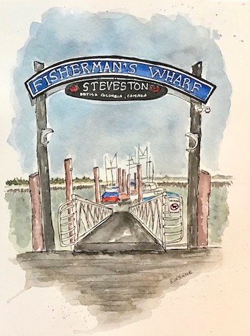
Steveston’s Fisherman’s wharf, painted by Roxsane Tanner.
Tanner has built another small business on that foundation. “I paint houses that are for sale. Realtors around Steveston commission my paintings as gifts for the new homeowners. People also come to me and ask me to paint their houses, or their children’s houses, as gifts. Sometimes, I paint from my own photographs. Other times, the clients bring their photos and order a painting from that image.”
Besides personal homes, she paints heritage places around Steveston. The old community centre, a coffee shop, a church turned into a thrift store, the pier, with its picturesque boats, and the tiny post office – the same one where some of her work is now on display.
The exhibition includes Tanner’s original watercolour paintings plus postcards and mugs with her artwork. Some of the paintings sport charming, quirky houses found only in the artist’s imagination. “I go online and search for heritage homes around the world. If I like one, I use it as my inspiration, but I don’t copy the photos. I want my painted houses light and whimsical, like a fairy tale. Maybe a bit crooked, but reflecting the essence of the house, its soul and personality. Even the real houses I paint are not exact copies of the photos. I don’t use a ruler to make the straight lines. I use my watercolours to remind people of the fun and joy their homes bring them.”
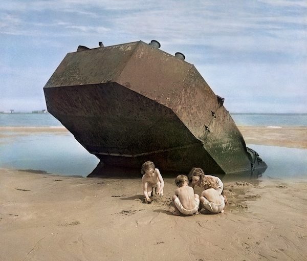
A photograph by David Seymour (Chim) of children in Normandy, in 1947. Part of the exhibit Chim’s Photojournalism: From War to Hope, at the Zack Gallery until June 15. (photo from Ben Shneiderman)
The new show at the Zack Gallery, Chim’s Photojournalism: From War to Hope, features one of the most influential photographers of the 20th century – David Seymour (known as Chim). Chim was killed in 1956, a few days before his 45th birthday, while photographing the Suez Crisis in Egypt, but his legacy lives on even now, almost 70 years after his tragic death.
Gallery manager Sarah Dobbs told the Independent that Ben Shneiderman, Chim’s nephew and the manager of his estate, approached her about the show.
“I was immediately intrigued,” she said. “I met with him and asked if we could host the exhibition. I recognized its importance to the community at the JCC and also to the city of Vancouver. It is a rare opportunity to showcase such an amazing photojournalist. It made sense to host it during the Festival of Jewish Culture in May. I met with the art committee here, and they agreed.… This is the first time these works will be shown together in Canada.”
According to Dobbs, the exhibit was initiated by Cynthia Young, a curator at the New York International Centre of Photography, using vintage prints in their collection.
“Then, the Illinois Holocaust Museum & Education Centre produced the 51 modern prints for their showing,” Dobbs said. “Later, they were presented in Portland, Ore., at their Jewish museum and Holocaust education centre. I flew down to Portland to see the exhibition while it was there and chatted with the curators.”
To package and ship the display to Vancouver, Dobbs needed funds. “I applied for grants and approached individuals,” she said. “In addition to the shipping cost, we also had a special wall built inside the gallery. It will serve us for other exhibitions, moving forward.”
The show preview on April 22 was a joyful event, presided by Shneiderman, who shared with guests his intimate knowledge of his uncle’s work and life.
David Seymour was born in 1911 in Warsaw. His father, Benjamin Szymin, was a respected publisher of Yiddish and Hebrew books. As a young man, Seymour studied printing in Leipzig and, later, chemistry and science in Paris. He wanted to become a scientist. Meanwhile, photography fascinated him. He started taking photographs and selling them to support himself financially, and unexpectedly found a passion for humanitarian photojournalism. His first credited photographs appeared in the French magazine Regards in 1934.
Interested in social issues, Seymour photographed labourers and political rallies, famous actors and street scenes. At that time, he adopted his professional name, Chim, a simplification of his last name, Szymin.
Between 1936 and 1938, as a photojournalist, Chim documented the Spanish Civil War and other international political events. Twenty-five of his Spanish stories were published in Regards. Several of those photos are included in the Zack show. One of them, a close-up of a nursing mother looking up, obviously troubled (1936), is well known. Shneiderman said several history scholars studied this photograph and concluded that it was one of the inspirations of Picasso’s 1937 masterpiece, “Guernica.” Chim’s photo of Picasso in front of “Guernica” positions the painting’s detail of a woman looking up at the falling bombs, right behind the artist.
In 1939, Chim escaped the unfolding war in Europe for Mexico and, later, the United States. As a multilingual and Sorbonne-educated journalist, he served in the US military intelligence as a photo-interpreter. After the war, he resumed his photojournalism career.
In 1947, he and a group of his friends, like-minded photographers, founded Magnum Photos, a cooperative run by photographers. Chim served as Magnum president from 1954 until his death.
Chim’s postwar photographic stories are a blend of anguish and hope. Many of the images are on display at the Zack, divided into several distinct sections. The biggest section is “The Children of Europe.”
In 1948, Chim took a UNESCO assignment to report on the plight of the 11 million European children displaced by the war. He visited Italy, Greece, Hungary, Austria and other European countries. He photographed children who were maimed and orphaned, children playing beside ruins or working in print shops or begging in the streets.
“When LIFE magazine published a spread of those pictures,” Shneiderman said, “together with a list of organizations that accepted donations on behalf of those children, the pouring in of donations was unprecedented.”
Another series of photographs focused on postwar Germany. One of the most poignant ones in this series shows a section of a beach divided by barbed wire – the border between West and East Germany. A couple of boys lounge on the sand. A young woman in a swimming suit runs towards the water. In the foreground, a border guard in uniform stands grim and watchful with his guard dog and his rifle. Tension thrums through the image, underlined by questions and uncertainties.
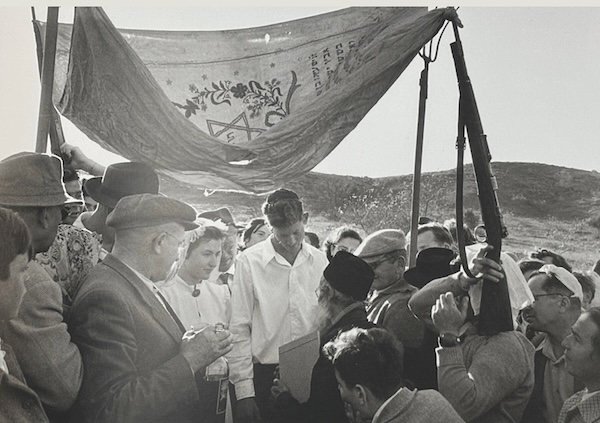
On the other hand, Chim’s Israeli photographs of the early 1950s are infused with hope. A man lifts his baby to the sky in elation – the first baby born in his village. A wedding is celebrated under the chuppah, its makeshift poles including a gun and a pitchfork. An Independence Day parade rolls through Tel Aviv. A team of fishers proudly display their catch of the day to the photographer.
A photograph by David Seymour (Chim) of a wedding in Israel, in 1952. (photo from Ben Shneiderman)
In all his visual stories, Chim is always there with his subjects. They are his co-authors.
“It is that emotional connection that made many celebrities willing to pose for him,” said Shneiderman.
Chim photographed Ingrid Bergman and Audrey Hepburn, Sophia Loren and Picasso, and many others. These photographs are not included in the show, but, together with those that are included, they portray their creator as a man of courage, integrity and vision, one of the best photographic artists of the 20th century.
“Is photojournalism art?” Dobbs mused. “Yes, I think so. Photojournalists capture a moment, an interaction at a specific time. Contemporary art is a mirror of our times. It reflects the societal changes, cultural shifts and significant events that shape our world. It is what the best photojournalists, like Chim, do.”
Dobbs is certain that Chim’s work is still relevant.
“It continues to inspire and draw attention. It teaches photographers to get close to their subjects,” she said. “His images remind us of the past, of the destruction of war, but also of the humanity that transcends it, and of peoples’ resilience.”
Chim’s Photojournalism: From War to Hope is on display until June 15. It is sponsored by the Averbach Foundation, Esther Chetner, the Yosef Wosk Family Foundation and the Government of Canada, in partnership with Shneiderman, Magnum Photos, the International Centre of Photography in New York, the Jewish Community Centre of Greater Vancouver and the Jewish Federation of Greater Vancouver.
For more information and to see a selection of photos, visit davidseymour.com.
Olga Livshinis a Vancouver freelance writer. She can be reached at [email protected].
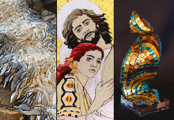
Mosaic Revival: Three Contemporary Expressions features the work of BC artists Maria Abagis, left, Lilian Broca, centre, and Daryl Lynne Wood. Shining the spotlight on this ancient medium, these artists challenge the viewer’s perception of what a mosaic is, and its relevance in the art world today. The exhibit is at CityScape Community ArtSpace, in North Vancouver, untilJune 6. (Images courtesy CityScape)
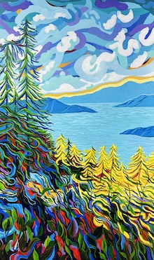
“Warm Blossoms” by Lauren Morris. (image courtesy Art Vancouver)
“The Watchers” by Lisa Wolfin. (image courtesy Art Vancouver)
Jewish community members Sky Lilah, Lauren Morris, Taisha Teal, Talin Wayrynen and Lisa Wolfin are among the artists participating in Art Vancouver International Art Fair, which runs until April 27 at the Vancouver Convention Centre. Tickets: artvancouver.net.
The new exhibit at the Zack Gallery, “Hope” is the Thing with Feathers, derives its name from the eponymous poem by Emily Dickinson. Gallery manager Sarah Dobbs, who curated the show, was instrumental in coming up with the name, as well as in bringing together the two artists whose works are on display: Ilze Bebris and Barbara Heller.
“I’ve known Ilze Bebris for many years,” said Dobbs. “I saw the works she produced during COVID and said she should submit a proposal for an exhibition at the Zack Gallery. When she did, the art committee and I met and decided she should definitely have a show. But there wasn’t enough work for a solo show.”
Bebris’s submission included a series of 19 drawings, called Ballad of Hope and Despair, and a journal with her sketches of feathers. “That journal is a record of found things; of feathers shed by the gulls in my neighbourhood,” Bebris explained. “Each morning, at least one feather landed on my daily walking route.… I collected them and drew them over a period of a month.”
When Dobbs contemplated Bebris’s feathers, another artist who uses feathers extensively came to mind.
“I remembered Barbara Heller instantly,” said Dobbs. “Heller had created many tapestries with birds and feathers, and I thought their art might work well together. However, once I reflected and looked deeper, it occurred to me that they were both talking about isolation and resilience. And the poem by Dickinson, which I used for the title of the show, also speaks of resilience, hope and feathers, even though Dickinson wrote it more than 100 years earlier.”
For the current exhibit, both Bebris and Heller are presenting art that they created during the pandemic.
Ilze Bebris (photo by Olga Livshin)
“We have a small property on Gabriola Island, a house” Bebris told the Independent. “My husband and I were driving there one day in 2020 when the news of the COVID lockup hit. We became stuck on the island, couldn’t go home or anywhere for months.”
Bebris and several artists she knew who lived or vacationed on Gabriola got in touch with one another and decided to exchange drawings that they would create daily.
“We needed something to do,” she said. “We were all trapped. The news was horrible. My father and stepmother both died from COVID in their care home in Ontario, and I couldn’t go there, could do nothing but wait and hope for a cure or a vaccine.
“I lived in a tumult of emotions: grief, hope, anxiety, boredom,” she shared. “So, I drew. I drew flowers and twigs and rocks I saw on my daily walks; I drew feathers. But, one day, I ran out of things to draw. I had this small wooden mannequin, and I thought: what if I put it into different poses and draw it. Then the black boxes appeared in the images, reflecting our collective feelings of being trapped, isolated. I called the series ‘Ballad of Hope and Despair.’ They were all done during the first summer and fall of the pandemic.”
The 18 images, set in two rows, one above the other, are all the same size and shape. In each frame, there is the grey background, a black box of a window in the middle, and a wooden mannequin inside the window. Every pose is different, like every person is different – different experiences, ages, ethnicities – but the series unites us as human beings. We have the same general body structure and we move in similar ways as the mannequins in those windows. We all went through the pandemic.
There is one additional image beside the original 18.
One of the images in Ilze Bebris’s “Ballad of Hope and Despair” series, now on display at the Zack Gallery. (photo courtesy)
“I did it a few months later,” Bebris said. “In the first 18, all the mannequins are trapped inside. But, in the last one, the mannequin is outside the window, finally looking in, reflecting beside the viewers.”
“Hope” is Bebris’s first show at the Zack, while Heller has exhibited in the gallery before. Her contribution to this show includes a series of small tapestries called “We Are All the Same….” Each tapestry shows a couple of bird bones with a feather above or below them. We don’t know what species of birds the bones belong to, and neither do we know from which birds came the feathers – they are bright and colourful but mysterious.
“The entire series includes 16 small tapestries I wove when I stayed home due to COVID,” said Heller. “They are small, because my studio on Granville Island was closed and I only had a small loom at home. The tapestries were a response to the killing of George Floyd and the chaos in the world at the time. Not that it is better now!”
Barbara Heller (photo courtesy)
She elaborated in her artist’s statement: “We are all the same under our skin, but by focusing on our differences, we have lost our sense of who we are and how we fit into our shared world. This series shows that … beneath the many colours of our skins and feathers, our bones, our organs and our blood are the same. They are what make us human, while the outward differences, no matter what kind, are invisible and irrelevant beneath our skins.”
In addition to the small tapestries, there are two other works by Heller that catch viewers’ interest. One is a big tapestry of a dead gull, called “The Shaman.” It is a skeleton and residual feathers. About 10 times larger than the small ones, the tapestry is bright with colour and infinitely sad – the memory of a bird rather than a living one.
“It is from a series of three tapestries I wove after I found a desiccated body of a seagull with its feathers almost intact, while walking to my studio on Granville Island,” Heller explained. “To me, there was such pathos in the creature that I took it home to photograph. And I wove a tapestry to honour its spirit. ‘The Shaman’ dances to warn of our earth in peril. It has included bits of wire and plastic in its nest, and a vessel for life becomes a warning of death.”
“Chance” by Barbara Heller. (photo courtesy)
Dead birds and feathers have been parts of Heller’s expressive pallete for several decades. They represent the artist’s appeal for change and, to Heller’s chagrin, they are still relevant today, maybe more than ever. But she keeps trying to inspire people to become less destructive, more considerate of one another.
Heller’s other offering is a real nest abandoned by its avian makers. It is full of feathers she found during her walks. Like Bebris’s journal filled with feather sketches, the nest is a memory. They both tell the same story: the birds were here, but they are not anymore. Should we take such a message as a warning or as an inspiration – each one of us must decide for ourselves.
“I was amazed and very pleased to see how well Ilze Bebris’s art and mine looked together,” said Heller. “We met for the first time on March 4, when we brought our works in to hang, but we explored the same themes. And the fact that we both have depicted boxes within boxes is fantastic. Both her works and mine deal with COVID and isolation and our relationship with the world. They complement each other and amplify our messages.”
“Hope” is the Thing with Feathers opened at the Zack Gallery on March 5 and will be on display until April 11.
Olga Livshin is a Vancouver freelance writer. She can be reached at [email protected].