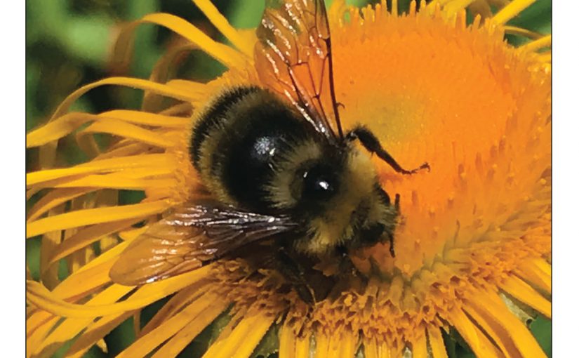
This year’s Jewish Independent Rosh Hashanah cover photo features a bumble bee on a heartleaf oxeye daisy flower – it was taken in Saanich, B.C., by David Fraser. Many native bumble bees are in decline, a concerning trend given the role they play in pollination of plants, including many food crops. Pesticides, habitat loss and introduced bee parasites and diseases are thought to play a role in this decline.
Apples are one of the main symbolic foods we eat on Rosh Hashanah, as we wish for a sweet year, with the help of some honey. Apples are the fruit of choice for this wish perhaps because Rosh Hashanah coincides with the sixth day of creation, when humans – Adam and Eve – were created and they ate the fruit (apple) of the Tree of Knowledge in the Garden of Eden. It could also be that apples symbolize the relationship between God and the Jewish people, as poeticized in the Song of Songs, or that the Zohar (kabbalah) describes paradise as a holy apple orchard.
Regardless of the reason for the fruit selection, apple production is dependent on bees and other pollinators. It would be fitting then for us to wish for more than a sweet, fruitful year, when we are dipping our apple slices into honey. We might consider our role in the decline of not only the bumble bee populations but of the environment at large, and what we can do to reverse it.
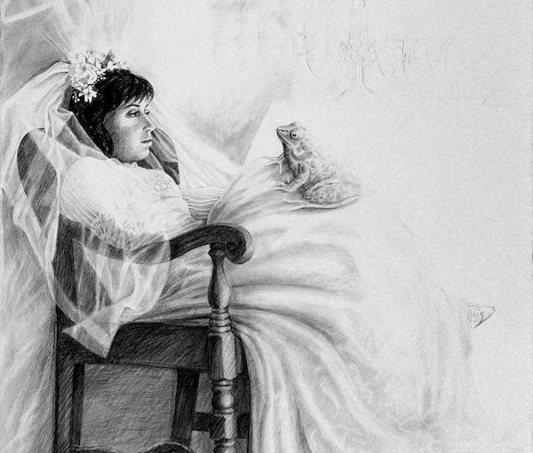
“Kiss! Kiss! Kiss!” by Lilian Broca is part of the exhibit Brides: Portrait of a Marriage, which is at the Italian Cultural Centre’s Il Museo until Sept. 30.
In most romance novels and fairy tales, a love story ends in a wedding and the couple lives “happily ever after.” In real life, it’s not that simple. Marriage has its challenges.
The show Brides: Portrait of a Marriage, which opened at the Italian Cultural Centre’s Il Museo in Vancouver this summer, examines some of the aspects of marriage that fairy tales purposefully omit. The show incorporates the works of several local artists in different media: textile art by Linda Coe, photography by Grace Gordon-Collins, drawings by Jewish community member Lilian Broca and a tapestry by fellow Jewish community member Barbara Heller.
“I always wanted a show about brides,” Angela Clarke, curator and director of Il Museo, told the Independent. “We have weddings at the centre almost every week. There is so much energy, so many emotions. But the Roman goddess of marriage, Juno, was not a happy woman. Hers was not a happy marriage, and the controversy attracted me.”
Brides is part of the museum’s Gendered Voices series, and looks at marriage from a woman’s perspective.
“This exhibition places the institution of marriage under the looking glass,” said Clarke. “Each participating artist tackles the deep psychological complexity and immense social pressure involved in a traditional marriage. Historical perspectives and family dynamics, personal reflections and the impact of feminism are explored in the show.”
Each artist contributed her own personal outlook. Coe’s fabric panels belong to her Dirty Laundry series. Colourful and sophisticated-looking hangings were all created from fabric snatches that were once parts of women’s dowries, used and reused for several generations before they ended up in the artist’s stockpile.
“The eight fabric panels represent eight stages of a woman’s life,” explained Clarke. “Each one incorporates relevant texts from Renaissance romance novels and etiquette manuals. In the 16th century, such manuals were very popular in Italy, especially among the middle classes. They were written to instruct young brides in the proper comportment, in the ways to become a successful bride and mother.”
In addition, those eight panels reference the eight requisite parts of a romance novel, from the Middle Ages to the modern Avon romances. “Those stages have names, the same names as the panels,” Clarke said. “No. 1, Stasis (infant). No. 2, Trigger (young girl). No. 3, Quest (betrothal). No. 4, Surprise (courtesan). No. 5, Critical Choice (bride). No. 6, Climax (wife). No. 7, Reversal (matron). No. 8, Resolution (widow). Every love story published these days must follow this structure.”
Heller’s tapestry and Gordon-Collins’s photographs explore wedding dresses and the commodification of weddings. The tapestry shows a bride in a beautiful dress, but her face is blurry, unimportant, and the dress becomes the focal point, a uniform, a symbol.
The photos, in the photogram or X-ray style, lack faces altogether, only the wedding attires of four generations of women of the artist’s family can be seen.
“Grandmother’s wedding tunic was modest, especially in comparison to the artist’s daughter’s wedding dress, much more opulent and sensual, and designed for one-time use only,” said Clarke. “Here, we can trace how, through the generations, the weddings grow into an industry, and the wedding accessories become commodities.”
While neon-bright colours dominate Gordon-Collins’s images and Coe’s collages shimmer with the patina of gold, Broca’s contribution to the show is a sequence of stark black and white lithographs, all from her Brides series.
“My mother passed away in 1989,” Broca said, as she explained the roots of her series. “I was devastated by her death, although it was a blessing after suffering for years from cancer. Soon after her passing, I started dreaming about her as a young bride. I decided to draw my dreams.”
Her drawings reflect the dichotomy between the happily-ever-after concept and the fact that most marriages in the past were arranged, and not unions of love.
One of the drawings, “Kiss! Kiss! Kiss!” depicts a bride sitting in a chair, regarding a frog in her lap. A few more frogs – potential princes? – wait at her feet, expecting her to choose between them.
“I knew my bride would not kiss that frog,” said Broca. “So I added several other potential grooms. Some small, others big…. Still, I had a feeling she would resist them all.”
The work “Upon Reflection” is even more powerful. It shows a bride in a gown and veil looking into a full-length mirror. The image in the mirror depicts the bride, face and posture serene, as befits the occasion, but Broca has left the image of the bride herself white and, from within it, there is the drawing of a woman, the bride, trying to escape.
“That woman, upon reflection, discovers how much she doesn’t wish to be married, to be tied down. What happens next is up to the viewer’s imagination,” said the artist.
For Broca, black and white was the only possibility for the series. “It was the most appropriate way to describe what I felt…. After the first two or three drawings, I began to realize that many brides were not happy at the altar – I showed them. Only a very few happy brides appear in my drawings. Not because happy brides are a minority, but because happy brides are difficult to portray without slipping into a less-than-powerful mode. I may be wrong, I may be able to do it today, but, at that time, it didn’t seem possible.”
Clarke knew about Broca’s series and wanted to include it in its entirety in the show, but that wasn’t possible. “We couldn’t include so many that Angela wanted because they had been sold,” said Broca. “We couldn’t borrow them. The owners live in the U.S. and Eastern Canada. As it is, the two works in the exhibition were borrowed from local owners.”
Brides is at the Italian Cultural Centre until Sept. 30.
Olga Livshin is a Vancouver freelance writer. She can be reached at [email protected].
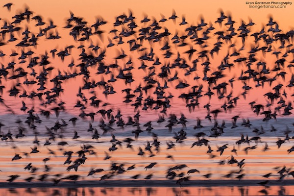
One of the most important issues we should be grappling with nowadays is the preservation of our habitat. At the forefront of the nature preservation movement are photographers and one of them is Liron Gertsman, a young, award-winning local nature photographer whose solo show, Essence of Earth, is at the Zack Gallery until Sept. 22.
The show is sponsored by Esther Chetner.
“Eldad Goldfarb, executive director of the Jewish Community Centre of Greater Vancouver, approached me about this upcoming sponsorship opportunity, aware of my own concern about climate change and my passion for photography,” Chetner told the Independent. “Though I’ve traipsed parts of the globe enjoying the wonders that photo details can deliver, I’m not at all technically trained nor technologically nimble…. I recognize the remarkable quality of Liron’s images, and see value in making his work accessible to others.”
Calling Gertsman a “rising star,” Chetner said, “Encouraging this type of exquisite work is another way to help people appreciate our natural world more deeply and then, hopefully, to work toward preserving such essential global health and diversity. The more we see and appreciate about our natural environment, the more we will all be inclined to proactively protect it.
“Jewish values are quite aligned with environmental stewardship, and so having Liron’s work displayed at the JCC seems like an appropriate fit.”
Part of the proceeds of the exhibit will benefit the gallery, and another part will go to the Nature Trust of British Columbia.
“There are several charities concerned with nature preservation in B.C.,” Gertsman said, “but I like the Nature Trust because they purchase land specifically to build and maintain a treasury of wild areas.”
Liron Gertsman has loved nature and photography all his life. (photo by Ian Harland)
“I’ve loved nature and taking photographs all my life,” he told the Independent. “Recently, I started moving toward doing it professionally, like giving photography workshops or guiding people on their bird-watching expeditions.”
His photographs are like a guided tour. “I want people to witness nature,” he said. “I want to share with them what I see, even if they can’t travel themselves.”
To cover some of his costs, he has, at times, formed partnerships with companies and organizations.
“I choose companies focused on nature conservation,” he explained. “They would subsidize some aspects of my trip, or sometimes an entire trip, in exchange for photo use and social media marketing, usually through my Instagram account, which has close to 50,000 followers.”
For instance, in May and August of this year, Gertsman partnered with Ocean Outfitters, an ecotourism company based in Tofino.
“They are Tofino’s first carbon-neutral ecotourism company, and they have committed to donating $200,000 a year for multiple years towards restoration of the Tranquil Watershed,” he said.
Gertsman’s photos at the Zack Gallery are full of life and colour. His birds seem to soar through the gallery space. His landscapes are like windows, looking out into the British Columbia wilderness. Stars twinkle in the night sky. Pink crags reflect in the still surface of the lake. Waterfall gurgles across the boulders. Owls hide in the grass, and gulls skim over the rippling wavelets. But the beauty and serenity of his images filled me with apprehension. Could we lose all of this gorgeousness? The night after I visited his show, I had a dream, and Gertsman’s imagery figured heavily in my dreamscape.
* * *
“What is it, Grandpa?” a girl asked.
“A picture archive,” the old man replied.
“But it’s not a memory crystal.”
“No, it’s from the 21st century, an antique. Two hundred years old,” he said, inserting an outmoded device into a slot of his com-link and opening the files. Hundreds of pictures appeared on his screen. Nature, when it flourished.
“Oh,” his granddaughter said with interest. “What are those?”
“Birds,” he whispered reverently. In the image, hundreds of small dark bodies hurtle across the peachy sky, their wings pumping so rapidly, the image blurred.
“Like a hologram in a museum?”
“Yes. Only they were alive. Flying.”
“But why is the wall pink? Why would they paint it pink?”
“Sandpiper Sunset,” photo by Liron Gertsman.
The old man glanced at the wall of the cave that housed the archives. Nobody lived on the surface of the earth anymore. Nobody could survive the toxic environment. People inhabited underground caverns such as this one and, mostly, they didn’t bother painting the walls. There were few resources anymore.
“It’s not a wall, it’s the sky,” he said. He had been very young when the last of humanity had moved underground, but he still remembered the sky. Scientists said that, in a few more generations, they could live outside again, but he wasn’t sure his granddaughter would last that long. He certainly wouldn’t.
“Our teacher said the sky should be blue,” the girl insisted.
“The sky could be any colour. This is probably sunset.”
“What is sunset?” She had never seen the sun.
He sighed, but, before he could explain, her gaze had skipped to another image.
“It looks like a fountain,” she marveled, “but what are these green blobs?”
The old man winced. “Trees. Bushes. It’s not a fountain. It’s a waterfall.”
Her finger zeroed in on another image. “I know,” she said triumphantly. “These are dogs. Strange dogs, though.”
“These are not dogs. These are bears. The mother bear is….” He contemplated the animals on the screen, trying to remember his own textbooks. He had never seen a living bear either. “I think she is as big as I am,” he said at last. “Maybe bigger. And the little bears are probably your size.”
“So huge?” She eyed him with doubt. “They lived outside, too?”
He nodded.
“I don’t think I’d like it outside,” she said. “Everything is different. I like it better here.” She climbed off her chair and started to leave. “We have everything here.” She went out into the corridor. “I think it’s all fairy tales anyway,” she called back.
The old man remained still, staring at the closed door with sadness.
* * *
Essence of Earth opened at the Zack Gallery. To see more of Gertsman’s work, visit lirongertsman.com or instagram.com/liron_gertsman_photography.
Olga Livshin is a Vancouver freelance writer. She can be reached at [email protected].
Ken Hughes infuses his paintings with messages. (photo by Olga Livshin)
Ken Hughes has always been fascinated with typography. “Since childhood, letters of the alphabet have intrigued me,” he said in an interview with the Independent.
“Public lettering is a centuries-old method of civic communication, both official and informal,” he said. “It goes back to Mesopotamia. By Greek and Roman times, public writing – inscriptions on buildings, commercial graphics, signs, epitaphs on tombs, graffiti – was common. The messages could be political or commercial, funerial or commemorative, religious or frivolous. In more contemporary times, particularly in Europe, public inscriptions have undergone a revival.”
The artist draws from this rich tradition for his paintings and his new show at the Zack Gallery, Ancient Writings in Contemporary Contexts, opens next week. A collection of inscriptional paintings, beautiful and evocative, colours and shapes of the images enhance and deepen the meanings of the lettering, and every piece tells a story.
Before retiring, Hughes was a professional graphic designer. He taught graphic design for years at Emily Carr and Kwantlen universities. He turned to art five years ago.
“Inscriptions – texts expressed formally or otherwise in different alphabets or languages – are a major source of inspiration for my paintings,” he said. “This particular exhibition’s goal is to visually express texts related to Jewish beliefs and culture. Some of the paintings have writings in the Hebrew alphabet. Others have transliterated Hebrew using the Roman alphabet.”
He explained that the messages in his paintings come from various sources: the Hebrew Bible, fiction and nonfiction by Jewish writers, as well as quotes by famous people, all related in one way or another to Jewish culture.
“I don’t speak Hebrew,” he said, “but I have friends who do. I always ask them to check the writing before I incorporate it into my paintings.”
In his work, the esthetics of the letters are intertwined with the message of the citation used. He has been collecting quotes, personal mottos, sayings and other forms of public texts for a long time. “I sing in a choir, and much of choral music is liturgical,” he said. “It has incredible messages, many of them in Latin. I also read a lot and get my messages from books, from newspapers, from common idioms.”
In 2002, Hughes took a yearlong sabbatical from teaching to prepare for what he does now.
“I traveled through Europe – Poland, France, Turkey, Belgium, Greece and Israel,” he said. “I took photos of the public inscriptions on civic buildings, in churches, at cemeteries. I wrote down quotes from illuminated manuscripts in national libraries. There are incredible inscriptions on the tombstones in Budapest, where many famous Hungarians are buried. Jewish cemeteries have beautiful inscriptions in Hebrew.”
Sometimes, a line of text or a quote stays in his memory or in his notebooks for decades before appearing in one of his paintings. Many of his pieces are sad, executed in a darkish palette, underscoring words of deep emotion: grief, fear, despair, memories of hard times and bleak thoughts. But there is hope and joy, too, and Hughes uses bright and colourful compositions to accentuate those messages.
One of his uplifting works, a multi-paneled cycle based on the story of Genesis, with Hebrew lettering dancing across the panels, is decorative as well as informative. The series will be in the exhibit at the Zack.
“Alphabets are amazing inventions, incredible almost,” Hughes said. “They allow people to communicate ideas with just a few symbols. And they are all different – the Roman alphabet, the Cyrillic letters, the Hebrew. In all cases, letters by themselves mean nothing; they’re just symbols. But a combination of letters, a phrase, could have profound meaning.”
When Hughes starts working on a piece, he approaches it as a designer, with a typographer’s attention to detail. He makes many sketches while investigating each idea. What colours should be employed and in what combinations? What is the best number of panels for this message and the most expressive configuration to highlight the meaning of the words? Even the font used can make a difference.
“Some letters look better in a rounded font; others need a blockier typeface,” he said. “The positioning of the letters and the words could be of paramount importance in my paintings. They constitute the composition. And, of course, the message itself often dictates the font type.”
There are not many artists in Canada who dedicate their art to this kind of painting.
“I wanted my paintings at the Zack,” Hughes said. “I don’t want to display at commercial galleries. I think my works are much more suited to schools, churches or community centres.”
Ancient Writings in Contemporary Contexts runs from July 25 to Aug. 25. To learn more, visit kenhughes-art.com.
Olga Livshin is a Vancouver freelance writer. She can be reached at [email protected].
Ira Hoffecker’s current solo exhibit at the Zack Gallery, Conjunction, runs until July 21. (photo by Olga Livshin)
Conjunction, Ira Hoffecker’s current solo exhibit at the Zack Gallery, opened on June 13 and runs until July 21.
German-born Hoffecker and her family moved to Canada in 2004. “I always liked art, but when I lived in Germany, my husband and I worked in marketing for the movie industry,” she explained in an interview with the Independent.
Once, when her children were still young, they came here for a family vacation and traveled Vancouver Island. “We loved it,” she said. So much that, when they moved here permanently, they settled in Victoria. As if that wasn’t change enough, Hoffecker also decided to switch careers and follow her lifelong love of art. She enrolled in the Vancouver Island School of Art and has been studying and creating ever since.
Hoffecker’s previous show at the Zack Gallery, in 2016, was dedicated to maps. Since then, her art has undergone a couple of transformations. Conjunction is much brighter and more expressive set of works, although the abstract component remains.
On the journey to her new colourful mode, Hoffecker went through a black-and-white stage, which was the focus of her master’s in fine arts’ thesis, which she completed last year. The works she created for her master’s degree include a number of huge paintings – abstracts made with tar on canvas – plus three documentary videos. The theme – “History as Personal Memory” – was a painful one for the artist. She recalled, “One of my professors said that my works are the interconnected layers of urban setting and history. ‘Where is your personal layer?’ he asked me.”
Taking this advice, she has been trying to delve into her personal recollections, to uncover her place in history, her “personal layer” among the historical layers dominating her art. “In ‘History as Personal Memory,’ I tore pages from a history book about the Third Reich, an era in history that many Germans would prefer to forget. Yet I think it is important to face and discuss this past. Such dialogue might prevent the horrors from happening again,” she said.
In Hoffecker’s art, the artist’s memories are intertwined with the history of her nation. “Correlations between my childhood abuse, which I tried to forget, and the history of Germany, which the Germans tried to eradicate from their memories, exist in my paintings and films,” she said.
In her art and her videos, she opens up about the abuse she suffered as a child at the hands of her grandfather, who was also a Nazi. She is convinced that such openness has helped her heal, whereas suppressing the memories led only to the festering of her inner wounds.
The same is true for historical memories, Hoffecker insisted. “Germany needs to remember, to confront and challenge complacency to prevent a repetition of historical atrocities,” she said.
Her master’s thesis was a deep and painful discovery, a journey in black-and-white to underscore the grimness and tragedy of the topic. Once it was completed, she was ready for a change of direction.
“I spent the summer last year in Berlin,” she said. “When I came back home to Victoria, I wanted to paint some colours again.”
Hoffecker’s current exhibit bursts with vibrant colours and optimism. The series Berlin Spaces, like most of her paintings, has several layers. “There are outlines of many famous Berlin buildings there,” she said, tracing the architectural lines embedded in the abstract patterns with her finger. “The Jewish Museum, the Philharmonie, the library, the Reichstag. It is like a reconstruction, when I think about the past. I overlay history and architecture.”
One of the paintings, a bright yellow-and-pink abstract, has writing among its patterns. “It means ‘forgetting’ in German,” Hoffecker explained. “A few years ago, I was invited to have a solo show in Hof, a city in Germany. I worked there in the archives, found many old maps and records. One of their buildings is a factory now. After the war, it was a refugee camp, and there is a plaque to commemorate the fact. But, during the war, it was a labour camp, a place from where Jewish prisoners were transported to concentration camps and death, but nothing is there to remind [people] of that past. The painting reflects the current happy state of the building, but it also reflects the tragic past, the past we shouldn’t forget.”
While not many art lovers will see the horrors of the labour camp in the airy and cheerful palette of the painting, Hoffecker doesn’t mind. Like other abstract artists, she infuses her images with hidden messages, but doesn’t insist on her personal intentions.
“I own the making,” she said. “I bring in my memories and my heart, but I have to leave the interpretation to the viewers. One man in Victoria loves my art. He bought two of my paintings. He said he sees animal in them. I don’t paint animals, but I’m glad people’s own experience resonates with my paintings.”
Hoffecker is very serious about her art, but bemoans the need for promotion. “I did marketing for movies professionally, but I never really cared [about the reaction]. If someone didn’t like the movie we were pushing, it was his business,” she said. “But to promote my own paintings is scary. When someone doesn’t like what I do, I care. It hurts. I don’t want to do it. An artist wants to be in her studio and paint. It is all I want: to paint and to exhibit. I want people to see my work. Besides, a show is the only time when I see many of my paintings together. I never can do that in my studio. I only see one or two at a time.”
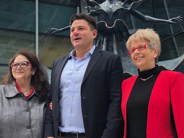
Left to right: Oree Gianacopoulos, Chali-Rosso Gallery director; James Sanders from Dali Universe (Switzerland); and Susanna Strem, president of Chali-Rosso Gallery. (photo by Shula Klinger)
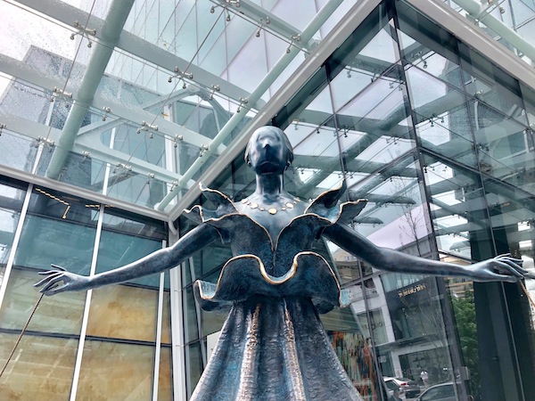
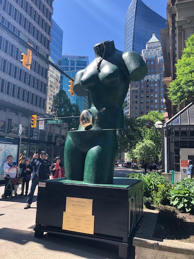
May 17 and 18 saw the unveiling of two sculptures by Spanish surrealist Salvador Dali, which will be on display until September. The sculptures were brought to Vancouver by the Chali-Rosso Gallery on Howe Street, the site of the annual Definitely Dali exhibition. More than 100 Dali originals are on display at the gallery, along with 20 smaller versions of Dali’s bronzes.
On May 17, “Dalinian Dancer” was revealed at the corner of Thurlow and Alberni. “Space Venus” was unveiled on the next day at Lot 19, on West Hastings at Hornby. The unveilings were accompanied by flamenco music, which Dali loved.
Oree Gianacopoulous, Chali-Rosso’s director, spoke before the unveiling of “Space Venus.” Describing it as one of Dali’s “iconic” pieces, she expressed her gratitude to Beniamino Levi, director of Dali Universe, the foundation that lends out the artwork. Levi worked with Dali himself to develop the collection of 29 sculptures.
This is the third year that Dali sculptures have traveled to Vancouver, under the leadership of Chali-Rosso president Susanna Strem, a member of the Jewish community. Working in close collaboration with Dali Universe in Europe, which loaned the sculptures to Chali-Rosso, Strem’s initiative has helped establish a new cultural tradition for the downtown core.
This year, the gallery also worked with Virtro Games to develop a smartphone application to enhance viewers’ experience of the sculpture. Definitely Dali is an augmented reality app – when a phone camera is focused on the image of Dali’s face, the dancer begins to move her arms and spin.
Alex Lazimir, who developed the app, talked about the privilege of spending many hours looking at Dali’s dancer. “I really like this piece because it was like going into Salvador Dali’s mind. The first thing I thought was that she has to be spinning.”
Salvador Dali’s “Dalinian Dancer” can be found at the corner of Thurlow and Alberni. (photo by Shula Klinger)
After the unveilings, Chali-Rosso hosted a champagne reception and a talk by James Sanders of Dali Universe (Switzerland). With reference to the sculptures at the gallery, Sanders spoke about Dali’s life and the tremendous influence of his surreal imagination on the world of art. Sanders is responsible for sourcing locations, sponsors and partners for exhibitions all over the world.
Originally from Europe, Strem came to Canada 25 years ago, via a spell in Israel. Formerly an information technology professional, Strem spoke about the challenge of bringing world-class art to public spaces in Vancouver.
“These sculptures are traveling all over the world. They’re exhibited in many major cities. Vancouver has to compete with cities like New York, London and Paris. These are major art hubs, so we are very happy that we managed to get two sculptures.”
Last year, Definitely Dali featured “Woman in Flame” and “Surrealist Piano.” More than three million visitors saw the sculptures.
Bringing monumental works of art here is a labour of love, however. “It takes almost a year to organize something like this,” said Strem. “Last year, when we had two other sculptures here, we were already talking about this year’s exhibition. It all depends on what is available and circumstances in other cities.”
The logistics of moving bronzes like “Space Venus” – which is 3.5 metres high – can be tough. “These sculptures were transported by ocean freight from Italy, then traveled through the Atlantic to the Panama Canal, up the Pacific Ocean past Mexico and California to Vancouver,” she said. “It’s a long journey. We experienced a delay. There was a traffic jam in the Panama Canal.”
“Space Venus” by Salvador Dali has been placed in Lot 19, on West Hastings at Hornby. (photo by Shula Klinger)
These exhibits are both the impetus for, and a sign of, urban growth – “for a real city,” said Strem, “public art is a natural part of its evolution.” She spoke of the collaboration with the Downtown Business Improvement Association. “They were full-force behind it from day one, which helped motivate us. They were really enthusiastic,” she said.
Part of Chali-Rosso’s community involvement includes supporting Recovery Through Art, a charitable organization in Vancouver that gives individuals struggling with mental illness and addiction a chance to heal through the creation and appreciation of art.
Strem is already seeing the impact of the Dali pieces on public display. “If somebody is looking at their phone and they walk by 10 times but, this time, they look up and their face changes, even for a fleeting moment, that’s important. Or they might stop for 30 minutes. There are many ways to enjoy art,” she said.
Strem explained that, to truly become part of life, art should not just be locked away in special locations.
“It’s not about having a destination for art, where you allocate time and energy to it,” she said. “When we don’t engage with art like this, in public, people are missing out.”
Shula Klinger is an author and journalist living in North Vancouver. Find out more at shulaklinger.com.
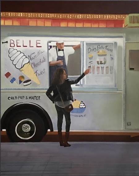
Jack Rootman, in front of his painting “Homage to Degas.” (photo by Olga Livshin)
Jack Rootman’s new solo show, Scene at Night, opens tomorrow, June 1, at the Visual Space Gallery on Dunbar Street. As the name implies, the exhibition is dedicated to Rootman’s paintings of urban night scenes.
“There are several reasons I’m interested in painting the night,” he said in an interview with the Independent. “First, I wanted to show human activity as it is spotlighted at night. People move from one light source to another, from the indoor balcony to the moving lights of cars. You don’t see it so focused during the day. When you look in the daytime, there is a panorama in front of you, your attention wanders; there is too much to see. But, at night, you see activity encapsulated. Someone drinks coffee. Someone crosses a street. Someone is sad or crying or laughing. Your attention is drawn to a spot of light.”
The second reason for his fascination with the nocturnal setting has to do with the constantly changing colours and contrasts. “There are many light sources wherever you are at night – streetlights, lights from the windows, moonlight – and each combination gives off different colour nuances and shadows, depending on where you stand, on the angle of your view,” he explained.
Rootman thinks an element of colour always exists, even at night, when there is a “dynamic blackness. If you look at my paintings,” he said, “there is red black and purple black, blue black and green black.”
Night’s more limited spectrum of colours intrigues and challenges the artist. “Of course, it is more difficult to paint night, to see colours in the darkness,” he said. “Sometimes, I have to use Photoshop to analyze what colours appear in a photograph, before I transfer the image to an oil painting.”
Rootman started painting night scenes years ago, although the bulk of the 22 paintings in the current exhibit have been created in the past five years. During his travels, he took many photographs at night in Paris, Venice, New York and Montreal. He also made sketches and recorded the colours as he saw them. But his paintings never follow the photos to the letter. One painting, a ribbon of light, might be an abstract representation of the night traffic along a boulevard, based on a photo taken from the balcony of his hotel room. Another might be a composition of images from different years and cities.
“My painting ‘Homage to Degas’ is one such a composition,” he said. “I saw this marijuana shop in Vancouver and it reminded me of a Degas painting. I included two of his paintings in this piece.”
In addition to the technical challenges of depicting a city scene at night, Rootman is interested in the loneliness that is most profound at night. “During the day,” he said, “we are at work, but the night brings isolation. It also brings possibilities – many people are lonely, and they go out during the night to meet others.”
“Ice Cream,” by Jack Rootman, is among the works featured in his solo show, Scene at Night, which opens June 1 at the Visual Space Gallery.
Some of the paintings show this disconnection. Everyone is absorbed in what they are doing, alone in their own spots of light, talking on their cellphone or lost in thought, and darkness separates them from one another.
“The night is also traditionally associated with a sense of danger,” the artist mused. “Several paintings in this series are lanes, particularly lanes in downtown Vancouver. Anything could hide in such a lane, with insufficient light: from rats to human predators.”
While his lanes are bleak, despite the illumination of neon signs and streetlights, there is always hope in Rootman’s paintings. Perhaps his medical background brings that sense to the fore of everything he does, both in his professional field of eye surgery and in his art.
“My most comfortable mental state is when I’m doing something creative and visual,” he said. “It works for my art. It also worked for my job as a surgeon, before I retired. Surgery is very creative. Like art, surgery is a discovery. Nothing is ever as you expected.”
And, like in his medical practice, where every patient had a story, all of his paintings are stories, too, stories of danger and loneliness, separation and connection, all linked together by darkness and light.
“My work has a certain affiliation with music and poetry,” said Rootman. “That’s why I decided to have a music night and a poetry night as parts of this show.”
The music night with Amicus Ensemble will be held at the gallery on June 5, 6-8 p.m., and the poetry night the next evening, June 6, 6-8 p.m. Scene at Night is at the Visual Space Gallery until June 9.
Olga Livshinis a Vancouver freelance writer. She can be reached at [email protected].
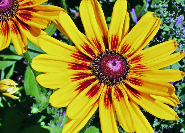
Yellow gazanias, by Pamela Fayerman. Eighteen of Fayerman’s macro photos form the exhibit Intimate Encounters, which is at VanDusen until June 27.
Well-known for her writing about medicine, science and health policy in the Vancouver Sun, award-winning journalist Pamela Fayerman has another area of expertise, perhaps somewhat lesser known: macro photography. Her first exhibit – Intimate Encounters: Botanical Closeups – opened at VanDusen Botanical Garden with a reception on April 6.
Born in Prince Albert, Sask., Fayerman grew up in Saskatoon. She moved to Toronto to attend Ryerson University School of Journalism, with the intention of becoming a photojournalist. While she changed her mind about that, she said the “photography courses at Ryerson taught me about important things like using light, subject composure and print developing. Even though everyone does digital photography these days, the foundations for those of us who learned on old SLR cameras are still pertinent.
“While I was at Ryerson, I got an incredible break with a story scoop that would be a defining career opportunity,” she said. “I sold the front-page story to the Globe and Mail and then I was invited to continue working there on a freelance basis. When I graduated from Ryerson, the company – then called FP Publications – offered me a job at their other newspaper: the Winnipeg Free Press.”
Fayerman worked at the Free Press for five years, mostly covering the law courts. During that time, she took a year break to study at Queen’s law school, focusing on the Charter of Rights and Freedoms.
“When I moved to Vancouver in the mid-1980s, the law beat was already taken,” she said, “so I had a variety of beats, including City Hall, before landing the medical beat in 1995. I think I’m probably the most experienced medical journalist in Western Canada and I’ve certainly had plenty of incredible professional development opportunities through American fellowships at places like Columbia University, MIT and the National Institutes of Health. It’s a highly challenging, satisfying beat for someone like me with insatiable curiosity. I cover health policy, which involves stories about the politics, economics and mechanics of the healthcare system; medical research; and clinical medicine. The latter often involves the mind-blowing ‘wow’ stories about lifesaving innovations.”
Fayerman became interested in botanical photography about a decade ago, she said, “because I’m obsessed with plants and gardening. It’s the only thing I do that could be described as mindfulness, and that’s important because journalists always take our work home with us. We never stop thinking about the stories we’ve just finished or the ones we’re working on.”
Pamela Fayerman with landscape architect Cornelia Oberlander at the opening reception of Intimate Encounters: Botanical Closeups, featuring Fayerman’s photography. (photo from Pamela Fayerman)
Fayerman said the best way to capture the biology and anatomy of plants in detail is with a macro lens.
“Flowers are so often extravagant and exotic and they are a naturally ideal subject for macro photography because of their sensual shapes, sublime colours and luscious textures,” she explained. “Plants always have hidden, intriguing beauty, often only revealed through macro photography. I use available light and get really close to the mysterious microstructures of plants.”
Her talent for photography has been recognized in various ways, including her being chosen as one of about 100 photographers across the country to participate in the Canada’s Golden Hour Photo project.
“The period right after sunrise and just before sunset is when you can achieve some magic in colour photos, especially blues and mauves,” she said. “In my exhibition, there’s a photograph of an echeveria succulent I shot in California that is a nice demonstration of how to exploit the golden hour before sunset.”
In addition to journalism and photography, Fayerman said, “For about 15 years, I’ve volunteered at the Louis Brier nursing home. In May, I put plants in the pots in the Shalom courtyard and then I tend to the plants weekly until November. My mother was a resident for a short time before her death and this was a project my family initiated in her memory. The residents and family members often express their appreciation because it beautifies the area, which is quite a serene oasis. Last year, one of the residents asked me weekly if I would plant some medical marijuana as well!”
Fayerman also volunteers as a board member for the Vancouver Botanical Garden Association.
“When I learned about the Yosef Wosk Library at VanDusen, that has a gallery inside it named for Roberta Mickelson, I was keen to get my first exhibition there,” said Fayerman, who has been selling her photos for several years via her website, pamelafayerman.com. “I’ve got 18 photographs on display – all of them for sale – including works on paper and on canvas. The retail store at VanDusen is also now carrying my matted prints.”
Intimate Encounters runs until June 27. For more information, visit vandusengarden.org/learn/library.
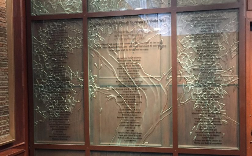
The Schara Tzedeck Shoah Survivors Tribute Wall was created for the congregation by John Nutter. The sculpture, which includes the names of 230 survivors, was dedicated May 3. (photo from John Nutter)
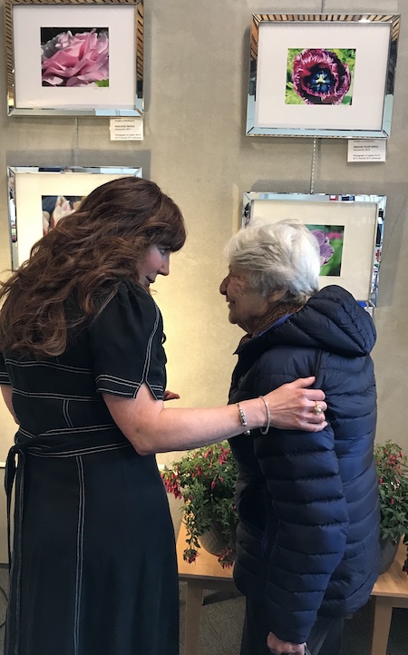
Congregation Schara Tzedeck has a new art installation in its main sanctuary. The Schara Tzedeck Shoah Survivors Tribute Wall – a Tree of Life rendered in sandblasted glass – includes the names of 230 survivors. It was dedicated May 3.
Full of shared memories and friendship, the pre-Shabbat dedication ceremony featured several speakers: the synagogue’s spiritual leader, Rabbi Andrew Rosenblatt; its executive president, Howard Kallner; younger family members of the survivors; Ed Lewin, co-chair of the project with Hodie Kahn; and the man who started the entire project, Dr. Robert Krell, a child survivor.
“We wanted to honour the Holocaust survivors who found their way to Canada, before and after the war, and wound up as members of this shul,” Lewin told the Independent. “Most of them came here in 1948. Their names are all there, on the wall. My parents’ and grandparents’ names are among them.”
Explaining how the project started, Lewin said, “We had this empty space, and Krell suggested a tribute to Holocaust survivors. It was several years ago. It took us awhile to find the talented glass artist, John Nutter, who transformed our ideas into a sculpture.”
The synagogue is publishing a commemorative book about the installation, as well. While the Tribute Wall features survivors’ names only, the book also contains photographs of the survivors; there are family and group photo pages. Together, the book and the wall serve as a memorial to those who not only survived the Shoah but contributed greatly to Schara Tzedeck and to the development of Greater Vancouver and the province over the past seven decades.
One page of the book is dedicated to Nutter, who has created numerous art installations for churches and synagogues, mostly in New York. His works decorate many institutions in the United States and Canada: hotels, museums, hospitals. He collaborated with local artist Bill Reid on a glass sculpture at the Vancouver International Airport. A few years ago, Glass Magazine named Nutter one of the top three architectural glass artists in the country.
About how he came to design the Tribute Wall, Nutter said, “A few years ago, I did a small glass sculpture for the Louis Brier Home, a collaboration with a wonderful artist and friend, Diana Zoe Coop. Camille Wenner, Diana’s daughter, works for Schara Tzedeck. I’ve known Camille since she was a young child. She contacted me about this project and, of course, I said, yes.”
He explained his work process. “They knew exactly what they wanted – a Tree of Life, made like a Vancouver cherry tree in bloom. Usually, I start with a small draft, show it to my clients, make changes until they’re satisfied, before I transfer the design to glass. But the people from Schara Tzedeck were very nice. They approved my first draft of the design.”
The first step in making the sculpture was creating a life-size drawing out of the small-scale draft. “I hire a company for that,” said Nutter, “give them my small drawing, and they blow it up to the size I want.”
Once he has the full-size paper draft, he starts working on the glass. For this sculpture, he used nine separate glass panels. The three bottom panels are roots. “The words ‘Schara Tzedeck’ are carved among the roots, to symbolize the Jews who had set their roots with the congregation,” Nutter explained.
The middle panel is the trunk, and the five panels around it are carved with leaves and flowers. “I sandblasted each petal of each flower individually,” Nutter said. “It gives more depth to the sculpture.”
The work is made of 15-millimetre laminated glass; two layers joined together. The carving is on the back, and the names of the survivors are written on the front, in black, which adds to the visual depth.
Nutter has been working with architectural glass for decades. “I started as an architecture student at the University of Manitoba,” he recalled. “A couple years into my studies, I took a summer job with a stained glass company. I loved it so much, I left my schooling and stayed with the company for several years, before I founded my own company. I never finished my architectural degree, but I taught stained glass making at the same faculty years later.”
He loves architecture, and most of his works are large-scale glass. “Sometimes,” he said, “my background in architecture helps me to win the contracts. I often build small-scale models of my proposed installations when I bid for a job. I like the details and hardware used in the models. I learned that during my years of architectural studies.”
Frequently, Nutter’s sculptures and windows tell a story, like the one he created for Schara Tzedeck. “In the past, when artists made glass installations in churches and other religious institutions, it was always to tell a story, as most of the population were illiterate,” he said. “Now, people can read, so the art became more decorative, but it still tells a story.”
To learn more about the artist, visit johnnutterglassstudio.com or visit his studio on Granville Island. For those interested in purchasing the hardcover, full-colour commemorative book ($54), visit scharatzedeck.com/event/-shoah-survivors-tribute-book-order.html; the order deadline is June 30.
Olga Livshinis a Vancouver freelance writer. She can be reached at [email protected].
The new show at Zack Gallery, #SeasonsAtZack features Instagram artists. A fundraiser for the gallery, the exhibit is extremely eclectic.
“The theme of the show is based on the theme of Festival Ha’Rikud, ‘Seasons of Israel,’” said Daniel Wajsman, marketing coordinator at the Jewish Community Centre of Greater Vancouver. “Every year, the gallery has a group show to coincide with the festival and the artists submit their paintings to the gallery. This year, we thought: why don’t we do social media instead? These days, everyone has a camera…. We all take pictures with our phones and share them with friends and family. This is one step further. Why can’t we share our photos with everyone? That’s what Instagram does – it is a site where we share our images with the world. That’s what we aimed for in this show at the Zack. We wanted to change the concept of what art is.”
The gallery started with the idea that only artists who have an Instagram account would be featured in the exhibit, but later opened the submission process to everyone, said Wajsman. All of the images from the show will be on the JCC’s Instagram page and prints will be available for purchase in different sizes and formats.
About a third of the photos in the exhibit come from a select group of people: staff members of several Jewish organizations, who went to Israel in April for a professional seminar. The organizations participating in the seminar were the JCC, Jewish Federation of Greater Vancouver, Jewish Family Services, Louis Brier Home and Hospital, Vancouver Holocaust Education Centre and Nava Creative Kosher Cuisine.
“We work closely together, but we don’t all know each other,” said Wajsman. “Some of us are Jewish, and some are not. The seminar had a double goal: to teach us about Israel and Jewish history and to connect us with each other.”
Regular visitors to the Zack Gallery will be familiar with many of the photographers in the exhibit. Some of the photos are by artists who have exhibited previously at the gallery – like Lauren Morris, Michael Abelman and others – and submitted photographs of their paintings for the show.
Another set of participants includes local masters of photography, such as Jocelyne Hallé, Judy Angel and Ivor Levin. Each one has more than one of their images on display.
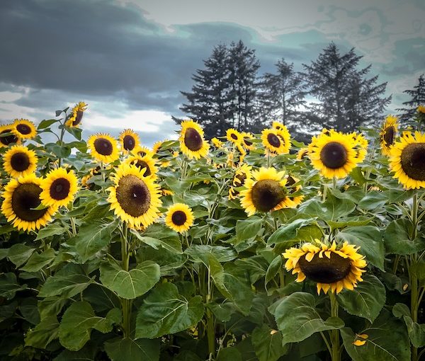
Halle’s “Sunflowers” photo was taken recently. The bright sunny heads of the large flowers contrast sharply with the heavy stormy clouds overhead, and the juxtaposition evokes strong emotions. “It wasn’t Photoshopped at all,” said Hallé. “It’s just the way I took it.”
In contrast, Angel’s airy images glow and shimmer with transparent sunlight. They are so light, they seem translucent, able to fly off the wall like magical butterflies.
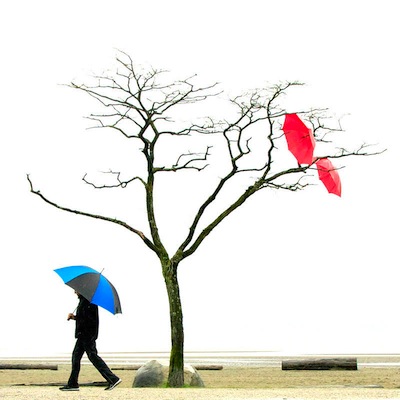
“Umbrellas” by Ivor Levin.
Beside them, Levin’s photos look like drawings, their colour schemes and compositions inspired by the rains and umbrellas of the autumn season in Vancouver.
New artists also have a strong presence in this show. For them, having their names under their art on the gallery walls is a fascinating experience. One of this crowd is Linda Lando, the Zack Gallery director. “I’m not an artist,” she said. “I’ve never displayed anything before.”
One of her photos, the colourful “Ein Gedi Night,” was taken on her trip to Israel, as a member of the seminar. “We visited Kibbutz Ein Gedi late at night,” she said. “It is a beautiful floral oasis in the desert. They have amazing flowers, and this blooming tree was near the entrance.”
Robert Johnson, also part of the seminar and a longtime JCC employee, has a couple of his photos in the show. One of them is particularly memorable: a photo of a camel with a sad expression, lying under a tree. The title of the photograph is “This is Not a Camel.”
“He talked to me,” Johnson said with a smile. “People were riding him all day, and he didn’t want to be a riding camel anymore.”
The variety of the images in the show is mind-blowing: from Israeli landscapes to mud bathers on the shore of the Dead Sea to abstract composition. #SeasonsAtZack continues until June 9.
Olga Livshin is a Vancouver freelance writer. She can be reached at [email protected].