Skip to content
  • Home
  • Subscribe / donate
  • Events calendar
  • News
    • Local
    • National
    • Israel
    • World
    • עניין בחדשות
      A roundup of news in Canada and further afield, in Hebrew.
  • Opinion
    • From the JI
    • Op-Ed
  • Arts & Culture
    • Performing Arts
    • Music
    • Books
    • Visual Arts
    • TV & Film
  • Life
    • Celebrating the Holidays
    • Travel
    • The Daily Snooze
      Cartoons by Jacob Samuel
    • Mystery Photo
      Help the JI and JMABC fill in the gaps in our archives.
  • Community Links
    • Organizations, Etc.
    • Other News Sources & Blogs
    • Business Directory
  • FAQ
  • JI Chai Celebration
  • JI@88! video

Recent Posts

  • Story of Israel’s north
  • Sheltering in train stations
  • Teach critical thinking
  • Learning to bridge divides
  • Supporting Iranian community
  • Art dismantles systems
  • Beth Tikvah celebrates 50th
  • What is Jewish music?
  • Celebrate joy of music
  • Women share experiences 
  • Raising funds for Survivors
  • Call for digital literacy
  • The hidden hand of hate
  • Tarot as spiritual ritual
  • Students create fancy meal
  • Encouraging young voices
  • Rose’s Angels delivers
  • Living life to its fullest
  • Drawing on his roots
  • Panama City welcoming
  • Pesach cleaning
  • On the wings of griffon vultures
  • Vast recipe & story collection
  • A word, please …
  • מארק קרני לא ממתין לטראמפ
  • On war and antisemitism
  • Jews shine in Canucks colours
  • Moment of opportunity
  • Shooting response
  • BC budget fails seniors
  • Ritual is what makes life holy
  • Dogs help war veterans live again
  • Remain vital and outspoken
  • An urgent play to see
  • Pop-up exhibit popular
  • An invite to join JWest

Archives

Follow @JewishIndie
image - The CJN - Visit Us Banner - 300x600 - 101625

Byline: Olga Livshin

Art helps bring us together

Art helps bring us together

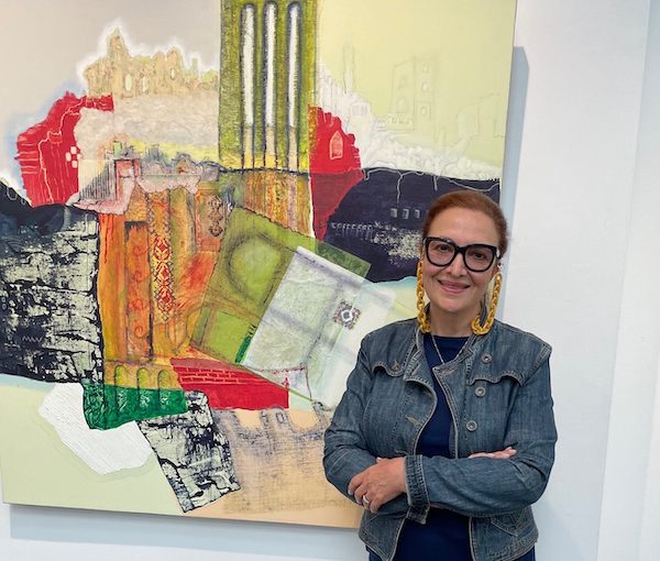
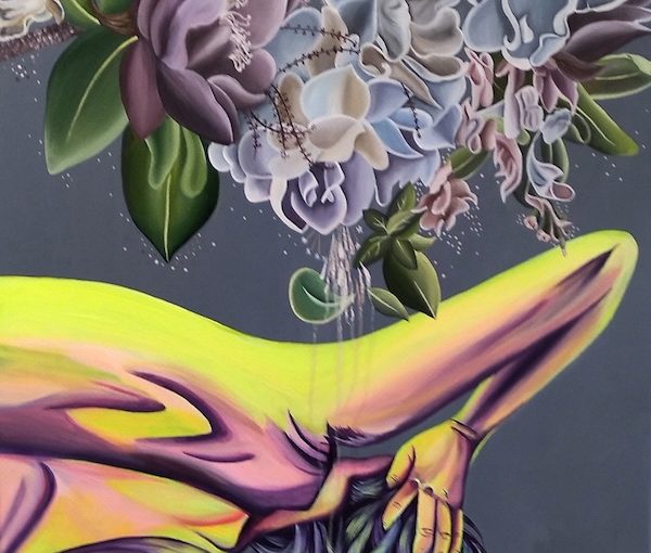
The current show at the Zack Gallery, Community Longing and Belonging, brings together a range of artists and styles. Pictured here is Alejandra Morales’s “A Landscape of Consumable Dreams.” (photo by Olga Livshin)

The current show at the Zack Gallery, Community Longing and Belonging, which opened Feb. 21, is the sixth annual exhibition in celebration of Jewish Disability Awareness and Inclusion Month. 

The exhibit was organized by the Jewish Community Centre of Greater Vancouver’s Inclusion Services and curated by Shelly Bordensky, the program’s coordinator. Most participating artists are either members of the JCC program or similar ones in other localities, like Aspire Richmond. These initiatives support people with developmental disabilities through various creative endeavours. 

The Zack show’s creative displays consist of paintings and pottery. While the size, media, colour palettes and framing of the works are all different, the underlying theme is the same: we all want to belong, we are all together on this planet.

Two paintings reflect that theme not only in their content and method of execution, but in their titles as well: “All Together 1” and “All Together 2.” Both works are cheerful and colourful, rendered with the abandon of the primitivism style. Cats and birds frolic on the canvas without regard for one another or for rules of perspective. Both list the artist as Art Hive, the visual art division of JCC Inclusion Services.

Bordensky told the Independent that both paintings were group pieces, created by several people. “Each artist added an element – a cat or a bird – and our wonderful art instructor, Kim Almond, made sure they all matched in style and colours.”  

According to Almond, 13 artists, all members of Art Hive, participated in each painting.

“Mark Li and Andrew Jackson started off the two collaborative paintings for the group, and it was a great project to work on as a class,” she said. “Colours were a huge part of the process, as the artists were always striving to create that special pop of colour.”

Another example of group art is the pottery creations – playful little animals, solemn hamsas (hands) and juicy pomegranates – crowding several stands around the gallery. 

“These ceramic pieces are all Raku ceramics by the pottery artists who are members of our Art Hive,” said Bordensky. “Together, we can create so much.”

Individual artists’ paintings are also on the theme of community.

Alex Lecce’s untitled piece is a slice of a neighbourhood street with a pie shop. The colours are realistic, and the image captures a quiet, everyday moment. We all go there, the artist seems to say. Those pies make our lives happier and more flavourful. They unite us in our humanity. 

On the other hand, Alejandra Morales’s painting, “A Landscape of Consumable Dreams,” is jarring in both the colour palette and the structure. This painting screams of discord. There are two disparate parts in the image. The top part is a tangled bunch of flowers, all in beautiful, greyish lilac hues, intertwined and elaborate. The bottom part is a vague human figure bowing to the pretty flowers. The colours of the figure are harsh, grating; they don’t fit with the flowers. But the figure obviously wants to fit, just as we all want to fit in with our surroundings. The complexity of the juxtaposition of humans versus nature is unmistakable.

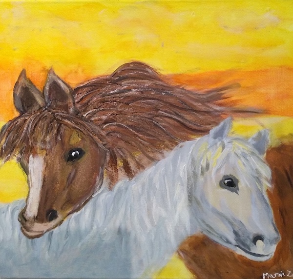
Other paintings are not as complicated. Mami Zimmerman’s “Best Friends” features two ponies. Its simplicity is charming and lovely. We all want such friends. 

image - Mami Zimmerman’s “Best Friends”
Mami Zimmerman’s “Best Friends” (photo by Olga Livshin)

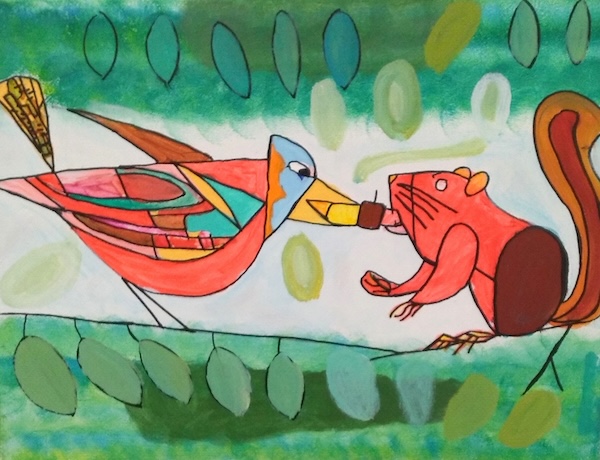
Calvin Ho’s painting “Nuts” is another example of primitivism in the show. The bright depiction of a squirrel and a woodpecker is reminiscent of picture books from our childhood. Bold lines and primary colours underscore that feeling. The two creatures are playing tug with a nut. Or maybe they are sharing it. Or fighting over it. The innocence of the picture invariably induces a smile.

image - Calvin Ho’s “Nuts”
Calvin Ho’s “Nuts” (photo by Olga Livshin)

In contrast, Merle Linde’s powerful landscape – “BC Wildfire 2023” – doesn’t invite smiles. The painting, its red and black scheme grim and scary, reminds us of the horror of the wildfires that affect our forests every year. The tragedy implied in the painting unites us, just as the sweeter emotions in other images do. 

In a telephone interview with the Independent, Linde said: “I’ve always enjoyed art, from the day I could hold a pencil. I liked going to art shows, too.” Mostly self-taught as an artist, she said she only started painting seriously after she retired. 

Judaica is one of the directions she explores in her art. To date, the Independent has used two of her paintings for its cover: for the 2023 Passover issue and for the 2022 Rosh Hashanah issue. Occasionally, she teaches classes for seniors in various artistic techniques.

Merle Linde’s “BC Wildfire 2023” (photo by Olga Livshin)

“Acrylic pour is a fascinating technique,” she said. “You pour the paint and let it spread as it will without a brush, and then wait till it dries. That was what I did for the background of the ‘Wildfire’ painting. I made it a few years ago. When I saw the news about the wildfires last summer, I picked up a brush and painted the black burned-out tree skeletons on top. I have two such paintings, but there was only space for one in the Zack show.”  

Most of the paintings in the show express themselves at first view. However, Gail Rudin’s “Out for the Hunt” raises questions. It portrays four seemingly perky owls on a merry, greenish background. One could assume a light-hearted company of friends on an outing, until one notices a line of tiny mice scurrying away in terror in the very bottom of the picture. Suddenly, the entire image changes its meaning, illustrating the unavoidable conflicts within nature, where the hunters and the hunted coexist. Despite the constant danger of the wild, nature somehow always finds its balance. Maybe, as humans, we could take lessons from that.     

Community Longing and Belonging is on display at the Zack Gallery until April 2. 

Olga Livshin is a Vancouver freelance writer. She can be reached at [email protected].

Format ImagePosted on March 8, 2024March 7, 2024Author Olga LivshinCategories Visual ArtsTags Community Longing and Belonging, inclusion services, JCC, Jewish Community Centre of Greater Vancouver, Merle Linde, painting, sculpture, Shelly Bordensky, Zack Gallery
Sculpturing with wood

Sculpturing with wood

“Constellation” by Rosamunde Bordo. (photo by Sol Hashemi)

Every true artist at the start of their career undergoes a period of intense search: for their voices, for their themes, for their artistic expressions. Rosamunde Bordo is at that exciting stage now. She is searching. Her show at the Zack Gallery, Morning Star, reflects her creative explorations. 

A professional artist today, Bordo has always loved art.

“As a child, I went to a school with a strong art program. I painted. I played saxophone. My parents always encouraged my interest in art,” she said in an interview with the Independent. 

photo - Rosamunde Bordo’s solo exhibit, Morning Star, is at the Zack Gallery until Feb. 7
Rosamunde Bordo’s solo exhibit, Morning Star, is at the Zack Gallery until Feb. 7. (photo from Rosamunde Bordo)

After a bachelor’s in liberal arts and print media at Concordia University in Montreal (2014) and master of fine arts degree in visual art at the University of British Columbia (2020), Bordo teaches printmaking at UBC. But her artistic interests range much wider than printmaking. Her newly emerging passions include the creation of installations and woodworking. 

“I started woodworking last spring,” she said. “In this show, I use different woods: maple, cherry, walnut. I’m fascinated by the process of turning wood into sculptures. In a way, woodworking is similar to printmaking. Both use technology but, unlike two-dimensional printmaking, woodworking offers three dimensions. In woodworking, I try to find the story of the material, try to immerse in material-based research to investigate the self as a created subject.”

Bordo began woodworking when she started her ongoing installation project, The Denise File.

“It is almost a work of detective fiction, written through physical space,” she explained. Using found postcards written to someone named Denise, Bordo “wanted to reconstruct who the elusive Denise is, to figure out what the letters meant, to show her essence through objects, sculptures and drawings.”

She built some wooden furniture for The Denise File – a screen and a chair – and wanted to do more, to explore all she could do with wood. Her current show, comprised mostly of several sculptures, has its roots in a Jewish magic class she took at her synagogue in 2021.

“I wanted to understand Jewish history, its mysticism and its superstitions,” she said.

Each figure on the gallery wall could have originated from the ancient writings of many nations.

“It could be ancient Hebrew or Aramaic or even Greek,” Bordo mused. “All the cultures in that region were interconnected. I see the entire show as a healing amulet, but I didn’t want to assign my own meanings to the individual figures. I wanted them to be mysteries for my viewers to investigate. I wanted the viewers to be detectives and I didn’t want to influence them with my personal vision, didn’t want to limit their imagination.”

That’s why she titled every “Constellation” figure with a number. “They could be stick figures – they are very simple – but I see them as constellations, stars connected to each other,” she said. “That’s why the show is called Morning Star. The world is a difficult place right now, and the morning star is a symbol of renewal.”

Bordo’s constellations are deceptive, looking a bit like wooden hieroglyphs, or perhaps molecular structures, each with its own character.

“The one with a leg sticking out of the wall – it wanted to be playful, maybe escape from the wall,” she said. “I was looking for harmony when I worked on them, but I didn’t want to force them into locked shapes. I wanted to give them their own personalities. Besides, I try to respect the wood I work with. It is alive. There are many ways one could interpret a wooden sculpture.”  

In addition to the constellations on the gallery walls, there is also a video called Potion, which comprises four minutes of rotating green abstract patterns. Postcards with a single image from the video form another part of the installation. The text on the back of the postcards reveals the artist’s motto for this show: “Ideas are to objects as constellations are to stars.”  

There is also a small table with a slab of pink salt on it.

“Placing salt in your pockets and in the corners of rooms was a well-known Jewish superstition to ward off malevolent spirits,” Bordo said. The table with the salt stands in the corner of the gallery, hopefully repulsing malice. We all need that in our troubled times, she explained.

The show opened Jan. 5 and will be on display until Feb. 7. To learn more, go to the artist’s website, withoutimages.com. 

Olga Livshin is a Vancouver freelance writer. She can be reached at [email protected].

Format ImagePosted on January 12, 2024January 10, 2024Author Olga LivshinCategories Visual ArtsTags Rosamunde Bordo, sculpture, The Denise File, woodworking, Zack Gallery
A land of contradictions

A land of contradictions

Sorour Abdollahi’s solo exhibit Intersecting Landscapes is now at Zack Gallery. (photo by Olga Livshin)

Over the years, Iranian-Canadian artist Sorour Abdollahi has participated in several group shows at Zack Gallery, but the current exhibition, Intersecting Landscapes, which opened on Sept. 7, is her first solo show here.

“Sorour is definitely not the first non-Jewish artist with a solo show at the Zack,” said gallery director Hope Forstenzer. For years, the mission of the Zack Gallery, which is in the Jewish Community Centre of Greater Vancouver, has been to showcase Jewish artists and art dedicated to Jewish themes, she said. Non-Jewish artists were not excluded, but they usually appeared in group shows.

“The big difference in the past few years,” said Forstenzer, “has been an expansion of the definition of a Jewish theme to include a wider variety of human universal experiences that reflect on Jewish cultural history and traditions.… Sorour’s work, while not as overtly Jewish as some, addresses the concept of diaspora and its impact on culture and memory. When we made the decision to show her work, it was based on the concept of a cultural nostalgia for home as an inherently Jewish theme. And the response to it, so far, has borne that out – it has had a very strong emotional impact on the community here at the JCC and has already engendered discussion of the Jewish diaspora.”

Abdollahi has been a professional artist all her life. “I’ve always painted, since I was a child,” she told the Independent.

She received her art education in Iran, and her first solo art show happened there in 1987. A successful artist, working in mixed media and acrylics, she regularly exhibited in Iran, participating in multiple group and solo shows in various cities, including Tehran and Isfahan. The only big gap in her exhibiting schedule occurred when she immigrated to Canada. “We came here in 2000,” she said. “We did it for the children.”

Like all immigrants, she struggled with the new language and new culture. “It was several years later, when my children grew older, that I enrolled in Emily Carr [University of Art + Design] part time,” she recalled. “I wanted to become familiar with the local art scene, with the educators and the artists. I wanted to become a part of the local artistic community. And it worked beautifully. My friendships with wonderful Vancouver artists Devora and Sidi Schaffer stem from those days.”

Five years after her immigration, Abdollahi felt immersed enough in the British Columbia art vista to open her own studio and gallery in Yaletown.

“People would pass my gallery on the street, and some would come in,” she said. “They asked questions. I felt that my art connected.”

That connection gave her the courage to join the Eastside Culture Crawl – the biggest visual art festival in Vancouver – 10 years ago.

Abdollahi’s current show at the Zack represents the scope of her art perfectly. It consists of old and new paintings from several different series. A blend of abstract and figurative art, her paintings are airy and bright. Most of them have vague architectural connotations and employ a predominantly blue and green palette reminiscent of spring and rebirth. The abstract forms, sometimes utterly modern, often reveal faint outlines of ruins, shimmering in the mist, in the background.

“I grew up in the land of contradictions, where a traditional way of living juxtaposed a modern, Western lifestyle,” she said. “Those contradictions manifested in the landscape surrounding me, the historical against the contemporary, with layers of change and transformation.”

Immigration to a new country profoundly impacts her imagery.

“In my paintings, I examine the relationship between memories and the external landscape,” she said. “My Iranian background and my Canadian experience have had an enormous influence on my works. They inspired a negotiation between the modern and the ancient, the old and the new, the West and the East. Ancient ruins and Persian architecture play a pivotal role, too. They have enabled me to express the conflict and the negotiation process that often exists between two different cultures or societies. While the ruins speak of a mysterious, pure and mystical past, they also illustrate the corrosive effect of time and modernity, the constant reconfiguration of a country’s landscape, architecture and culture. The dripping paint in many of my pictures also illuminates the process of renewal. The old slides down, while the new grows over it. My paintings attempt to form a bridge between the past and the present.”

Two of the paintings particularly stand out. “The Magical Carpet” is a collage, full of the whimsical patterns, warm hues and bright shapes of a traditional eastern bazaar, with the artist’s customary ruins in the background.

Another painting, “Letters from Beyond”, with its strong punch of red paint, uses fragments of writing that are wholly imaginary. “The language and the letters in that writing don’t belong to any nation,” Abdollahi said. “I created it because I believe that we are all the same people. We should have no borders and no different languages separating us. That’s why I wanted to have a show here, at the Jewish Community Centre. I feel like my art is a link that connects us all.”

Abdollahi’s works can be found in private collections in Canada, the United States, the United Kingdom, France, Australia, Saudi Arabia and Iran.

Intersecting Landscapes runs until Oct. 12. For more information, visit sorourart.wordpress.com.

Olga Livshin is a Vancouver freelance writer. She can be reached at [email protected].

Format ImagePosted on September 22, 2023September 21, 2023Author Olga LivshinCategories Visual ArtsTags exhibits, Hope Forstenzer, landscapes, painting, Sorour Abdollahi, Zak Gallery
Zack exhibit celebrates nature

Zack exhibit celebrates nature

Enda Bardell (photo from Enda Bardell)

Creativity manifests itself in people’s lives in different ways and at different times. For Enda Bardell, various forms of art occupied her for decades, while Mike Cohene discovered woodcarving only a few years ago, on his way to retirement. Their double show, Artistry in Wood and Water, opened at the Zack Gallery on July 26.

Bardell told the Independent that she was born in Estonia. In 1944, when she was a young child, her family fled from Estonia, then occupied by the Nazis, to Sweden. Her mother worked at a paper factory there, and Bardell played with paper dolls she made herself. She also drew all the dolls’ colourful outfits. “I gave the dolls away to other girls, to make friends,” she recalled. “My first attempts at fashion design.”

A few years later, the family was forced to move again. The Russian communist government wanted the return of all the Estonians who had escaped the Nazis during the war, and Sweden was going to comply with that demand. But Bardell’s father didn’t want to live in communist Russia, so they became refugees again, this time ending up in Canada.

“In 1951, we came to Winnipeg,” said Bardell. “I went to school there and I desperately wanted to fit in. To belong. To be Canadian. I participated in many school clubs and activities. Entered an art class, too. My teacher praised me and recommended that I send one of my drawings to an interschool art competition. I did. And I won. I knew then that I was an artist.”

Interested in landscapes and abstracts, Bardell painted a lot as a teenager, but, after her high school graduation, she became deeply involved in fabric art. “I sold my batiks at craft fairs and house parties. People liked them, and someone suggested I should open my own store,” she said. “I did. I designed lots of different textile objects: skirts, pillowcases, aprons, etc. I felt that I needed a business course, in addition to my art education, so I took it. My store was very successful.”

But, as soon as the store achieved that success, running it lost its challenges. “I became bored,” said Bardell. “It was time for a change.”

She sold the store and did many other things in her professional life. “I always want to try something new, something I’ve never tried before. At one time or another, I was a lamp designer. I worked in banking. I was a realtor. I designed costumes for the Vancouver movie industry,” she said.

She also traveled a lot. “I have visited 38 countries. I like adventures, like it when I can’t speak the tongue. Then I have to express myself through body language. I have to be creative,” she said.

Art always shimmered on the periphery of her life, a constant creative supplement to her various commercial careers. First, abstract oils and acrylics, and, later, watercolours. Painting eventually metamorphosed into the focus of her existence. In the past two decades, she has participated in multiple solo and group exhibitions in Canada and abroad. In 2008, she even participated in an art show in her native Estonia, the Estonian Art in Exile exhibition at KUMU, the National Museum of Art in Tallinn. KUMU acquired one of her acrylic abstracts for their permanent collection; another of her paintings is in the Tartu Art Museum in Estonia. Her paintings are represented by many local galleries.

The current exhibition at the Zack is the result of a trip Bardell took to Yukon shortly before the COVID pandemic temporarily closed all travel. “My son lives in Yukon,” she said. At his prompting, she applied and was granted residency for one month at Ted Harrison Cabin in 2018. “We hired an RV and traveled there for two weeks,” she said. “Yukon was amazing: mountains, rivers, lakes. The place resonated with me. I took 1,400 photos during our travels. Based on the selection from those photos, I painted 40 watercolour pieces during my stay at the cabin. It was a privilege to stay in that wonderful place, especially because I had met Ted previously.”

Many of Bardell’s paintings in this series involve rivers and lakes. “I like water,” she said. “I have always lived on the water, except for one year in Winnipeg. I swim year-round here, summer and winter. Sometimes, I have seals swimming with me. It feels magical.”

When she submitted her Yukon series to the Zack Gallery, it was accepted, on the condition that it would be a double show, as gallery exhibitions must have a Jewish connection. Bardell’s Jewish connection became Mike Cohene, a local woodcarver. His colourful carved fish complement perfectly Bardell’s watercolours of Yukon’s rivers and lakes.

Unlike Bardell, Cohene didn’t do anything artistic until 2009. “I had a solid clothing business,” he said. “Awhile back, I started thinking about retiring and selling the business.”

photo - Mike Cohene
Mike Cohene (photo by Linda Babins)

In the summer of 2009, Cohene visited Steveston Farmers Market. “They had a booth of the Richmond Carvers Society – I thought their works were outstanding,” he said. “I always whittled but I never considered myself artistic. I started talking to the man in the booth, expressing my admiration. He said anyone could learn to do it. He invited me to come to the club meeting in September. I went.”

Since that day, he has learned a lot about the artistry and the technique of woodcarving. His journey began with woodcarving classes at the society. Later, he took a course at Emily Carr University of Art + Design and enrolled in carving workshops.

“My first carving was a bear cub,” he said. “Then I made a dolphin. Then I started carving fish and birds…. I’ve always been a fisherman, but I never studied fish anatomy before. I caught a fish and tossed it into a bucket. Now, I catch a fish and study it: the fins, the tail, the scales, how the colours change. I look at fish from a new perspective.”

In 2017, Cohene participated in his first two-artist exhibition at the Zack Gallery, with photographer Joanne Emerman. Since then, his art has become even more refined. “I learned more sophisticated techniques and tools,” he said. “I got several residencies in B.C. and Oregon.” Three years ago, he began teaching woodcarving to other Richmond Carvers Society members.

To create his wooden creatures as life-like as possible, Cohene uses various reference materials. “Mostly I use my own photographs,” he said. “When other people photograph wildlife, they give it their own interpretation, but I want to follow my own vision.”

His statues of fish include rocks and corals, all carefully carved and painted in bright, realistic colours. “Sometimes, one statue takes up to 20 coats of paint – different wood parts absorb paint with different intensity,” he explained.

He also uses tree branches as mounting blocks – they are not carved, just sawed off, polished and lacquered. “I only use dead wood for my statues. I often walk along the beach and pick up interesting pieces of driftwood. I’ve never harmed even one living tree,” he said.

Recently, Cohene has started exploring First Nation carving. The motifs attract him, and he has several pieces on display at the gallery, including two decorative oars.

He also creates Judaica – mezuzot, chanukiyot and dreidels – some of which can be seen at the gallery. Cohene has been to Israel 34 times. “Once, I brought 12 kilograms of olive wood with me from Israel, and I make many of my Judaica pieces from the reclaimed Israeli wood,” he said. “Olive wood has such a beautiful texture. And dreidels are fun to make.”

Whatever he works on, Cohene always gives it his all. “For me,” he said, “woodcarving is a form of self-fulfillment.”

Artistry in Wood and Water runs until Sept. 5. To learn more, visit the artists’ websites: endabardell.com and mikecohene.com.

Olga Livshin is a Vancouver freelance writer. She can be reached at [email protected].

Format ImagePosted on August 18, 2023August 17, 2023Author Olga LivshinCategories Visual ArtsTags carving, Enda Bardell, environment, Judaica, Mike Cohene, painting, watercolour, Yukon, Zack Gallery
Parker Art Salon on display

Parker Art Salon on display

“Aqua,” by Violette Zohar Fiszbaum, who is one of the more than 50 artists participating in the Parker Art Salon exhibit at Pendulum Gallery. (photo from Violette Zohar Fiszbaum)

Pendulum Gallery in downtown Vancouver opened a new show on May 15 – What Moves You – by the Parker Art Salon. More than 50 artists, all having their studios at 1000 Parker St., presented one piece each for their annual exhibition. The art, including paintings, sculpture and photomontage, is inspiring and uplifting, brightening up the space around it.

While the exhibit is already open to visitors, the opening reception, and the launch of an online auction hosted by Waddington’s Auctions, will be held at the gallery on June 8, 6-8 p.m. Fifty percent of the auction proceeds will go to Beedie Luminaries, a scholarship program for students with potential who are facing financial adversity. To further promote the artists, there will be a Parker studios tour on June 10.

The Independent spoke with one of the Jewish artists participating in the show, Violette Zohar Fiszbaum, at Niche Art Gallery on Granville Island. She is one of Niche’s co-founders.

Fiszbaum grew up in Sao Paulo, Brazil. “I studied art as a teenager, but my parents thought you couldn’t make a living at art – they were right, it is tough. They wanted me to be a doctor or a lawyer or an engineer. After I graduated from high school, I studied chemical engineering. I also wanted to study astronomy and quantum physics, but, again, it is not easy to make a living. But it never stopped me. I always did some art and I keep up my interest in quantum physics, too. I read on it even now, when I can’t sleep.”

After she finished university, she went traveling: Europe, Asia, North America. “I studied Tibetan art restoration in Paris and I visited Tibet in the 1990s. Tibetan culture is exotic, yes, but very spiritual. It brought me closer to my Judaism, my spiritual roots. I think all spiritual cultures are connected,” she said.

Fiszbaum studied kabbalah. “I grew up secular,” she said. “My parents survived the Holocaust as children, got married in Israel, and then moved to Brazil. But Judaism came from the inside of me, from my studies and my travels. Zohar is my Hebrew name, and that’s how I sign my paintings.”

She visited Israel many times during her wandering days. One of her travels brought her to Vancouver, and she liked it here so much she decided to stay. “I worked in the movie industry for a time,” she said. “I wanted to act in movies, and I did.”

photo - Violette Zohar Fiszbaum
Violette Zohar Fiszbaum (photo from Violette Zohar Fiszbaum)

She also worked a lot at her art, and she continued studying art, as well. “In the last 10 years, I have been teaching art,” she said. “I teach mixed media. In the beginning, I was an assistant at Emily Carr [University of Art + Design]. Lately, I have had my own class at Olympic Village. It is a beautiful room. It faces the water. My students are all adults, and we are having fun together.”

Fiszbaum’s artistic interests are diverse. She plays piano. She dances. She enjoys photography. But, mostly, she paints. “I often paint with some music on. I turn on the music, dance and paint,” she said.

One of her preferred techniques is mixed media. “I like my paintings to have layers, to have a mystery, an intrigue. Using mixed media is like adding an archeological layer to the image, a depth,” she explained. “For example, I saw this old poster in Israel and I incorporated parts of it in one of my abstract paintings.”

Mixed media is also the technique that allows her to be successful at Niche, although commercial art has never been her focus. “I don’t paint just to sell,” she said. “I want to leave something beautiful behind. In the last two years, I sold and donated 100 pieces.”

She sells and markets herself through several venues. “My website, of course, Parker Art Salon, the East Side Culture Crawl – that is huge in Vancouver, the biggest annual art show in town. I use Instagram. Anywhere I go, really. I play tennis and I belong to a tennis club – I sold some of my paintings there. I like swimming, and I sold many of my Swimmers series paintings through my connections with other swimmers. My painting in the Parker Art Salon exhibition is one of my swimmers. I used to be a dancer, and the human body, its movements, always have fascinated me, both in the water and on land.”

But Niche Art Gallery is one of her favourite places. “It started as a pop-up store just before the COVID pandemic,” she explained. “Pop-up is a short-term lease, and it has been popular lately.”

After her pop-up term had expired, she teamed up with a few other artists and opened the gallery. “Many galleries on Granville Island closed during the pandemic, but Niche flourished,” she said.

Besides her paintings, Fiszbaum sells some unusual pieces at Niche, including funky denim caps. Each one is decorated with an assortment of mixed media: snatches of lace, old buttons and zippers, feathers, disassembled toy fragments, even an old phone keyboard. “It is fun to work on them,” she said. “I use only salvaged materials there. Now I want to make denim jackets.”

Fiszbaum likes working on commissions. “I enjoy the challenge,” she said. “I have created paintings to customers’ demands, both in size and in the colour palette. Sometimes, they wanted my paintings to match their couches and curtains; other times, their carpets and pillows; even a vase once. And I did it.”

Among the work for sale at Niche Art Gallery are Fiszbaum’s portraits. She returns to female portraits again and again. “My mother was beautiful, like Cleopatra,” she said. “I keep painting women’s portraits in order to capture her beauty, to share it with everyone.”

The show at Pendulum Gallery runs until June 16. For more information on the artists (who include many Jewish community members) and the auction, and to book your Parker studios tour, visit parkerartsalon.com.

Olga Livshin is a Vancouver freelance writer. She can be reached at [email protected].

Format ImagePosted on May 26, 2023May 25, 2023Author Olga LivshinCategories Visual ArtsTags art, auctions, Niche Art Gallery, Parker Art Salon, Pendulum Gallery, Violette Zohar Fiszbaum
Community artists highlighted

Community artists highlighted

Guest speaker Marsha Lederman addresses the crowd at the launch of the 40th issue of The Scribe on April 19. (photo from JMABC)

Last month, the Jewish Museum and Archives of British Columbia (JMABC) released its 40th issue of The Scribe, the organization’s mostly annual publication that chronicles various aspects of Jewish life in the province. This latest issue features 30 members of the local Jewish visual arts circle: painters, sculptors, mixed media artists, illustrators, textile artists, art educators, art consultants, an art curator and a gallery owner.

The official launch of the publication at VanDusen Botanical Garden’s Floral Hall on April 19 incorporated a silent auction of works donated by many of the artists highlighted in the issue. The items ranged from original paintings and sculptures to art books, sets of cards, and an art consultation.

The festive atmosphere buzzed, as people talked and laughed and greeted their friends. After the mixing and mingling, several speakers addressed the crowd. JMABC past president Carol Herbert acted as emcee, introducing current president Daniella Givon, the issue’s managing editor Carol Crenna and the keynote presenter, Marsha Lederman, who is Western arts correspondent for the Globe and Mail.

Givon gave an overview of the history of the JMABC, calling it the “community storage of history and memory.” She also talked about The Scribe and how it has evolved since its first issue.

Lederman’s address included a video presentation, as she concentrated on the theme of what makes Jewish artists Jewish, how their Jewish identity informs their art. The artists’ Jewishness is much more than the tragedy of the Holocaust, she said. There is a place in Jewish art for humour and family, for traditions and ecology. Lederman didn’t mention every artist featured but she mentioned as many as she could, given the time constraints, and her delivery was laced with admiration for the artists’ love of life, their creativity and their courage.

image - The Scribe 2023 coverCrenna, who was hired specifically to lead this issue of The Scribe, talked about her excitement when she received the offer. “I’m not Jewish,” she said, “but so many Jewish people affected my life. I worked in businesses owned by Jews. I ate at Jewish restaurants. I wore clothing designed by Jewish designers.” She spoke about the stories in the magazine, which inspired her. She also said a few words about the visual aspect – the multiple colourful illustrations that made the publication an artistic creation of its own. And she introduced her graphic designer, Sonia Bishop.

“The Jewish artists in this magazine, and the ones we didn’t include – they are all fearless,” Crenna said. “They reinvent themselves again and again.… Their creativity has no limits.”

The magazine itself is a glossy, large format publication. Each of the 30 features inside is based on an interview with an artist, plus several colour illustrations of that artist’s works.

In her email interview with the Independent, Crenna said, “I was hired to complete this issue last June. Before, [Jewish Independent] publisher Cynthia Ramsay edited a number of previous issues on a volunteer basis, but this was the first time that the JMABC hired an editor to create one of its publications. The job was advertised, and I was hired due to my experience and the vision I had for The Scribe.”

Crenna has been a journalist for 39 years, including nine years as a columnist for the Vancouver Sun. “I have been an editor of nine magazines varying in subject matter. I have been the managing editor of the national visual art magazine Art Avenue for the Federation of Canadian Artists for seven years. I am also an artist. It was my wish to create a visually beautiful, more contemporary and more reader-friendly version of The Scribe…. I was very inspired by the incredible stories I read in the previous issues.”

She also said she wanted to make the magazine more accessible to a wider audience, not just Jews, and ruminated about the selection process – how the editorial team chose 30 artists from the much larger artistic community. Every issue, the team must narrow its subjects down to fit the constraints of a finite publication.

“An artist subcommittee was formed in the year prior to the beginning of work on this issue, before I was hired,” said Crenna. “This committee compiled a list of approximately 70 established B.C. artists or those that are emerging…. All are professionals. All have sold their works and have had exhibitions. To reduce the numbers, since 30 is the average number of individuals featured in every issue of The Scribe, it was decided that photographers would be excluded. They will have their own issue.… Some artists opted out, as well. Also, it was decided that the publication should include others within the artistic community…. Therefore, art consultants, a curator, an art educator and a gallery owner were also included in the visual arts issue. After much consideration, only living artists were included, since there are no archival interviews with those who are deceased.”

Crenna explained how the interview process worked. All of the participants were interviewed for this issue in 2022, she said. “These interviews – either on Zoom or in-person – were conducted by JMABC volunteers within the offices, where recording equipment is of high quality, so the future generations would be able to listen to them. The interviewers included Helen Aqua, Carol Herbert, Brynn Gillies, Perry Seidelman, Daniella Givon, Pam Wolfman and Bill Gruenthal. The 30 interviews lasted from one hour to two-and-a-half hours and were from 6,000 to 19,000 words. Afterwards, JMABC interns transcribed the recordings. Then I edited the information and wrote the features, which were then approved by the interviewees.”

Crenna organized with each artist to send her six high-resolution images of their artwork – in different styles/themes for variety – and headshots of them working on their art.

To purchase an issue of The Scribe or find out more about the JMABC, visit jewishmuseum.ca.

Olga Livshin is a Vancouver freelance writer. She can be reached at [email protected].

Format ImagePosted on May 12, 2023May 11, 2023Author Olga LivshinCategories BooksTags Carol Crenna, Daniella Givon, Jewish museum, Marsha Lederman, The Scribe
Designing the 12 tribes

Designing the 12 tribes

Artist Anna Marszalkowska stands in front of “Levi,” which is part of her Tribes series, which is on exhibit at the Zack Gallery until May 4. (photo from Anna Marszalkowska)

The challenge of visually depicting the tribes of Israel has attracted many famous artists over the centuries. For example, on the 25th anniversary of the state of Israel, Salvador Dali, inspired by descriptions in the Torah, created a series of watercolours, “The Twelve Tribes of Israel.” Before that, in 1962, Marc Chagall made his famous stained-glass windows, “The Twelve Tribes,” for a synagogue in Jerusalem. Anna Marszalkowska, a local Vancouver artist of Polish origins, fits easily into this august company. Her solo show, The Tribes, opened at the Zack Gallery on March 29.

Marszalkowska grew up in Poland, but studied graphic design and worked as a graphic designer in London, England. “Diversity is what made my design path exciting,” she said in an interview with the Independent. “I started my career as a freelance web and graphic designer and then moved to video design and editing, as well as motion graphics and animation.”

Five years ago, she and her husband moved to Canada, but they lived and worked in the eastern part of the country. They relocated to Vancouver two years ago.

“We came here during the pandemic,” she said. “We wanted to try something different. For an outdoor person like myself, this is a great place. The nature is beautiful, and everyone is very friendly.”

She also changed the direction of her professional life. “I work with artists in the movie industry, but not as an artist myself,” she said. “I understand artists because of my past as a graphic designer, but I wanted less time at the computer screen. I wanted to free my creativity for more personal projects, which was hard to do while working as a graphic designer. Then, my creativity was fully engaged in my professional activity, but, on the other hand, I was limited by clients’ requirements. After a full day of work … I was often tired, I wanted to relax. Now, my creativity is freed. I have more time for my artistic experiments. I started abstract painting and I love it. Just me and a painting – it calms me.”

But even while working full time as a graphic designer, she still found energy to search for her individual style and themes. One of them was her Tribes series. “In 2010, I completed a print production course, and this series was the result.”

The series consists of 12 large digital prints, each one corresponding to one of the tribes of Israel. Although Marszalkowska’s version is an entirely modern take, it involves ancient symbolism, which originated in the Hebrew Bible. The artist conducted deep research for this project, and the end results are simultaneously stunningly simple and visually compelling.

“I had a blog before and, when I put the images online, many people expressed their interest. They wanted to buy one or several or all of the images.”

For the artist, this body of work has meaning beyond its commercial success. “It was a personal journey. I was searching for my Jewish ancestry. My grandmother grew up in a town in Poland where most citizens were Jewish before the war. She might have been part Jewish herself, but after the Holocaust, I had no one to ask.”

Instead, she studied the Bible and tried to interpret the narratives within a cultural context. “The symbols of the tribes are by no means fixed,” she explained. “Every artist could have their own interpretation, as the biblical texts describe the sons of Jacob allegorically.”

In her interpretation, the traditional symbols are given a contemporary, stylized appearance. “I explored the relationship between geometric shapes and lines,” she said. “I used repetition and symmetry to keep balance in each individual design and all 12 together.”

She also leaned towards a minimalistic approach, where a symbol of the tribe is centred on a one-colour background, with no other embellishments to attract a viewer’s attention. “In the original design, I had an ornamental frame around each image, but I got rid of them. I think less is more,” she said. “COVID made me realize that my focus should be the meaning, not the decorations.”

“Benjamin” by Anna Marszalkowska.

In most images, the background colour palette reflects that of the tribe, except for Benjamin, the youngest. “His symbol is a wolf,” Marszalkowska said. “He represents all colours of all tribes. To reflect that, I placed a ‘rainbow’ above the wolf. I think it is his spirit or maybe his song, Or his breath. It would depend on your own interpretation.”

In some of the designs, she incorporated photography for texture. “I used Adobe Illustrator to combine my photographs with my digital illustrations,” she said. For Simeon, her symbol is a tower, and she put her photos of bricks to good use in her pictorial tower construction. For Zebulun, whose symbol is a ship, she employed photos of water. “Issachar’s symbol is a donkey with a burden,” she said. “I used my photos of wood for the donkey’s load.”

When different sources offered different visual symbolisms for a tribe, the artist’s scholarly touch led her towards her own esthetic. For example, in the case of Levi, some documents don’t count him as a tribe and don’t offer any symbols for him. Historically, the Tribe of Levi wasn’t given any land, but its men served as religious leaders and teachers. Maszalkowska decided that Levi’s description as God’s Chosen Tribe warranted its own image: a breastplate of a high priest. The breastplate is embedded with 12 gemstones, each inscribed with the name of one of the tribes in Hebrew.

“Overall, the series is an invitation for everyone to embark on their own journey, to reflect on their own purpose and fulfilment,” said Maszalkowska. “Ultimately, I hope that my art will connect with the viewers and inspire them.”

Tribes runs until May 4.

Olga Livshin is a Vancouver freelance writer. She can be reached at [email protected].

Format ImagePosted on April 14, 2023April 17, 2023Author Olga LivshinCategories Visual ArtsTags 12 Tribes, Anna Maszalkowska, arts, Bible, culture, graphic art, Judaism, photography, Poland, Zack Gallery
Finding community in art

Finding community in art

“Nostalgia” by Lovena Galyide (photo by Olga Livshin)

Community Longing and Belonging, the fifth annual exhibition in celebration of Jewish Disability Awareness and Inclusion Month, is now on at the Zack Gallery.

Curated by Leamore Cohen, coordinator of Jewish Community Centre of Greater Vancouver’s Inclusion Services, the participating artists demonstrate a range of artistic levels, abilities and social affiliations, but they all strive to answer the same questions in their artwork: What does community longing look like? How to find a place to belong in our ever-changing world?

Cohen has been the driving force of this show for five years. For her, an unjuried exhibition is the best way to honour the commitment to remove barriers and celebrate community members’ creativity. If an artist wanted in, they were in, professional artist or amateur, Jewish or non-Jewish, young or old. Cohen stressed that inclusion is the basic principle, and participation is what counts most.

Many artists in the current show have participated in the Inclusion Services exhibit before. Although most of the works on display are paintings, there are also photographs and drawings. There are portraits and landscapes, figurative and abstract imagery. Some items are for sale, while others are not.

Many of the portraits are disturbing in their naked emotional anguish. The faces are jagged or crooked, angular or cubical. One of them is clearly inspired by Picasso, but all of them portray loneliness, a search for belonging.

Most of the abstract images are similarly angry or sad. Very little figurative recognition manifests, but the emotions explode out of the pictures, multiplied by dark colours and sharp lines. They depict the pain of isolation, the desire for acceptance.

Not every work is bleak. Clare Palmer’s photograph “Red Maple” is full of natural serenity, as if the photographer found her community in nature and recommends it to everyone.

Roi Alexander M. Sanchez’s painting with a long and winding title starting with Clean Environment shows a man and a woman cleaning the land, collecting garbage into sacks, together with their friends in the background. The cleaning they are doing is obviously a community event, and the artist emphasizes this with bright colours and cheerful composition. The painting radiates gladness, with a child-like flare. The author seems to say: we clean our home together.

Togetherness also seems to be the main meaning of Aileen Leong’s untitled piece, where two hearts are pierced by one arrow. Connected by this arrow of love, the hearts fly above the mountains on the golden wings of joy.

Lovena Galyide, on the other hand, doesn’t speak of love in either of her two paintings. Both are larger than most of the others in the exhibit. Both feature a single woman. In one, called “Say Yes to Your Open Door,” a girl lifts the curtain of night above her head, allowing in the light of the morning. She welcomes a new beginning and abolishes darkness. The painting thrums with hope. The girl is alone, with her back to viewers, but maybe the new day will bring her a new friend. Or a new love is waiting for her on the sunny side.

Another of Galyide’s paintings is “Nostalgia.” It is less exuberant than the first. The woman in this canvas stands in the rain outside the window of a flower shop. The viewers are “inside,” looking out. All they see is a blurry female silhouette under an umbrella. But, inside the shop, flowers bloom. Is that pensive, lonely woman going to enter? Buy flowers? Or is she just passing down the street? So many stories could start with this painting, all going in different directions. It is up to viewers to finish those stories.

Flowers are also the focus of Sandra Yuen’s “Bias.” This painting is large, and the close-up flowers are accordingly huge and gloriously pink, blooming in splendid isolation on the blue background. The painting is reminiscent of Georgia O’Keeffe’s gigantic flowers, capturing the beauty and vastness of nature.

Unlike Yuen’s exposition of colour, another large painting, by Rodrigo Perez Parra, seems composed mostly of melancholy, echoed by its subdued, earthen palette. Its title, “The Dance in the Dream,” reflects its subject: a woman standing thoughtfully beside an open door. Does she dream of a dance in her past? Does she hope to dance again? Where is her partner? Only a hat, hanging beside the door, reminds us about them. Are they coming back? Again, stories abound from this painting, some of which might even have a happy ending.

photo - “Folk Guitar” and “Tree of Life Paddle” by Andrew Jackson
“Folk Guitar” and “Tree of Life Paddle” by Andrew Jackson. (photo by Olga Livshin)

In the middle of all the images on the gallery walls, two 3-D exhibits stand out. Andrew Jackson’s “Folk Guitar” and “Tree of Life Paddle” are tongue-in-cheek, almost goofy. Both are real-life objects, painted in a distinctive folksy style. The guitar flaunts soaring gulls gobbling fish. The paddle is painted with the Tree of Life. Although the guitar lacks its strings, perhaps the artist considers music our inescapable community. Or sports (for the paddle)?

Another unique item on display is a small clay tablet called “The AHA Community.” The artists who created it belong to the Artists Helping Artists (AHA) collective. The plaque doesn’t list any names, but Cohen said each of the 11 little colourful figures placed on the tablet’s surface, all engaged in different artistic activities, were made by different members of the collective. They are merry self-portraits, making the tablet itself a representative of all the artists in this show.

According to their website, AHA is an art studio collective in Burnaby, where artists of all abilities and skill levels are encouraged to come together to make art – visual art, music, writing, anything goes. The studio provides space, affordable materials and the opportunity to pursue the individual artist’s aspirations. A large percentage of their membership is artists with complex needs.

Like the JCC Inclusion Services, AHA believes that art is a vital element in our lives, and that inclusion is mandatory. Their mandates are congruent – each invites people to share their feelings through art.

The Community Longing and Belonging exhibit runs at the Zack until March 28. To view the flipping book, visit online.flippingbook.com/view/836064016.

Olga Livshin is a Vancouver freelance writer. She can be reached at [email protected].

Format ImagePosted on March 10, 2023March 9, 2023Author Olga LivshinCategories Visual ArtsTags AHA, art, Artists Helping Artists, folk art, inclusion, JCC Inclusion Services, JDAIM, Jewish Disability Awareness and Inclusion Month, Longing and Belonging, painting, Zack Gallery
Creating functional artworks

Creating functional artworks

An archival photograph of Andrzej Jan Wroblewski explaining the mechanics of one of his kinetic sculptures, a predecessor of Opus 6. (photo from cicavancouver.com)

During the six decades of his professional life, industrial designer Andrzej Jan Wroblewski contributed to almost every area of artistic expression and human consumption. A list of his works includes cutlery for an airline, an excavator, tapestries, computer software, children’s books, kinetic sculptures, an iron, and a portable shower in a suitcase. His retrospective show, Andrzej Jan Wroblewski: Invisible Forces of Nature in Art and Design, opened Jan. 26 at the Centre of International Contemporary Art (CICA) in Vancouver.

Wroblewski graduated from the Academy of Fine Arts in Warsaw, Poland, in 1958. A year before, as a student, he participated in his first major sculpture competition – for the Auschwitz-Birkenau Memorial. The committee received 426 entries from many countries. Wroblewski and his friend, architecture student Andrzej Latos, designed a way for a visitor to walk through the camp’s horrors, to understand them on a visceral level. Their design used the existing landscape, while the authors acted as composers of the visitors’ experience.

“Our submission was one of only seven selected for the short list,” Wroblewski said in an interview with the Independent. “Before I submitted, I didn’t even tell my sculpture professor. I thought he might have submitted his own concept and I didn’t want him to think I was competing with him, especially if I didn’t win. I was right. He did submit his own proposal and he was one of the seven shortlisted as well.”

After that, there was no more hiding. “But my professor was a wonderful man,” Wroblewski recalled. “He told me that my presentation was so good, I should use it as my diploma project. He also offered me the position of his assistant after my graduation.”

Wroblewski started teaching sculpture, but he doubted the artistic medium would be his future. “After my project didn’t win the Auschwitz competition, someone tried to comfort me,” he said. “They said I could use the idea for some other project, and it made me angry. Re-using that idea felt wrong. The whole concept was created for a special place and purpose; it didn’t belong elsewhere. And that led me to thinking that maybe sculpture wasn’t what I wanted to do. Artists rarely decide what happens to their creations; bureaucrats decide. But if I switched to industrial design, I would have many more chances to give my creations to people: industrial designers create with their users in mind.”

He switched to industrial design and became one of the pioneers in the field in Poland. He submitted proposals for several international competitions and worked on many objects on contract with production companies. An excavator, a scooter, and a set of thin steel cutlery for a Polish airline all originated from that period of his life. He became the first dean of the faculty of industrial design of his alma mater.

“Industrial design changes our behaviour,” he said. “If I design a cup and it goes into production, it could change how people drink. Good industrial design is supposed to make our lives easier.”

Wroblewski was one of the first industrial designers in Poland to use a computer, and even developed special software to help other industrial designers. By 1987, he was a rector of the Academy of Fine Arts in Warsaw. Cracks in the Iron Curtain were already emerging, and the academy started cooperating with one of the best schools of industrial design in the United States. In 1988, Wroblewski received an invitation to teach at the University of Illinois.

“I taught there for 13 years, before I retired,” he said. “After retirement, in 2000, my wife and I moved to Vancouver. Our daughter was already here, working at UBC. I taught at Emily Carr, but for one semester only. I still had too many ideas, too many projects in my head, and I wanted time. Retirement gave me that time.”

Some of his ideas are on display at the CICA gallery. All of these installations employ various forces of nature, which lent the show its name. “In the past,” Wroblewski said, “the division in the arts was much more rigid. You either did sculpture or you painted or you drew. Now, the dividing lines are dissolving. The artist uses what he needs to express himself. One installation might involve several artistic forms in various combinations.”

One of the pieces is an interactive kinetic sculpture called Opus 6. It explores kinetic energy and gravity. There is a moving part with a tablet and a stationary part with a suspended pen. If you put a piece of paper on the tablet and give it a nudge, it begins swinging, and the pen produces a unique abstract drawing on the paper underneath.

photo - A doodle created by Andrzej Jan Wroblewski’s Opus 6
A doodle created by Andrzej Jan Wroblewski’s Opus 6. (photo from Andrzej Jan Wroblewski)

For Wroblewski, Opus 6 was a reconstruction. His original installation was called Opus 5 and it was bought by a museum in Poland. “I decided it was much cheaper to build it from scratch here, in Vancouver, than to transport the original from Poland and back,” he said.

Another installation explores gravity and viscosity and concentrates on water. “I studied music before the art academy [and] I used my own music for the water installation,” the designer shared. “I also built a special maze of Plexiglass to be able to see how a drop of water flows, and then I recorded it all in a light projector and created a video. This installation is a tribute to water, one of the most powerful forces of nature.”

In a separate corner, made dim by the enclosed walls, Wroblewski situated a series of light sculptures. His chandeliers hang from the ceiling or stand on the floor, their radiance interweaving. The shapes and sizes are all different, but the material used is the same: paper-thin strips of light-coloured wooden veneer.

Wroblewski’s desire to explore new materials and new approaches for his work always drove him towards experimentation, towards the unknown. “When I came to the States, I was fascinated by computers,” he said. “I used a program called Paintbrush to create some abstract compositions, but, at that time, there were no printers big enough to give me the large size I wanted. I decided that a tapestry would be the best medium to enlarge those digital paintings. I built a special loom and made a tapestry for each of those paintings. Every pixel in the digital paintings corresponds exactly to one knot in the tapestry. It took me about six months to complete each of the large tapestries. It is how I operate. When I have an idea, I find a way to achieve it.”

Demonstrated side by side with the printouts of his digital paintings on standard-sized paper, his couple-metre-wide tapestries look impressive.

One of his most recent projects is a series of 10 children’s picture books. Each book is about a specific animal, with the amusing pictures by Wroblewski and the text by his daughter, University of British Columbia professor Anna Kindler. “We did it when my great-granddaughter was born, three years ago,” he said.

His latest sculpture dates from about the same period, 2019. “I saw a tree grown through a fence, as if the wires sprouted from inside the tree. It was near UBC. I cut it down and installed it in a wooden frame. It demonstrates how nature could absorb civilization.”

In 2018, for his lifetime contributions to the field of industrial design in Poland, Wroblewski was awarded the Officer’s Cross of the Order of Merit of the Republic of Poland. He was also named one of the three most influential Polish designers of the 20th century.

The retrospective runs until March 3. For more information, visit cicavancouver.com.

Olga Livshin is a Vancouver freelance writer. She can be reached at [email protected].

Format ImagePosted on February 10, 2023February 14, 2023Author Olga LivshinCategories Visual ArtsTags Andrzej Jan Wroblewski, Centre of International Contemporary Art, CICA, industrial design, Poland

Complexities of Berlin

Photographer Jason Langer’s perception of Germany and its capital, Berlin, is a complicated one, and his current exhibition at the Zack Gallery, Berlin: A Jewish Ode to the Metropolis, reflects those complexities. Organized in partnership with the Cherie Smith JCC Jewish Book Festival, the exhibit is Langer’s first show in Canada.

photo - "Boys" by Jason Langer, from his book Berlin
“Boys”  (photo by Jason Langer)

Langer’s newly published book, Berlin, includes 135 black and white photographs. A selection of these images forms the exhibit at the Zack, which has an emotional sophistication of its own, even though the show is being promoted as a prologue for the book festival. Both the show and the book catalogue the artist’s several trips to Berlin and his explorations of the city. They also provide visually compelling commentary on Langer’s contradictory and evolving feelings for Germany.

photo - A Nazi uniform in the Sachsenhausen concentration camp museum in Berlin. (photo by Jason Langer)
A Nazi uniform in the Sachsenhausen concentration camp museum in Berlin.  (photo by Jason Langer)

As in life, the then-and-now overlap and, occasionally, the juxtaposition of the past and the present are jarring in Langer’s imagery. On the one hand, Germany is the country where the Holocaust originated, the country that erased its Jewish population almost entirely and spearheaded the destruction of the Jews of Europe. On the other hand, it is a modern country of laughing kids, hardworking people and beautiful architecture, a country that acknowledges its past actions and tries to make amends to the Jews. It is a country inspiring fear, hatred, respect and admiration in varying measures.

Langer writes in an essay about his relationship with Germany and its progression from total negativity to growing understanding. When he was 6 years old, his family moved from his native United States to Israel, where he spent his formative years, until age 11, on a kibbutz.

“Every year, each children’s house would visit the Holocaust memorial, located on the kibbutz property, during Yom Kippur…. We were asked to walk silently and led into a courtyard with one building and three short walls,” writes Langer. “I remember the walls were made of large, rectangular stones, grey in colour and a bit rough and oddly shaped. We learned about how the Jews had suffered, first as slaves in Egypt and then in the Holocaust by the Germans.”

Later, as an adult, he “vaguely remembered having heard fearful stories of German people from my mother and grandmother, though my mother also made jokes about Germans, putting on a comic fake accent. She died in 2003 and I inherited her books, among other things, including a kind of illustrated encyclopedia titled The Wonderful Story of the Jews, written by Jacob Gewirtz. It was published [in 1970], not long before our move to Israel. The text refers to the Germans’ ‘unspeakable crimes’ against the Jews, as well as the ‘unending ravages of war, persecution and tyranny’ they had faced. Some of the illustrations are quite scary, showing buildings on fire and Jewish people menaced by gun-wielding Nazis. The book presents Israel as a place of refuge, the kibbutzim as almost unique.”

After being exposed to such ideas during childhood, Langer’s predominant feeling towards Germany was aversion. But then, in 2008, when he was already an established photographer, one of his friends suggested he photograph Berlin.

“He thought the city would be a good match for my sensibilities but I met his suggestion with trepidation and fear,” Langer recalled. “I harboured many preconceived ideas about Germans and Germany. I imagined Berlin as a vast, cold, unfriendly, gritty place, but, at the same time, it seemed exciting and sexy somehow.

“I decided to see Berlin for myself, keen to challenge my existing ideas and also uncover reminders of the Jewish people who had lived there, until they fled or were hunted down and killed by the Nazis.”

photo - Photographer Jason Langer’s exhibit at the Zack Gallery runs to Feb. 16
Photographer Jason Langer’s exhibit at the Zack Gallery runs to Feb. 16. (photo from Jason Langer)

In the next five years, Langer visited Berlin frequently. “From 2009 to 2013,” he said, “I made five trips for two weeks at a time. I stayed in a flat with about six people. When they were going on vacation, they would let me know, and I would fly over and occupy their rooms. They would also give me advice on where to go.”

During those visits, he took multiple photographs and strived to form a new narrative regarding his feelings and associations regarding Germany and its people.

“This work is an attempt to remember, confront and unwind my attitudes about Germans, Germany, Berlin and my Jewish inheritance; these images are part discovery, part remembrance and part fantasy,” he explained. “They’re my attempt to stand where Jewish people were rounded up and deported, to remember but also reassess. They’re an effort to confront my internal attitudes and prejudices, to look into people’s eyes and find a continuation of kindness, to be open to the happiness of contemporary life in Berlin.”

Some photographs in the gallery are full of anguish and terrible beauty, like the Holocaust Memorial, consisting of 2711 concrete slabs (stelae) of  different heights, or an ornate door of the Stiftung Neue Synagogue, built in 1865, the only synagogue in Berlin to survive the war, though its interior was burnt.

The horror of the war is also reflected in the image of an old, dilapidated shed, the “goat house,” where one Jewish family, a mother and a daughter, hid for several years to survive the Nazis’ attempt to exterminate Jews. No water, no heat, no electricity, just the women’s indomitable spirits and relentless wish to live.

Every photo has a story to tell. Many a story of heroism and tragedy. But there are other pictures, too, reflecting modern Berlin, the city of now. Laughing boys, a tired-looking woman, an anti-fascist demonstration, various streets and buildings.

Langer writes: “It was a strange mix of death and life.… There was a sense of youth, freedom and joy I felt in Berlin.… Whenever I wandered, I took it as a gift of prolonged, uninterrupted time for reflection.”

The artist’s wanderings and reflections led to the creation of the photobook Berlin.

“This book is not a document,” said Langer. “It is a dream within a dream within another dream. Berlin is immense, there was no way I could cast a wide enough net to what it’s like. Instead, I have painted a picture of then and now, pain and pleasure, some people who died long ago and those who are living and young, all from my own perspective.”

Berlin: A Jewish Ode to the Metropolis opened on Jan. 6 and will continue at the Zack Gallery until Feb. 16. For more information, visit jasonlanger.com.

Olga Livshin is a Vancouver freelance writer. She can be reached at [email protected].

Posted on January 27, 2023January 26, 2023Author Olga LivshinCategories Books, Visual ArtsTags Berlin, Cherie Smith JCC Jewish Book Festival, Holocaust, Jason Langer, photography, social commentary, Zack Gallery

Posts pagination

Previous page Page 1 Page 2 Page 3 Page 4 … Page 20 Next page
Proudly powered by WordPress