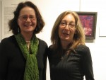
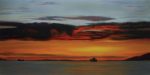
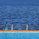
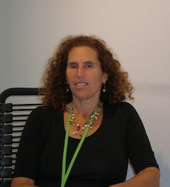
The Intersection of Science & Art, now at Zack Gallery until March 24, features the works of Joanne Emerman and Mike Cohene. (photo by Olga Livshin)
The Intersection of Science & Art exhibit at Zack Gallery features the works of two artists – Joanne Emerman, professor emerita of physiological sciences at the University of British Columbia, for whom photography has been a hobby for decades; and Mike Cohene, whose woodcarving unfolded unexpectedly in the past few years, after a lifetime of other pursuits.
Emerman explained that, for her, science and art have always intersected. “I worked for 33 years in cancer research. I only retired four years ago. I’m a scientist. I often used my photo camera, attached to the microscope, to photograph cells.”
Her hobby, especially her photos of animals, seems an extension of her scientific imagery.
“My photographs show how animals adapt to their environment. Every feature you see in the pictures is a result of natural selection, the survival of the fittest,” she said. “The individuals with adaptations suited to their environment will live long enough to breed and pass down those traits to their offspring, whereas the individuals that don’t adapt will die off. For the natural selection to work, several factors must be present, including the overproduction of offspring. They must ‘reproduce like rabbits.’ Also beneficial are variations due to mutations. They increase the likelihood of survival.”
Because of her scientific leanings, Emerman tries to capture in every shot the most significant characteristics of each animal, the ones that contributed to the survival of the species, like the stripes of a zebra, the legs of a tortoise or the fins of a turtle. She also documents the endless variations in nature in her thousands of photo frames.
Of course, to photograph exotic creatures, she has had to travel widely.
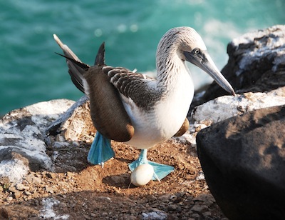
“I’ve always traveled a lot,” she said, “all over the world, and photographed during my travels…. I love animals but I love them in the wild. I never photograph animals in cages. The pictures in this show are all of animals and birds in their natural habitat. I took them in the Galapagos Islands and several South African game reserves. I tried to get as close to the animals as I could with my camera.”
The quality of the images reveals Emerman as a master photographer, although she is mostly self-taught. “I never took any classes on photography until I retired four years ago,” she said. “Then I decided to learn, and enrolled in a basic photography course at Emily Carr. I thought I would know everything they had to teach, or almost everything – I mean, it was called basics – but I learned so much!”
Eventually, the time was right for this show, her first gallery exhibit. “I was retired. I thought, maybe I should exhibit my pictures. I never did before. I submitted to the Zack Gallery, and the jury accepted me.”
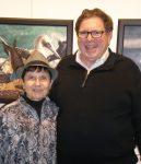
Another first for her was meeting Cohene. Linda Lando, the gallery director, introduced them.
“Linda said, ‘We have a wonderful carver. He carves fish and birds. His works will complement yours.’ She put us together,” explained Emerman.
Cohene’s artistic journey started in 2009.
“In the summer of 2009, I visited Steveston Farmers Market,” he recalled. “They had a booth of the local woodcarvers club. I looked at their works and thought, outstanding! I could never do anything like that. I’m not artistic, though I always whittled. Professionally, I had a clothing business until I sold it awhile back. The man in the booth talked to me and said, come to the club in September. You can do it. So I went.”
His first carving was a baby bear, and he loved it. After that came a dolphin and then some fish.
“I felt good about my carving but I wanted to learn more,” said Cohene. “I started attending woodcarving classes at the Richmond Carvers Society – enjoyed it so much, took a course at Emily Carr.” He also participated in an intensive 10-day workshop with world-renowned master fish carver Dale Barrett of Redmond, Ore.
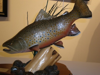
Cohene carves what interests him: wildlife, fish and birds mostly. “I’m a fisherman, have been all my life, but I never studied the fish anatomy before. I caught a fish and tossed it into a bucket. Now, I catch a fish and study it: the fins, the tail, the colour of scales. I look at fish from a different perspective now.”
To carve and paint his creations as realistically as possible, he uses reference material. “I take photos of what I catch or search for photos online,” he explained. “Sometimes, when I take commissions, people send me photos of the fish they caught and they want me to carve it.”
An active member of the Richmond Carvers Society, he regularly participates in the carvers’ juried exhibitions in British Columbia and Oregon. He has already collected a few “best in the show” awards for his work. However, as with Emerman, the exhibit at the Zack is his first gallery show.
Cohene has a second line of woodcarving, totally unrelated to his life-like creatures: Judaica. “A couple years ago, I brought 12 kilos of olive wood from Israel,” he said. “Each piece of wood was reclaimed from trees that had been in the fire of Har Carmel. I make mezuzot and dreidels from this olive wood, and people like them.”
To learn more about his carving, visit his website, mikecohene.com.
The Intersection of Science & Art opened on Feb. 23 and runs until March 24. Emerman is given an exhibit-related talk – Looking through the Lens of a Microscope and the Lens of a Camera – on March 21, 7 p.m., at the gallery. The suggested admission is a donation of $5. For more information, visit jccgv.com/content/jcc-cultural-arts.
Olga Livshin is a Vancouver freelance writer. She can be reached at [email protected].


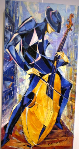 The theme of music and musicians appears in paintings by several artists in the show. Eternal and borderless, music wanders where it will, crossing barriers, especially now with the internet. Valeri Sokolovski’s images illustrate the concept perfectly. One could encounter his musicians almost anywhere. Their ethnicity is vague, but their passion soars in his paintings. Sokolovski’s musicians play with such intensity, the viewer can almost hear the notes, the syncopated beats and the soulful melodies.