Artworks on healing

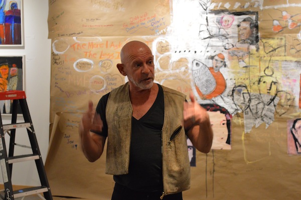
Gail Dodek Wenner conceived the group exhibit Physician Heal Thyself … and Others, which is at Zack Gallery until June 25. (photo by Olga Livshin)

The new exhibition at Zack Gallery, Physician Heal Thyself … and Others, includes four artists, all of them local physicians near retiring or recently retired. Regular visitors to the gallery probably will be familiar with the work of two of them – Ian Penn and Carl Rothschild, who have exhibited at the gallery before – but maybe not that of Arturo Manes and Gail Dodek Wenner.

Rothschild’s contribution to the show is a selection of small, colourful paintings, which look like snapshots of his garden or a street around the corner. Each one is accompanied by a poem written by the artist. Together, they represent his impression of his home city and its healing potential.

photo - “Preventative Medicine” by Carl Rothschild
“Preventative Medicine” by Carl Rothschild. (photo by Olga Livshin)

Penn’s part of the show is more dramatic. It includes a video and several photographed pages from his journal, where he documented the before and after of his complicated spinal surgery in 2016. His display fits the theme of the show almost too perfectly for comfort.

Manes’ paintings – his method of spiritual healing – are based on Roman Vishniac’s book of black-and-white photographs, A Vanished World.

“The Shoah has been for me a defining event not only in Jewish history but human behaviour, which I’m trying to come to grips with,” Manes said in an email interview. “Black-and-white photographs in Vishniac’s book impressed me greatly…. I used those images of my people prior to the Holocaust as a template for my paintings. By adding colour and a free rendering, I hoped to express the feelings the photographs have evoked.”

He said Physician Heal Thyself is the first exhibit in which he has participated, although he has been painting since childhood. “I’m not an artist – I’m a physician who paints. I was honoured to be invited by Dr. Gail Wenner to be a part of this show.”

Dodek Wenner invited the other doctors to participate in the show, as well. It was she who came up with the theme.

“I always loved art, but I loved science, too,” she told the Independent. “I chose medicine as my career, but art has always been my hobby.”

As an artist, she is very versatile. At one point or another, she has tried various media: painting, ceramics, textiles, photography, Hebrew calligraphy. In practising medicine, however, she stayed true to one direction: mothers and babies. “In the past 26 years, I delivered 2,000 babies,” she said. “But I made the decision to stop delivering. It’s time for a change.”

One of the precursors of her decision was going back to school, to Emily Carr University. In 2009, she received a diploma in fine art technique.

photo - “Weaver” by Arturo Manes
“Weaver” by Arturo Manes. (photo by Olga Livshin)

“I took a class, Business of Art,” she recalled. “One of the assignments was to pitch an idea for a show to an art gallery. I chose a theme: healing, what it means to be a doctor and what Judaism says about healing. I chose the Zack Gallery, and I decided to invite several Jewish physicians to participate. All for a school assignment. I didn’t actually do it at that time. I did mention it to Yosef Wosk, who is a friend, and he said it was a great idea.”

A few years later, Wosk reminded her of the idea, and she finally contacted Zack Gallery director Linda Lando. “I pitched the idea to Linda in 2016,” Dodek Wenner said. “We brainstormed it and came up with a few names of Jewish physicians who were artists.”

That was the first step. The next step was to determine what she wanted to paint for the show. “I needed to explore what healing meant to me,” Dodek Wenner explained. “Personally, I always went to my parents’ beach house when I needed to do some healing. So, I thought, what was it about the ocean that healed me?”

After some contemplation, she came up with four steps of healing. “The first one is the acknowledgement: yes, there is a problem. There is a fear, and a doctor has to acknowledge that fear in her patient. Next comes compassion, which leads to the doctor assuring her patient: I can help you. The third one is wisdom. Doctors have a huge body of knowledge. They study for many years, and they share their knowledge with the patient, use what they know for healing. Last is comfort. Comforting the patient is very important at every stage of the healing process.”

After formulating these concepts in her head, she explored what Judaism says about healing. “I looked in the siddur, the Jewish prayer book, and found all four of those concepts of healing, both body and soul, in the first couple pages,” she said.

She knew she was on the right track but wasn’t sure how to showcase her ideas through art. “I went to the beach house again, walked along the shore, and I knew,” she said. “The ocean represents all four facets of healing, too.”

Her paintings, two distinct series of five paintings, are all different interpretations of the shoreline. The ocean is sometimes quiet, sometimes turbulent and the colours of the waves fluctuate from light blue to deep green. The foam, created with the use of medical gauze, plays in the sand among the shells. The shells are real, collected by the artist along the same beach she loves so much. “I scooped them with a cup,” she said.

“My paintings don’t show one particular place,” she added. “They are the essence of a shoreline. Each piece is different, but they all connect.”

Physician Heal Thyself opened on May 25 and continues until June 25.

Olga Livshin is a Vancouver freelance writer. She can be reached at olgagodim@gmail.com.

Life arising from destruction

Barbara Heller in front of “Regeneration,” the work she created in collaboration with botanist Elena Klein. (photo by Olga Livshin)

Through the art of weaving, internationally acclaimed local artist Barbara Heller explores the world – and she doesn’t shy away from controversial topics. Themes of politics and destruction, renewal and society attract her exactly because of their complexity.

Heller’s road to the tapestry arts wasn’t straightforward. Her first bachelor degree was in psychology. “I started a master in psychology and, as part of the program, I had to keep an art journal,” she recalled. “It made me happy, much more so than psychology, so I decided I wanted to go to an art school. But, at that time, an art program would be mostly about ideas, concepts. If I wanted to learn techniques, I needed a program in art education.”

After earning a certificate in art education, Heller taught printmaking for awhile, but an allergy to the chemicals used pushed her to seek another form of artistic expression. She took some evening classes in tapestry-making, and loved it. She started showing her work at craft markets and art fairs.

“Tapestry-making is a slow, time-consuming process,” she told the Independent. “Sometimes, a large tapestry takes a year to complete. But the meditative aspect of weaving fits my personality. I need slow. I need time to think, to contemplate what I am doing. When I make a tapestry, I can stop at any moment, which was convenient when I was younger. I rented my studio on Granville Island the same year I got pregnant, 36 years ago.”

She continued her art while raising her son.

“With a tapestry, I’m creating the canvas along with the image, and I like that,” she said. “Dealing with mistakes is much harder than in a painting, so I go slowly to get it right the first time. It is almost a dialogue between me and the tapestry on my loom.”

In the beginning, Heller taught tapestry, but she doesn’t do so any longer. “I learn by doing,” she said. “It’s the best way to learn. I often find it hard to explain in words all the concepts and ideas that go into my weaving. I still make presentations and lectures at the professional conventions and shows, for the experienced artists, but I don’t want to explain the alphabet to the beginners anymore. I want to have more time for my tapestries.”

Her latest creation, “Regeneration,” took a year to complete. This large tapestry, made in collaboration with botanist Elena Klein, is part of the group show Connections that opened on May 11 at Craft Council Gallery on Granville Island. The concept of the show was collaboration, an exchange of ideas between three textile artists and their non-artist friends.

photo - “Tzimtzum” or “Transcendence,” by Barbara Heller
“Tzimtzum” or “Transcendence,” by Barbara Heller.

“For a long time, I had this image in my head of bombed-out buildings in Syria,” Heller said. “I wanted to use it for a tapestry, but I didn’t know where to go with it. Then, I met with Elena, and we talked. That’s how I found out that certain species of pine trees drop cones that don’t release their seeds unless a forest fire occurs. The seeds then germinate in the earth newly cleared of large trees by the fire. Suddenly, the image of my tapestry took shape.”

The tapestry has three distinct sections. The bottom layer is flames, blazing with red, yellow and orange, gorgeous and deadly. The middle part is what comes after, and these grey ruins could almost be anywhere in the world. The aftermath of a fire, whether man-made or natural, is the same: ash, devastation, fear. But hope won’t be denied, and the top part of the tapestry represents rebirth: a green field with the pinecones scattered around. The artist’s message is clear: new growth will come out of the wreckage. Life will reassert itself.

The same message of life arising from destruction or death manifests in another of Heller’s large tapestries, “Tzimtzum” or “Transcendence.” In 2016, she was invited to submit a piece to the 15th International Triennial of Tapestry in Lodz, Poland. “I wanted to work on an image with birds and wings, starting with tragedy, but ending with hope,” she said.

The tapestry depicts a stylized ladder. The darker blue rungs at the bottom incorporate a dead bird, a recurring image for the artist. From that low point, the ladder climbs, punctuated by several pairs of wings, with the shades of blue gradually lightening towards a white radiance. “The ladder has many interpretations,” Heller says in her artist’s statement. “It can be seen as a metaphor for our life, as a link, a liminal space between birth and death, heaven and earth … matter and spirit…. For me, they [the rungs] are stepping stones on the path of spiritual attainment, of transcendence.”

After six months in Poland, the tapestry came home, and it is currently on display at Christ Church Cathedral on Burrard Street, as part of the show (in)finite. The exhibition, featuring 30 Canadian textile artists, opened on May 25 and runs until June 4, with an opening reception on May 27. The show Connection on Granville Island continues until June 22.

Olga Livshin is a Vancouver freelance writer. She can be reached at olgagodim@gmail.com.

Diverse selection of artwork

Johanan Herson is coming from Israel to Art! Vancouver. (photo from Johanan Herson)

“I am very much looking forward to seeing all the new artwork coming from around the world,” Lisa Wolfin told the Independent. “We have some giant heads coming from Miami, some art made out of spider webs, metal sculptures and some really crazy stuff – can’t wait to see it all together under one roof.”

Wolfin is the founder and director of Art! Vancouver, which this year takes place May 25-28 at Vancouver Convention Centre-East. She is also an artist herself and will be bringing recent work to the fair.

“Over the past year,” she said, “I have contemplated what to make for the show that is new and unique and have come up with my new series called I Feel. It is a portrait series made from different materials: oil on canvas, mixed media on wood panel, and photography.”

Her current work is contemporary, she said. “What I have found in the many art fairs that I have attended is that artists are using recycled materials and making them into creative art forms. My newest series is made out of my kids’ things they used when they were young. Sometimes, it feels like I am back in kindergarten being free to just play with materials, not thinking what you are trying to make out of it, just doing. Who doesn’t want to be a kid again?”

photo - “Golden Hour,” acrylic on canvas, by Michael Abelman, one of several Jewish artists whose work is part of Art! Vancouver, which runs May 25-28
“Golden Hour,” acrylic on canvas, by Michael Abelman, one of several Jewish artists whose work is part of Art! Vancouver, which runs May 25-28. (photo from Art! Vancouver)

As more people have become aware of the art fair – this is its third year – inquiries have come from around the world, said Wolfin. And CBC Arts’ Amanda Parris “is flying out from Toronto to host the show and speak in a panel talk on Saturday at 3 p.m. Joining Amanda on the panel is Barrie Mowatt, who presently runs the Vancouver Biennale.”

Art! Vancouver opens on May 25, 7 p.m., said Wolfin, with “The Face of Art, where the artists walk down the runway carrying their artwork, so the attendees can put a face to the art to know who the artist is. People are curious as to who are the makers of the art – at this show, the artists are mostly in attendance, where people can come to meet them.”

Among those artists are several from the Jewish community, including Wolfin. Also presenting their work will be Johanan Herson, who is coming to the fair from Israel, and local artists Michael Abelman, Lauren Morris, Taisha Teal Wayrynen and Skyla Wayrynen.

“I will be showing mostly the soft art, textile art, but will have some of the sculpture works and acrylic paintings as well,” Herson told the Independent about what he’s bringing with him. “Le Soleil Gallery [on Howe Street] is showing the full range of my work and will continue after the fair to handle my artwork.”

Herson said he’s been to Vancouver a couple of times before, when he was a student at Banff School of Fine arts. He is originally from Montreal.

“I grew up in Montreal and visited Israel on various occasions before making aliyah,” he said. “In fact, I had come to study at the Bezalel Academy just after the Six Day War and hated it. I traveled the world before coming back to Montreal and the Canadian sense of pluralism and diversity. I came back later [to Israel] to understand the meaning of my Jewishness and fell in love with an Israeli woman, of a 10-generation family, and find myself part of this dynamic society.”

In terms of his artwork, Herson said, “I know that my soft art is a product of being at the right time and the right place, where this technique evolved, and I did look into the possibility of doing it in Quebec, but … the soft art is definitely an Israel discovery and development.

“My Canadian identity is one of respect for everyone, the celebration of diversity and acceptance of the other, and I cherish my Canadian roots and heritage and am proud of my citizenship. My work in Israel and my Jewish identity has always been part of who I am wherever I am and was part of who I am as a Canadian and an Israeli. I hope that my commitment to making the world a better place for everyone would have guided me if I had never left Canada, although perhaps the intensity of living and creating in the Middle East has challenges that are unique to Israel.

“I believe in the good in humanity,” he continued, “and have always sought to defend the less-privileged and suffering … whether they are in Montreal, Tel Aviv, Ramallah or Africa, and seek global communication as a platform to making the world a healthier and safer place of love, respect and opportunity for a better life for everyone. I do so as a Canadian Jewish Israeli artist.”

photo - "Welcome to my World," latex on canvas, by Skyla Wayrynen
“Welcome to my World,” latex on canvas, by Skyla Wayrynen. (photo from Art! Vancouver)

He gave the example of an exhibit of his work that just closed at the University in Minnesota. The exhibit, he said, was “part of encouraging dialogue between the Jewish student and Islamic student bodies. The message is that we must pray and work for a better world, that tikkun olam is to wake up every day and say that the world has been created for me alone, and that I must make it a better place for everyone.”

Teal Wayrynen is working toward a similar goal – making the world a better place – in a different way.

“I received my associates degree in psychology from Capilano University and am graduating this year with my bachelor’s degree from Simon Fraser University,” she told the Independent. “I will then combine my art with my counseling and do a master’s program for art therapy after I travel for half a year.”

At last year’s Art! Vancouver, Teal Wayrynen featured her Pop Icon collection. This year, she said she is “experimenting with charcoal and acrylic paint and drawing female bodies.”

Right now, her favourite medium is acrylic paint mixed with spray paint, she said. “I just started to mix mediums and use molding paste, acrylic paint and charcoal on top,” she added.

Morris has also been delving into new methods and media.

“I have continued predominantly working on flowers, however, I have introduced a new colour palette, as well as more abstraction within my floral pieces,” she told the Independent. “I’ve also continued with my free, fluid style and introduced some abstract landscapes using the new colours. My inspiration comes from the beautiful flowers that seem to surround me every day. Every season brings on something new and I am inspired by their shapes and colours.”

She has been working on a new series for Art! Vancouver, Morris said, “experimenting with a couple of new techniques and colours. They will be mainly florals and will all coordinate in style so that there is consistency within my pieces. I work predominantly in acrylic.”

She added, “I am hoping that my growth as an artist is shown in my new pieces and that my work continues to evoke my viewers’ emotions through visual imagery.”

Art! Vancouver opens May 25 at the convention centre with a VIP preview at 6 p.m. and the gala at 7 p.m. The show runs May 26-27, noon to 8 p.m., and May 28, noon to 5 p.m. A one-day pass is $15 (online) or $25 (at the door); $8 for children under the age of 14. A multi-day pass is $40 and a VIP pass is $100. Tickets to the opening gala are $30. Visit artvancouver.net.

Artists’ views of friendship

Orly Ashkenazy’s “Strings.” (photo by Olga Livshin)

The Festival Ha’Rikud group exhibit at Zack Gallery, Celebrating Friendship, presents 23 artists in a variety of styles and media. Each artist, in his or her own special way, explores the theme of friendship.

Photographer Judy Vitek interpreted the theme literally. The children in one of her photos and the texting teenage girls in another live hundreds of miles apart, on different continents, but their friendships are unmistakable.

photo - Gaye Collins’ “Friendship through the Sands of Time”
Gaye Collins’ “Friendship through the Sands of Time.” (photo by Olga Livshin)

On the other end of the spectrum, the abstract canvas by Lauren Morris could be seen as a medley of lines and colours, intertwining and mixing like friends at a party. Or perhaps it is a firework explosion. Or a flower bouquet a friend brought one summer afternoon.

Flowers bloom in Carl Rothschild’s paintings as well, but there is nothing abstract in his imagery. Maybe the artist glimpsed his poppies and lilies in a friend’s garden or on a neighbouring street. Cheerful and unblemished, his flowers are his friends. They wave their bright petals in recognition of their creator’s love for his home city.

In contrast to Rothschild’s decidedly local milieu, Gaye Collins’ painting, “Friendship through the Sands of Time,” feels like an exotic metaphor. Two black figures stroll away from the viewer through a vague landscape, reminiscent of yellow dunes or poetic imagination. The painting is dreamlike, and the figures undefined. Friends or lovers, they tell a story everybody knows, but nobody remembers.

Another metaphor, Jennie Johnston’s small and elegant quilt, is a labyrinth, a place of search and contemplation, a path leading into the heart. Whose heart? Everyone must decide for themself.

photo - Lori-ann Latremouille’s “Flowers of Friendship”
Lori-ann Latremouille’s “Flowers of Friendship.” (photo by Olga Livshin)

Between conceptuality on one hand and photographic precision on the other, two paintings stand out – two of the few where faces play the major role. While Yodhi Williamson’s “Chance Meeting on 4th Ave” conveys the simple joy of accidentally bumping into an old friend, Lori-ann Latremouille’s “Flowers of Friendship” channels a more complex narrative. In it, undertones of doubt and surprise mingle with recognition and kinship in the artist’s deceptively transparent double portrait.

Faces also appear in Sima Elizabeth Shefrin’s two tiny fabric panels, but here they resemble primitivistic art, innocent and childlike, ideas rather than portraits. In both panels, an Arab and a Jew refuse to succumb to the current political facts – they want to be friends.

Hope also emits from Alina Smolyansky’s shining piece “Jerusalem Domes of Faith.” Three temples of three different faiths grow out of the same root, united inside one hand, one hamsa, one finite world.

photo - Alina Smolyansky’s “Jerusalem Domes of Faith”
Alina Smolyansky’s “Jerusalem Domes of Faith.” (photo from the artist)

Pamela Cohen explores a different aspect of hope: an aerial view of a brightly coloured patchwork of countries and borders. Could friendships develop across those delineated borders, as the artist implies? Or is it wishful thinking?

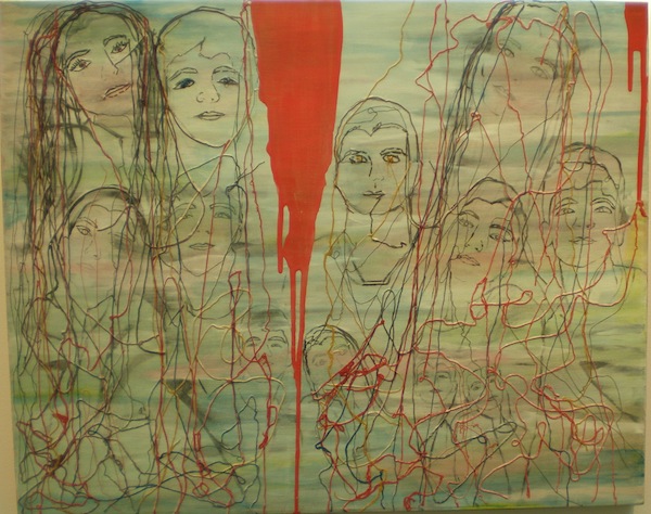
Orly Ashkenazy’s composition “Strings” doesn’t feel very hopeful, although its meanings resonate on many sublayers. At first glance, the painting is a random collection of rough face drawings. They look like pencil sketches. A tangle of cotton strings stretch and intersect, cross and turn, connecting those faces. The strings bind them, bind us all; however, a splash of red paint runs from top to bottom of the painting, dividing it into two separate parts like a river of blood. No string crosses the river, no connection manifests between its two sides.

photo - A tapestry by Vladimira Fillion-Wackenreuther
A tapestry by Vladimira Fillion-Wackenreuther. (photo from the artist)

Another work, a tapestry by Vladimira Fillion-Wackenreuther, pays tribute to Prague, the city of the artist’s youth. Tinged with nostalgia, the woven image is playful, uplifting. It reflects Prague’s medieval architecture, its culture-infused streets and traditional Czech marionettes. The city is indisputably the weaver’s friend, and she invites all of us to join in the friendship.

Many other artists are featured in the show – Aurel Stan, Ava Lee Millman Fisher, Beryl Israel, Claire Cohen, Gail Davidson, Joel Libin, Joyce Ozier, Monica Gewurz, Marion Eisman, Patricia Haley-Tsui, Sidi Schaffer – and each has enriched the concept of friendship with his or her unique perspective, talent and skills.

The exhibit opened May 4 and runs until May 22.

Olga Livshin is a Vancouver freelance writer. She can be reached at olgagodim@gmail.com.


Transforming the landscape

A photograph of Deadvlei in Namibia, by Judi Angel, is part of the exhibit Eye Lines, at Zack Gallery until April 30.

Five years ago at Zack Gallery, Judi Angel had a solo show of photographs from her time as a volunteer in Asia and Africa. Most of her work from that period was portraits of people she met during her travels. By contrast, her new solo exhibit, also the product of her travels, features no people – instead, her latest works transform landscapes into geometry, into lines, colours and shapes. The title of the new Zack show, Eye Lines, reflects the artist’s new approach.

“Each photo in this show has a leading line,” Angel said in an interview with the Jewish Independent. “That line attracts the viewer’s gaze, builds a narrative. It takes your imagination on a journey. You look at the image and you ask questions. Where are we? Where are we going? How do we get there? What is beyond the frame?”

Her fascination with lines started in recent years. “I took a photography class on developing your own style,” she said. “I hadn’t noticed how much I use lines in my images until I went back over my photos, thousands of them. Then the lines emerged as something important, so I decided to exploit that direction and enjoy what comes of it.”

She doesn’t consider herself a professional photographer, despite the artistic quality of her photos. “Photography is a serious hobby for me. I’m not trying to make a living with it,” she said. “I want it to be fun and challenging. I’m looking for new ways to express my vision of the world.”

photo - Judi Angel
Judi Angel (photo from Judi Angel)

Awhile ago, she began experimenting with her craft. Layering, double exposure, conceptual photography and a new medium for her images – sublimation printing on aluminum – are only some of the new things she has played with recently. But finding unusual images and original angles are still her primary goals.

“Five years ago, when my husband and I volunteered in impoverished countries, my photos were like a documentary. Now, I want to experiment more,” she said. “We still travel, but the trips are shorter. We don’t want to leave home for long periods of time; we have eight grandchildren. But we often travel specifically to places I want to photograph, like Africa – it is a visual feast for a photographer.”

Earlier this year, she and her husband traveled to Namibia. “We went there particularly for photography,” she explained. A few photos in the exhibit come from one of the major Namibian tourist attractions, a ghost town, called Kolmanskop, in the Namib Desert. According to Angel, Kolmanskop was a mining town founded in the earlier 1900s by German settlers to mine diamonds. The miners built their town in their homeland’s style.

“It had all the amenities: a hospital, a casino, a school, even a ballroom,” she said. “Unfortunately, by the middle of the 20th century, the mine’s diamond production petered out and the town was abandoned.”

Today, only sand and tourists move among the empty buildings, and Angel’s photographs demonstrate the power of both. The desert irrevocably reclaims its own, encroaching on the former human dwellings, creeping in through broken windows and open doors. The rippling sand dunes inside the houses look eerie, almost alien beneath the pastel-coloured walls.

A different alien landscape meets the travelers outside, in the desert. Angel’s photos of the desert reflect the stark contrast of blue sky and yellow sand. The colours are blinding. “There is a new railway there, in the desert, but the sand always moves. It covers the rails every day and has to be constantly cleared,” she said. Her photograph of a sand dune a couple of metres high, piling across the straight line of rails, is awe-inspiring and achingly beautiful.

Another unique desert photograph sports three colours instead of two. A grove of dead trees stretch their long-dry branches upward, adding dark brown to the blue-and-yellow combination of the desert. “The trees have been there for 600 years,” said Angel. “The dryness of the desert preserves the wood from rotting and crumbling, so they just stand there.”

Most other pictures in the exhibit reveal architectural elements, as seen through the artist’s lens. Several of them are in the monochrome palette, while all the desert pictures use colour. “I like colour, especially the warm yellows, reds and blues, but sometimes, black-and-white is the only option,” she explained. “In my geometrical photos, black-and-white emphasize lines, while colours would be distracting.”

Her architectural photos are not precise copies of real life but rather an enhanced fantasy, a capriccio on an urban theme. One of her favourite image-manipulation programs is Photoshop. “Some photographers say that using Photoshop means cheating, but I don’t think so,” she said. “Photoshop is my tool, like paintbrushes for an artist. It has so many creative possibilities, and I experiment with them.”

Angel’s experimentations led her to join the Capture Photography Festival, and the current show at the Zack is part of the festival. Launched in 2013, this year’s festival presents photography at more than 70 galleries and community spaces throughout Vancouver.

“I like visiting their shows – so many outstanding artists,” said Angel, noting, “They have judges to ensure that every participating photographer and every exhibition are on a decent level.”

Eye Lines opened at the Zack on March 30 and will continue until April 30. To learn more about Angel’s work, visit judiangel.com.

Olga Livshin is a Vancouver freelance writer. She can be reached at olgagodim@gmail.com.

Mosaics change our views

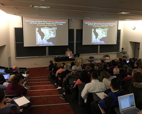
Dr. Ra’anan Boustan of Princeton University delivers the Itta and Eliezer Zeisler Memorial Lecture at the University of British Columbia on March 23. (photo by Gregg Gardner)

A mosaic from Late Antiquity has lessons for Jewish communities today. According to Dr. Ra’anan Boustan of Princeton University, “Jewish identity, historically, was broader, more porous, and integrated more non-Jewish elements than we might think, and, likewise today, we should not hasten to essentialize or rigidly define Jewish identity or culture.”

Boustan offered this insight when delivering the Itta and Eliezer Zeisler Memorial Lecture at the University of British Columbia on March 23. Called Greek Kings and Judaean Priests in the Late Antique Synagogue: The Newly Discovered “Elephant Mosaic,” Boustan’s visit was presented by the Archeological Institute of America, Vancouver Society, and co-sponsored by the UBC Diamond Chair in Jewish Law and Ethics, and the department of classical, Near Eastern and religious studies (CNERS).

A 2011 dig led by archeologist Jodi Magness excavated several sections at the site of a former village, Huqoq, near the Sea of Galilee. Among the items uncovered was a mosaic that is said to have adorned the floor of an elaborate 1,600-year-old synagogue.

“The discovery of the mosaic was a major find,” Prof. Gregg Gardner of CNERS told the Jewish Independent. “There are very few mosaics from the ancient world that depict biblical scenes.”

The mosaics’ scenes include Samson fighting the Philistines, Noah and the flood, the destruction of the Egyptian army in the Red Sea, and others. A particularly noteworthy element is that the mosaics also show images from Greek history and mythology. “This confluence of biblical and Greek imagery was quite surprising,” said Gardner.

Boustan was in Vancouver to talk about the “Elephant Panel,” which depicts a battle between unknown actors. Although some have argued that the panel represents Alexander the Great, Boustan interprets the mosaic as the depiction of a Seleucid attack on Jerusalem led by King Antiochus VII in 132 BC. “It shows they had a sense of historical connection to predecessors in a more robust way than we might have expected, and wanted to have that memorialized in synagogue art. This shows a historical consciousness, not just the timeless world of rabbis and scriptural interpretation developing in the Talmud of the same period.”

Boustan is a specialist in Judaism in Late Antiquity (circa 200-700 CE) who has focused particularly on understanding “extra-rabbinic culture,” the Judaism that existed outside of what was preserved in the narratives of the rabbis. “The rabbinic writings – the Talmud, the Midrash – preserve the world through their eyes, what they thought was important and how they wanted things to be viewed. The rabbis did not represent all Jews or all Judaism, and the wider Jewish world may have had different viewpoints and priorities.”

Boustan has focused on studying the piyyutim (hymns) written and preserved outside the rabbinic canon and containing some unusual theological ideas, as well as on apocalyptic and mystical literature, which flourished on the fertile edge between Jewish and non-Jewish cultures.

“The mosaic is important for understanding the history of Jews and Judaism and gives us something to think about in terms of Jews living in the Western world today,” he said, noting the broader and more porous nature of Jewish identity in those times, and how we shouldn’t be in a hurry to “rigidly define Jewish identity or culture.”

For example, Boustan explained, “The figural art we are finding at Huqoq and elsewhere upends some of our assumptions that, classically, Jews didn’t do that. In fact, we’ve found many small villages of one to two thousand habitants who built very expensive buildings containing a mixture of folk art and world-class art. In Huqoq, the art is imperial-quality work, which would not be surprising to find in a major landowner’s villa in Antioch. Yet, there it is, being commissioned, paid for and used by a farming village of maybe 2,000 people. That tells us we have a lot more to learn about the Jews of Late Antiquity.”

He noted, “In addition, the synagogue art contains a zodiac wheel with a figure of the sun god, Helios, in the centre. What’s going on there? Is it just a decoration? Was it actually part of religious worship in the synagogue? Was it seen allegorically as a poetic representation of God?

“Helios imagery was adopted by Christians in the third century, along with many other Greek religious symbols,” he said. “As the Greco-Roman world Christianized, however, they distanced themselves from ‘pagan’ imagery. By the late fourth to seventh [century], Jews are the only ones actively cultivating zodiacal and Helios imagery. Ironically, if you find a building with Helios imagery from that period, it’s almost definitely a synagogue.”

The mosaics can be viewed in detail at nationalgeographic.org/news/huqoq-excavation-project.

Matthew Gindin is a freelance journalist, writer and lecturer. He writes regularly for the Forward and All That Is Interesting, and has been published in Religion Dispatches, Situate Magazine, Tikkun and elsewhere. He can be found on Medium and Twitter.

Celebrating Canadian teams

In 2012, Avi Dunkelman and his business partner, Joseph Gault, won a five-year contract from Canada Post to create a postage stamp series celebrating 100 years of the National Hockey League. (image from Avi Dunkelman)

It was as if he had come full circle, when Israeli-born Avi Dunkelman won a five-year contract from Canada Post in 2012 to create a postage stamp series celebrating 100 years of the NHL, focusing on the seven Canadian teams in the league.

Dunkelman was born in Haifa in 1954 and, at an early age, started collecting the stamps from the postcards his father sent him on his travels in Europe. The stamps gave Dunkelman a great appreciation for graphic design, so much so that he opted to go to art school.

“After I finished my military service, I decided to see if I could get some work in graphic design,” he told the Independent. “I soon realized that what I had learned in high school was not enough. I needed to study this very seriously in order to make a career out of it.”

photo - Avi Dunkelman
Avi Dunkelman (photo from Avi Dunkelman)

Dunkelman first thought to pursue his studies in the United States but, as all of his mother’s family lived in Toronto, he chose to go there to study for a year. During this time, he also worked on improving his English language skills, with the intention of continuing his studies in the States.

Three weeks after he arrived, in 1977, he was attending Ontario College of Art and Design. He then pursued a post-graduate degree in Switzerland, at one of the top graphic design schools in the world at the time – they only accepted eight students per year.

In 1984, he made his way back to Toronto and got married, opening his own graphic design firm in 1986, called Avi Dunkelman Design Group. In 1987, he began teaching at Ontario College of Art and Design, where he has worked ever since – he’ll be celebrating 30 years there this spring.

“In 2010, I formed a partnership with my business partner, Joseph Gault, who studied with me in Switzerland,” said Dunkelman. “We’ve known each other for 37 years, and decided to form a creative partnership under the brand of Mix Design Group.

“We were invited to compete in designing the stamp for the Year of the Snake in 2011 – we won four design awards for it. In 2012, we were asked to compete on a five-year project celebrating or commemorating the 100th anniversary of the NHL. We submitted our design concept and we won the competition.”

Over the five years, Dunkelman and Gault designed 69 stamps, 32 first editions, about 15 booklets, and all kinds of other materials. It is the largest program that Canada Post has ever tasked.

Dunkelman did not grow up with hockey in Haifa. Instead, soccer was the sport of choice. He recalled, “I saw a glimpse of hockey, but never got to really understand the game like some Canadians do. I don’t know how to skate.

“My business partner is a hockey buff. His father was actually a professional hockey player in Scotland. He’s Canadian-born and grew up playing hockey with his father coaching him. He knows a lot more than I do.

“I think that the fact that I look at it from a layman’s perspective gives us an advantage … looking at things in a different way. And this is what my contribution to this project is.

image - One of the biggest challenges for Dunkelman was working with six different player photos at a time, editing them so that they work seamlessly together
One of the biggest challenges for Dunkelman was working with six different player photos at a time, editing them so that they work seamlessly together. (image from Avi Dunkelman)

“The way we work is we sit and brainstorm some ideas,” he said. “Then, we work independently on some ideas, designs, get together, analyze them, and decide what works and what doesn’t.”

One of the biggest challenges for Dunkelman was working with six different player photos at a time, editing them so that they work seamlessly together.

“That’s a challenging process,” he said. “If you look at the photograph on the stamp and the original, they sometimes look totally different.”

Over his more than 30-year career, Dunkelman has had to learn how to incorporate computers into the design process. The first computers came onto the scene as he graduated from the school in Switzerland and Dunkelman recalled that one of his teachers received four computers from Steve Jobs as a gift. While not so useful at the time – it was the mid-1980s – as software and computers developed further, Dunkelman began using them in his design process.

“Obviously, I had to adapt to computers, as the technology was growing, too, and going through its own growing pains,” he said. “I’d say I’m not unique in that. I think most designers had to do the same thing. When I was starting out on computers, Photoshop wasn’t around … wasn’t as complex and sophisticated as it is now. So, there were a few things I was integrating at the same time … taking an image, doing something, printing it, re-photographing it, re-modifying it, going back and forth between the computer and the work table.

“By the way, that’s part of the way I teach at school now … because my message to the younger generation is that the computer is not the answer for everything. The idea is not to develop a dependency on it. Depending on the nature of the project and what the opportunities present you with, even today, there are certain things to do in an analogue way.”

Dunkelman works with a production person. “I don’t have the time to get the ins and outs of every little update of software coming my way,” he said. “I try to keep up, but, to do this effectively, I’d need to devote my entire time to it. It’s not feasible for me.”

According to Dunkelman, graphic design has changed a lot in the computer era, opening up opportunities for more people to be in the industry. However, he said, “It’s a little disappointing to me how graphic design in general is going back. A lot of things look the same because people are using the same software, the same tools, fonts and colours. Especially with website design being template-oriented … it’s becoming more about information management and data management, as opposed to creating.”

Dunkelman has a long list of clients, including the Ontario Chamber of Commerce, the Royal Canadian Mint, the University of Toronto and many private companies.

“Right now, I split my time between teaching and working,” he said. “Going forward, the professional work I’m doing is probably going to slowly diminish by choice, while still teaching and being a mentor for the next generation.

“This is one of the things I’m focusing on for my students – mentoring them to a point where I still keep a strong connection with former students who seek advice. They know I’m always available, open and willing to help. This is what I really enjoy seeing – the next generation and my former students getting ahead in their own careers and taking charge of the industry … hopefully, to become leaders.”

Rebeca Kuropatwa is a Winnipeg freelance writer.

About the Passover cover art

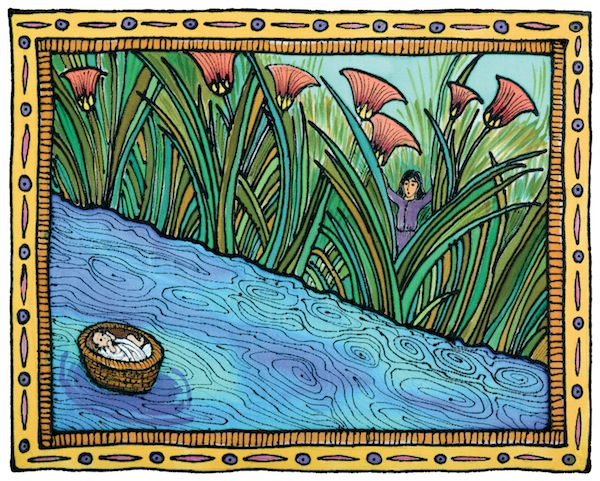
“Basket on the Nile” by Carol Racklin-Siegel. “She could not hide him any longer, so she took for him a wicker basket and smeared it with clay and pitch; she placed the child into it among the reeds at the bank of the River.” (Exodus 2:3)

This image – created with gutta resist and fabric dyes on silk – is the cover art for The Brave Women Who Saved Moses, the eighth book in a series of children’s Bible books published by EKS Publishing. The books are available on Amazon or from ekspublishing.com.

You can see more of Racklin-Siegel’s artwork on pomegranatestudios.com or “The Artwork of Carol Racklin-Siegel” on Facebook.

Wildlife takes over the Zack

The Intersection of Science & Art, now at Zack Gallery until March 24, features the works of Joanne Emerman and Mike Cohene. (photo by Olga Livshin)

The Intersection of Science & Art exhibit at Zack Gallery features the works of two artists – Joanne Emerman, professor emerita of physiological sciences at the University of British Columbia, for whom photography has been a hobby for decades; and Mike Cohene, whose woodcarving unfolded unexpectedly in the past few years, after a lifetime of other pursuits.

Emerman explained that, for her, science and art have always intersected. “I worked for 33 years in cancer research. I only retired four years ago. I’m a scientist. I often used my photo camera, attached to the microscope, to photograph cells.”

Her hobby, especially her photos of animals, seems an extension of her scientific imagery.

“My photographs show how animals adapt to their environment. Every feature you see in the pictures is a result of natural selection, the survival of the fittest,” she said. “The individuals with adaptations suited to their environment will live long enough to breed and pass down those traits to their offspring, whereas the individuals that don’t adapt will die off. For the natural selection to work, several factors must be present, including the overproduction of offspring. They must ‘reproduce like rabbits.’ Also beneficial are variations due to mutations. They increase the likelihood of survival.”

Because of her scientific leanings, Emerman tries to capture in every shot the most significant characteristics of each animal, the ones that contributed to the survival of the species, like the stripes of a zebra, the legs of a tortoise or the fins of a turtle. She also documents the endless variations in nature in her thousands of photo frames.

Of course, to photograph exotic creatures, she has had to travel widely.

photo - Joanne Emerman tries to get as close to the animals as she can with her camera, as is evidenced by this blue-footed booby photo
Joanne Emerman tries to get as close to the animals as she can with her camera, as is evidenced by this blue-footed booby photo. (photo by Joanne Emerman)

“I’ve always traveled a lot,” she said, “all over the world, and photographed during my travels…. I love animals but I love them in the wild. I never photograph animals in cages. The pictures in this show are all of animals and birds in their natural habitat. I took them in the Galapagos Islands and several South African game reserves. I tried to get as close to the animals as I could with my camera.”

The quality of the images reveals Emerman as a master photographer, although she is mostly self-taught. “I never took any classes on photography until I retired four years ago,” she said. “Then I decided to learn, and enrolled in a basic photography course at Emily Carr. I thought I would know everything they had to teach, or almost everything – I mean, it was called basics – but I learned so much!”

Eventually, the time was right for this show, her first gallery exhibit. “I was retired. I thought, maybe I should exhibit my pictures. I never did before. I submitted to the Zack Gallery, and the jury accepted me.”

Another first for her was meeting Cohene. Linda Lando, the gallery director, introduced them.

“Linda said, ‘We have a wonderful carver. He carves fish and birds. His works will complement yours.’ She put us together,” explained Emerman.

Cohene’s artistic journey started in 2009.

“In the summer of 2009, I visited Steveston Farmers Market,” he recalled. “They had a booth of the local woodcarvers club. I looked at their works and thought, outstanding! I could never do anything like that. I’m not artistic, though I always whittled. Professionally, I had a clothing business until I sold it awhile back. The man in the booth talked to me and said, come to the club in September. You can do it. So I went.”

His first carving was a baby bear, and he loved it. After that came a dolphin and then some fish.

“I felt good about my carving but I wanted to learn more,” said Cohene. “I started attending woodcarving classes at the Richmond Carvers Society – enjoyed it so much, took a course at Emily Carr.” He also participated in an intensive 10-day workshop with world-renowned master fish carver Dale Barrett of Redmond, Ore.

photo - Mike Cohene began woodcarving in 2009
Mike Cohene began woodcarving in 2009. (photo by Olga Livshin)

Cohene carves what interests him: wildlife, fish and birds mostly. “I’m a fisherman, have been all my life, but I never studied the fish anatomy before. I caught a fish and tossed it into a bucket. Now, I catch a fish and study it: the fins, the tail, the colour of scales. I look at fish from a different perspective now.”

To carve and paint his creations as realistically as possible, he uses reference material. “I take photos of what I catch or search for photos online,” he explained. “Sometimes, when I take commissions, people send me photos of the fish they caught and they want me to carve it.”

An active member of the Richmond Carvers Society, he regularly participates in the carvers’ juried exhibitions in British Columbia and Oregon. He has already collected a few “best in the show” awards for his work. However, as with Emerman, the exhibit at the Zack is his first gallery show.

Cohene has a second line of woodcarving, totally unrelated to his life-like creatures: Judaica. “A couple years ago, I brought 12 kilos of olive wood from Israel,” he said. “Each piece of wood was reclaimed from trees that had been in the fire of Har Carmel. I make mezuzot and dreidels from this olive wood, and people like them.”

To learn more about his carving, visit his website, mikecohene.com.

The Intersection of Science & Art opened on Feb. 23 and runs until March 24. Emerman is given an exhibit-related talk – Looking through the Lens of a Microscope and the Lens of a Camera – on March 21, 7 p.m., at the gallery. The suggested admission is a donation of $5. For more information, visit jccgv.com/content/jcc-cultural-arts.

Olga Livshin is a Vancouver freelance writer. She can be reached at olgagodim@gmail.com.

Sunsets constantly changing

“April 5, 2006, Reflected Embers: Cerulean, Cadmium Red, Yellow and Orange.” One of the sunsets Jack Rootman captured in oil over the space of a year.

For three decades, Jack Rootman combined two of his passions: medicine and art. Last year, after 43 years of practice as an eye surgeon, he retired and finally could dedicate himself completely to his art.

“This is the first opportunity I had in my life to paint whenever I wanted,” he said in an interview with the Jewish Independent. “I like painting in series. It allows me to explore my chosen theme from different viewpoints, but it was not easy when I could only paint a few hours a week. Now I can.”

photo - Artist Jack Rootman
Artist Jack Rootman (photo by Olga Livshin)

His latest series – of sunsets – comprises his new show at the Zack Gallery. Called Contemplating Sunset: English Bay, the show opened on Jan 19.

“I began the series just before I retired,” said Rootman. “My studio is in English Bay, and I watched sunsets there almost every day for years. Every night of the year, people come to the beach to watch the sunset. It’s become almost a ritual. Of course, more people come during the summer months than in winter but, in any weather, a sunset inspires people to enter a spiritual mood. Couples embrace. Everybody often stays silent, no small talk. Sometimes, people sing or salute the setting sun with their raised hands.”

Several years ago, Rootman started taking photographs of the sunsets he witnessed. “I also took colour notes for every photo. A camera doesn’t always reproduce the exact colours of sea and sky, so I noted the oil paint names.” Examples of his notes, which mix in with the images’ titles, are: “January 31, 2010, Serene Mist: Cobalt Violet, Ivory Black, Ultramarine Blue” or “June 12, 2015, Final Moment: Lavender and Lilac.”

“As the months go by, the position of the setting sun moves across the azimuth, from the far left in January to the far right in July,” observed Rootman, whose series covers a full year. “After the summer solstice, the sunset position starts to move back, gradually month by month. Sunsets also take longer as the days grow longer.”

Rootman started the series at the beginning of last year, after he had accumulated a great number of photographs. He wanted to depict the best sunset for each month.

“No sunset is the same,” he said. “Even on the same day, when I took photos every few minutes, the view is different. The sky, the sea, the clouds, the colours change almost every moment.”

That’s why he never tried to paint on site, because the sunset is constantly in flux. The best artistic approach, he explained, was to paint inside his studio, to capture the moments using his hundreds of photos as inspiration.

photo - “June 12, 2015, Final Moment: Lavender and Lilac,” by Jack Rootman, is one of the sunsets on display at Zack Gallery until Feb. 19
“June 12, 2015, Final Moment: Lavender and Lilac,” by Jack Rootman, is one of the sunsets on display at Zack Gallery until Feb. 19.

“I wanted to characterize the nature of light of both sky and sea, to paint a series of portraits of individual sunsets, as if they were persons,” he said. “Sunset always has an emotional impact on its human watchers, and I painted them, too.”

Indeed, some of the paintings at the Zack Gallery are populated by people who are sharing the sunset with the artist; most of them have their backs to him.

One of the most interesting features of a sunset over water is that, exactly as Rootman depicts in this series, at a certain point, the sea becomes a mirror, reflecting the sky above.

“You might notice that the sea is always a different colour than the sky,” he said. “It is because the sea reflects what is up, directly over it, but the artist looks at the sky and paints the sideway view. We don’t see what is above that distant sea on the horizon. We only see what is in front of our eyes. The entire sunset is like a sequence of visual effects in a movie.”

Rootman considers sunsets an intimidating subject, “a colossal challenge,” perhaps because of their fluid, “visual-effect” nature. Many artists over the ages have tried painting sunsets, but not many have succeeded. One of his friends, an Israeli artist Yasha Cyrinski, wrote in an email exchange with Rootman: “The subject matter you chose is quite challenging to say the least. A subject devoid of irony.”

But Rootman is never afraid to tackle a challenge.

“I have done landscapes and portraits on commission, and portraits are much harder,” he said. “When I paint a portrait, I want to capture the essence of a person, his emotional subtext. When I painted sunsets, I wanted to catch the ephemeral moment of what a sunset is.”

The exhibit Contemplating Sunset: English Bay continues until Feb. 19.

Olga Livshin is a Vancouver freelance writer. She can be reached at olgagodim@gmail.com.