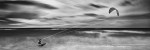
Sharon Tenenbaum’s work can be seen on billboards above highways in Vancouver, Toronto and Montreal. (photo by Sharon Tenenbaum)
Sharon Tenenbaum discovered her love of photography in 2006 on a trip to South East Asia. In 2014, only eight years later, she is a nationally recognized photographer. From Dec. 15 to Jan. 15, four of her photographs will be displayed on billboards along Canadian highways and bridges as part of Paint the City (paintthecity.org), an international initiative to promote arts in unexpected places.
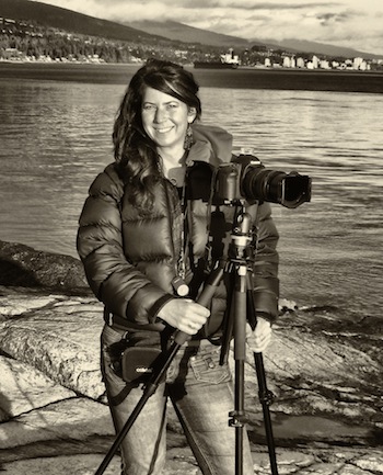
Tenenbaum talked to the Independent about her transformation from an engineer dissatisfied with her career to a successful artist.
“Last year, I participated in a RAW Artists (rawartists.org) competition,” she said, explaining how her images found their way to the billboards. “RAW is an art organization supporting artists in the first 10 years of their career. I became a finalist, together with another artist. Then, the organizer called me and said she nominated us for the Paint the City project. I didn’t even know about them.”
According to Tenenbaum, Paint the City selected the winner through social media. They stipulated that the one who got more “Likes” on Facebook and Twitter would win. “I had to recruit all my friends and even my family in Israel, and my family and friends in turn incited everyone they knew to login and vote for me. I won. I guess I have more friends,” she joked.
In reality, it was a long road from her first travel photos to her sophisticated billboard images displayed on the highways of Vancouver, Toronto and Montreal.
“At first, many people discouraged me. They would say: ‘She discovered a camera, so what?’ But I can’t see myself doing anything else. I didn’t care what anyone said. I have confidence in myself.”
In the beginning, what she did was photojournalism, documenting everyday life, she said. “In Asia, I took photos of buildings and people, but when I returned to Vancouver, I couldn’t photograph people here. It requires legal permissions, so I started photographing architecture, rediscovering Vancouver. I wasn’t just documenting anymore; it was my interpretation of what I saw.”
Out of her engineering background sprouted her passion for photographing things constructed by human beings. “I have a talent to see how elements of the whole work in harmony, how shapes and lines come together. I like modern architecture with its clean lines. The approach is artistic. The image has to speak to the heart.”
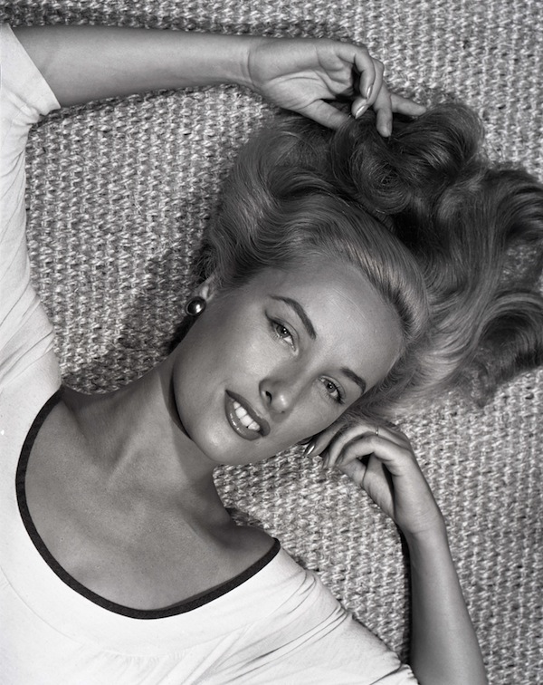
Her stark black and white images that won their places on billboards speak to people’s hearts. They show the artist’s unerring sense of light and shadows, her flair for the dramatic. Her quest for visual tension resulted in her unique series of bridges, all of them spectacular black and white instants in time and space. Some of them are Vancouver bridges, others she took during her travels.
“When you travel,” she explained, “you see everything with new eyes. It’s harder to achieve at home. I traveled a lot at first. Now I only travel to specific locations. If I want to photograph a certain bridge, I research it, then go there to take pictures.”
Most of her photographs are black and white. “When you use color in a photo, it steals the show,” she said. “A color photo doesn’t have to be as good as black and white. Sometimes, if you take color out of the image, it has no merit otherwise. Black and white photos are more challenging. The image must stand on its own. In many cases, color feels like cheating. I use color in my photos only when it’s essential, when color is what it’s all about. Color is an emotion. When I need to convey that emotion, I leave the colors intact. The same image seems to tell different stories when it’s in color or in black and white.”
Recently, she turned to a new technique, new stories infused with color. She started painting on top of her photographs. She applied this development not to the man-made structures but to something created by nature: trees.
“I started with one image of a tree, a photo from Portugal. There is a maple tree outside my window; it’s gorgeous in the fall. It inspired me. I wanted to convey such beauty with my image too, so I painted on top. Then I participated in Culture Crawl, and this painting was very successful. I started doing more.”
Like every artist, she strives to evolve, constantly finding fresh dimensions in her art. “I want to keep changing. I don’t want to have one style associated with me. Every artist needs to grow. After awhile, you get bored with the old stuff. Look at Picasso. He had five distinctive stages, each one unrecognizable from the others. Same with me. I have to keep reinventing myself.”
She also helps others reinvent themselves: she teaches, offering workshops in photo skills, as well as creativity. “I love teaching, love sharing what I know. Sometimes, when I teach, it clarifies the concept for me as well. I teach people how to be artists. Creativity has different phases. I teach my students how to get into each one, how to recognize and be receptive to new ideas. But then, each idea needs a follow up, lots of hard work. That’s also part of creativity.”
For more on her work, visit sharontenenbaum.com.
Olga Livshin is a Vancouver freelance writer. She can be reached at [email protected].