Inspiring optimism with art

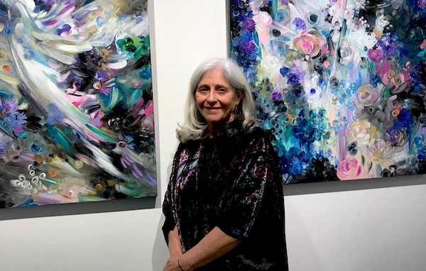
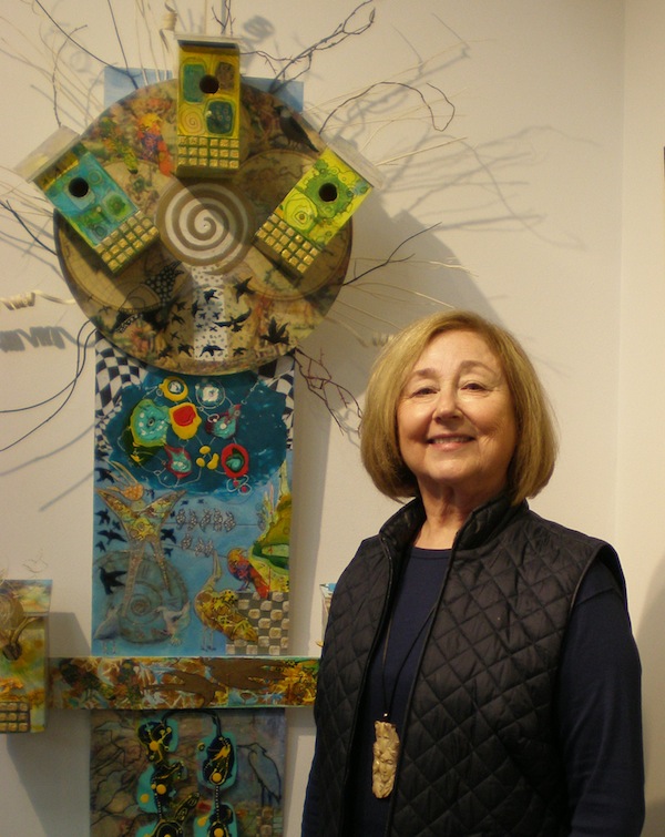
Linda Frimer’s exhibit, Beckoned by the Light, runs until Feb. 23 at the Zack Gallery. (photo from Linda Frimer)

“Since I was a child, I’ve always looked for the light – in the forest near my home and in the stories of my family. All the paintings in my show were inspired by light, the light of creation,” said Linda Frimer.

The exhibit, Beckoned by the Light, opened at the Zack Gallery on Jan 30. Originally, Frimer thought that her show would open simultaneously with the launch of her upcoming book, Connecting the Dots, and this is why the gallery exhibit opened in conjunction with the Cherie Smith JCC Jewish Book Festival. But life interfered, and the book is still a work-in-progress. Nevertheless, Frimer told the Independent, “I decided to go ahead with the show.”

Frimer’s paintings are beautiful, suffused with light. They are closer to impressionism than to realism, but every piece is unmistakably and uniquely hers. Light bathes the trees and the streams. It filters among the branches. It soars on dove’s wings over brilliant abstractions and illuminates mysterious paths winding through the woods. Light bursts into explosions of gladness and swirls like dancing fairies, inviting gallery visitors to share the luminous joy, to rejoice in the rainbow of colours.

“When I paint, I want to be positive,” the artist said. “Life is hard. That’s why I want joy in my paintings.”

To express her joy, Frimer uses bright colours, including gold and silver. “Gold and silver are great for all the recurring symbols in my paintings,” she explained. “One of my favourite symbols is wings – wings of the birds, like a dove, which is a metaphor for light.”

Another symbol that appears frequently is a tree. “Trees have wings, too. Sure, they are rooted in earth, but they reach for the sky, for the light,” Frimer said.

One more symbol populates many of her paintings – a flower, specifically a sunflower, which always strives to stretch higher, to touch the sun.

And then there are paths, roads to the light. Or to a better place. Or to someone you love. “I love people,” she said. “Love being a member of a group. I’m a member of several different groups.”

One of her groups – with five artist friends – attended her opening night and brought a gift: a wooden staff adorned with symbols of her art. Each object that was attached to the staff was created by a member of the group.

“We met through a project of the Hebrew University about 15 years ago,” Frimer said. “Now, we meet regularly, support each other in life and art. Whenever one of us has a show, the rest of us always make something symbolic for her.”

The group comprises Frimer, Nomi Kaplan, Lilian Broca, Barbara Heller, Sid Akselrod and Melenie Fleischer. “We call our group Five Hens and a Rooster,” Fleischer said with a laugh, as she presented the group’s gift to Frimer.

Music also plays a big part in Frimer’s artistic life. One could almost hear notes thrumming in her imagery. “I often listen to music when I paint,” she said. “I even dance sometimes. I love classical music, pop, all kinds, really.”

Frimer always starts a painting with an idea, but then her imagination takes over. “I follow my intuition,” she said. “Painting is a spiritual act for me. It’s like meditation. I love the process, the magic of creating. It’s wonderful to be able to express all that positive energy.”

In her opinion, everyone is an artist. Not necessarily a visual artist, but we all create in our own way. “It’s about how you feel, how you express yourself,” she said. “The process is much more important than the end result. I taught art a lot and I facilitated several healing artistic projects. It is great when I can help people tell their stories through creativity.”

Her new book is about that, too. “It’s my life story through art,” she said. “There are also creative exercises there, and some essays about different aspects of creativity. It’s about the healing power of the arts.”

Many of Frimer’s canvasses are large, expensive, fit for corporate headquarters or ballrooms, but the artist wants more than to sell her paintings for profit. “I believe in art reaching the public, being accessible. That’s why I make reproductions of my own work,” she said. “I make posters and giclée prints in different sizes. While my original paintings might not be affordable to many, anyone can afford a small print or appreciate a poster.”

In the same spirit, she often makes donations of her art to hospitals and synagogues. “When a painting hangs in a hospital,” she said, “I hope it might make someone feel better, help with their healing. In a synagogue, I hope my paintings might inspire and support. I studied colours and how they could aid in healing a body or a spirit. I even wrote about it in my book.”

Frimer’s bright paintings are permeated with hope and energy. They are celebrations of possibilities, as if the artist sees everything through the lens of optimism. And she shares that optimism freely with all of us.

Beckoned by the Light runs until Feb 23. For more information on Frimer and her work, visit lindafrimer.ca.

Olga Livshin is a Vancouver freelance writer. She can be reached at olgagodim@gmail.com.

Artistic visions of hope

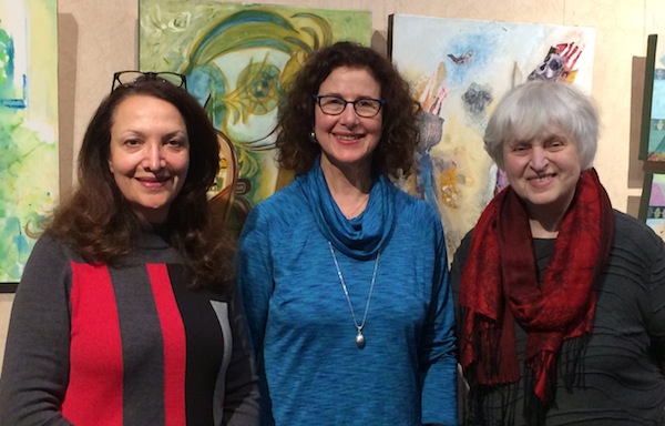
Left to right, Three Echoes artists Sorour Abdollahi, Devora and Sidi Schaffer. Their exhibit, Hope and Transformation, is at Amelia Douglas Gallery until Feb. 29. (photo from Three Echoes)

Connected by similar values and inspirations in their creative work and in their lives more generally, Sidi Schaffer, Sorour Abdollahi and Devora are longtime friends. Their fifth exhibit together – as the informal collective Three Echoes – is called Hope and Transformation. It is at the Amelia Douglas Gallery at Douglas College in New Westminster until Feb. 29.

“Art transcends the limitations of time, space, language and cultural background,” said Devora in her written remarks, prepared for the exhibit’s opening Jan. 16, which was postponed because of the snow, and given Jan. 21. “The echoes from within spill over onto the canvases,” she said. “Together, our works create a dialogue of hope and transformation.”

Devora told the Independent that the name for the exhibit came “through talk and discussion between the three of us in reflecting on our individual and collective journeys and where we found ourselves, and the world, at that moment.”

“Today, there is a lot of anxiety about globalization and migration,” Abdollahi said. “As an immigrant artist, my art deals with connections between cultures and hybridity. Therefore, my works might help serve as a bridge and tell the immigrant story.”

Abdollahi was born and raised in Iran, where she graduated with a diploma in Persian literature from Yazd University and a bachelor’s in fine arts from the University of Art in Tehran. In Vancouver, where she settled 20 years ago, she studied at Emily Carr University of Art and Design. She writes in the exhibit catalogue that her Iranian heritage and Canadian experience “have had a tremendous influence on my works’ subject matter, dealing with the mediation between the modern and the ancient, the old and the new, the West and the East.”

The artist uses collage, a multi-layering technique and mixed media. “My works show the relationship between culture and environment and migration,” Abdollahi explained to the Independent. “Our environments are changing both internally in our mind and externally, and my works illustrate this change. My works create negotiation between different cultures and societies.”

Schaffer also started her fine arts education in her birth country, Romania. In Israel, she received a degree in art education and taught in the school system for more than a decade. When she came to Canada in 1975, she studied at the University of Alberta, where she majored in printmaking and painting. Initially focused on abstraction, her work has become “more integrated, combining abstract and figurative forms,” she writes in the catalogue. “Now I am continually exploring new possibilities with mixed media, a combination of print, drawing, painting and collage. Important for me is the visual poetry, the relationship of form, space, colour and light. Some of my works in this show are a combination of collages of different things from nature and painting; others are collages of my own imagination.”

“I am an optimist and also I am amazed about the continuous transformation in nature around me,” Schaffer told the Independent. “I combined my love and respect for the beauty of flowers and leaves, surrounding them with hope, and new imaginary landscapes. In a way, I give the dry flowers a new life, bringing them out from the pages of old books.”

As for Devora, she told the JI, “What gives me hope is my relationship with the Divine – that there is no separation, that we are all connected and made of stardust, that we are all on an unfolding journey of being together. I attempt to express that emotion onto the canvas.”

For Devora, art has the power to transform the viewer when the viewer can hear her work speak to them from their own experience. “At the opening,” she said, “the Douglas College students from two classes – one poetry class and one art history class – gathered around and engaged with all three of our works, asking questions, wanting to understand the process, the intention and how they could relate from their own lives to what they were seeing.”

Normally, only the art history students attend each artist talk. However, after Devora shared that the Zack Gallery at the Jewish Community Centre of Greater Vancouver hosts Pandora’s Collective poetry nights, where members of the collective create works inspired by the art, the Amelia Douglas Gallery invited the poetry class, as well.

Growing up in Berkeley, Calif., where she earned a master’s at California School of Professional Psychology, Deborah Ross does all of her creative work under her maternal grandmother’s name, Devora, in honour of her grandmother, who was murdered in the Holocaust. “Her spirit gives me the strength and confidence to create,” said the artist in her remarks for the exhibit.

Devora, who now lives both in Vancouver and on Salt Spring Island, came to Canada in 1993. She has studied art at Emily Carr, Langara College and elsewhere. “My artwork reflects the love I have for the creative process and exploration,” she writes in the exhibit catalogue. “I am fascinated by the inner world of emotion, dream, metaphor and story and strive to illuminate both the universal and personal by bringing them onto the canvas.

“My latest works explore the interplay and continuum between abstract and representational images of landscapes and figure, and a fascination with the surreal, in mixed media combining acrylic and collage.”

In her remarks for the exhibit opening, Devora explained, “My art reflects a search for understanding and clarity about my personal and ancestral history and the world. My experiences inform my work as I go inside and bring them onto the canvas. I endeavour to transform darkness into the light of hope. I am interested in what is hidden and how it informs what is revealed.”

She noted that she, Abdollahi and Schaffer “turned to esthetics as a way to focus and navigate our journey.” And she expanded on this concept. “Through the lens of esthetics combined with the common immigrant experience and effects of war and displacement,” she said, “the three of us have managed to bridge all other divides: language, ethnicity, culture, religion and country of origin. Our childhood environments and experiences could not have been more different on the surface and yet the foundations of connection and similarity were already being laid down, established through the development of the lens of sensitivity to beauty in the world and compassion for the human experience.

“Our ideal, of different cultures living in harmony, is reflected in our own personal experiences, in which intimate exposure to the world of ‘the other,’ unearths commonalities and gives rise to a greater depth of understanding about our own lives.”

She concluded, “In closing, I would like to quote Sorour, as Sidi and I feel that her words speak for all three of us: ‘In my friendship and collaboration with Sidi and Deborah, I see an opportunity to explore and express my own culture, but also to relate these themes to other cultural experiences – recognizing the echoes of each other in our works and our lives. My works side by side those of my friends’ works create a dialogue and negotiation which hopefully provides the viewer with a different vision of the world – one which is borderless, free and peaceful.’”

Cohen’s clay defies gravity

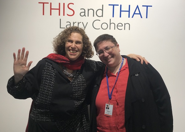
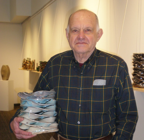
Larry Cohen’s new ceramic exhibition at the Zack Gallery runs until Jan. 25. (photo by Olga Livshin)

Larry Cohen’s new ceramic exhibition at the Zack Gallery is called This and That. The name is symbolic for the artist. His show consists of two entirely different types of pottery: whimsical woven sculptures and functional crockery. “I wanted to explore the relationship between pure art, like my sculptures, and functional things, like my bowls, vases and cups,” said Cohen in an interview with the Independent.

“There is a continuum that stretches from pure functional to pure art, and every object fits somewhere along that continuum,” he explained. “The closer to the artistic end, the less functionality the object has, except for people to look at it and think about it. On the other end, there is pure functionality: you can use a bowl for fruits or a mug for your coffee, but it also has a shape and a colour; something to look at, too.”

In his long artistic life, Cohen has worked in many different mediums, creating sculptures from metal and wood, but clay is his material of choice. “Clay is a wonderful thing to work with. It feels good in my hands,” he said. “And it could be found anywhere in the world. Here, in British Columbia, in Europe, in China, in Japan, in Latin America.”

In the past decade, Cohen has won a couple of month-long residencies as a clay master, one in China, another in Japan. “The clay is different everywhere. Its chemically different compositions provide different visual and textile effects in the objects made of it,” he said. “It could be the same colour when unfired and painted with the same glaze, but, if made from different types of clay, after firing, the resulting pottery would look and feel different.”

Cohen travels a lot and, everywhere he goes, he searches for the local potters and their art, trying to absorb as much as he can from the various traditions. “As clay is different everywhere, so the traditions are different, but, in most of the places I have visited, the history of pottery goes back thousands of years,” he said. “People made things of clay in ancient China and ancient Mexico. Not so much in Europe – it had to import the technique from China, but it is still very old. The only place in the world I know that didn’t have pottery is here, in British Columbia. The local clay is wonderful, but the indigenous people here didn’t use it. They made everything out of wood. Only in the past 200 years, since the Europeans settled in B.C., pottery has been on the rise.”

To a degree, Cohen is a local clay pioneer, like other local potters. It is important to him that everything he creates is unique, that no object repeats another. He is as much a craftsman as an artist, which makes even his utilitarian bowls and vases works of art. His woven sculptures are really one of a kind; they are akin to wicker baskets, but made of clay.

“Some of them look like vases, but there are holes,” he said with a smile. “You can’t pour water inside. No functionality except to look at and admire. It is a new technique for me. I always try something new, always think: what is another way to use clay?”

This particular technique looks like ceramic ribbons lying on top of one another, or interwoven. “Clay is forgiving,” Cohen said. “You can make all kinds of different shapes from it, but, even so, it took me awhile to develop this technique. I had to figure out how to overcome the softness of clay and how to combat gravity, so the upper layers wouldn’t squish the lower ones.”

photo - On display are works he has made using a technique that creates dynamic, ribbon-like clay structures
On display are works he has made using a technique that creates dynamic, ribbon-like clay structures. (photo by Olga Livshin)

He cuts clay in strips and then twists them in various ways to create the dynamic shapes. “Sometimes, I repeat the same shape multiple times, sometimes make them different,” he said. “I dry them before firing, so the whole sculpture doesn’t collapse under its own weight. Sometimes, I make two or three layers together. Other times, every layer is dried separately, and then they come together in the kiln, held to each other by the glaze. Once or twice, I made the full sculpture before firing, and you could see the lower layers sort of melting together.”

Unlike a painter, who sees the immediate result of his labours, a potter doesn’t see what he creates until it’s fired in the kiln. Cohen fires every piece twice, first without glaze, the second time with glaze.

“Once a piece goes into the kiln, you never know what will come out,” he said.

Cohen makes his pieces in bunches before firing them all together. “I have three large kilns in my studio on Cortes Island,” he said. “I fire them four or five times a year. One is electric, for lower temperatures. It is the first one I use. Whatever I’ve made by the time I fire the kilns goes in. Then everything has to cool down before I paint on the glaze and use the other two kilns – one for regular glaze, for the smooth surfaces, and another with salt for the special textures.”

This and That opened on Jan. 9 and continues until Jan 25.

Olga Livshin is a Vancouver freelance writer. She can be reached at olgagodim@gmail.com.

Artistic responses

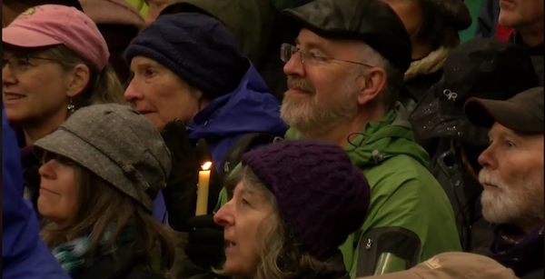
Gabriolans held a candlelight vigil after antisemitic graffiti was found at Camp Miriam. An arts festival will take place Feb. 7-9. (photo from You’ve Got a Friend)

Since Camp Miriam on Gabriola Island was defaced with antisemitic graffiti in December, Gabriolans have shown support for the Jewish community, including a candlelight vigil on Jan. 2. Next month, island artists, musicians and writers will gather together to present You’ve Got a Friend: A Festival of Jewish and Gabriolish Art, Words and Music. The Feb. 7-9 festival will feature Jewish-themed visual art, music and writing, all created by residents of Gabriola, among them Juno nominees and literary prizewinners.

“When people heard about the vandalism at Camp Miriam,” said Sima Elizabeth Shefrin, one of the festival’s organizers, “many said, ‘What can I do to help? How can I show my support?’ The festival is a chance to celebrate our friendship and solidarity with each other and to move things on in a positive way. We took the title, You’ve Got a Friend, from Carole King’s old song.”

The festival program includes visual art by Shefrin, Heather Cameron and others at the Gabriola Arts and Heritage Centre. The opening reception will take place Feb. 7, 6-9 p.m., and the gallery will be open Feb. 8, 10 a.m. to 4 p.m., and Feb. 9, 10 a.m. to 1 p.m.

The concert Oy! will feature Bob Bossin, Paul Gellman, Dinah D, the Today Only Klezmer Band and others. It will take place Feb. 8, 7:30 p.m., at the Roxy Lounge and Cultural Club, with tickets available at North Road Sports. Admission is a suggested donation of $15.

Earlier on the Saturday, at 3 p.m., Amy Block will lead a celebration for Tu b’Shevat, the Jewish new year of the trees, at the arts and heritage centre.

Finally, Nu? – poetry and memoir by Janet Vickers, Naomi Wakan, Lisa Webster, Shayna Lindfield, Gloria Levi, Lawrence Feuchtwanger, George Szanto and Bossin – will be held at the arts and heritage centre Feb. 9, 1-3 p.m.

You’ve Got a Friend is supported by Camp Miriam, the Gabriola Arts Council and Anne Landry. For more information, contact Cameron at true_stitches@yahoo.ca.

Letting imagination fly

Janet Strayer at the opening of her solo exhibit, Wings of Imagination, on Nov. 28 at the Zack Gallery. (photo by Olga Livshin)

Janet Strayer first conceived the idea for her new show at the Zack Gallery, Wings of Imagination, about a year ago. “I was talking with Linda, and the bird theme came about,” she said in an interview with the Independent, referring to Linda Lando, director of the gallery.

“Birds appeared in my paintings before,” said Strayer. “They take us into the air, into a different place. Birds symbolize freedom – freedom of movement, freedom of imagination. The flight of imagination allows us to envision different possibilities, different solutions, even different ways to see familiar things. When I considered the name for this show, I thought about [Albert] Einstein and his words that knowledge is always limited, but imagination is limitless. Imagination is the most important thing for any artist.”

Wings of Imagination is all about flight and wings. Birds populate the paintings. Bright and whimsical, they flitter around birdhouses, soar towards a distant sky or interact with other creatures, real or imaginary. Some images are bright, almost cartoonish, inviting a smile, while others seem more serious, characterized by quiet intensity and misty, pastel colours. And then there are funky collages, with real 3-D birdhouses attached to the two-dimensional pictures.

“There are three distinct styles of paintings in this show,” said Strayer. “The three styles are consistent with the theme of the show. I started it conceptually, as I always do, but I couldn’t explore it in any one direction. Wings of imagination is a huge theme, and there is no one way to approach it – all the possible ways should be expressed. Freedom of expression is what it is all about; it is like several different directions of flight.”

image - “Papageno” by Janet Strayer, whose exhibit at the Zack Gallery runs until Jan. 5
“Papageno” by Janet Strayer, whose exhibit at the Zack Gallery runs until Jan. 5.

One of the styles is almost impressionism. The paintings’ blurry lines are reminiscent of Claude Monet’s foggy nights. The dream-like imagery catapults the viewers into some eldritch realms of sublime illusions with their wings and birds, sky and air.

“Another style is magic realism,” the artist explained. “I wanted to go magical. Imagination is magic. The Canada goose is flying, but his wings are magical – you can’t see such pattern on a real goose, except in your imagination. Beside the goose hangs my homage to Leonard Cohen, as he walks across the sky.”

The two paintings of “Birdwoman” seem similar in composition but entirely different in their palettes and in their emotional subtext. “The colours in ‘Birdwoman on the Roof’ are muted compared to the other one,” said Strayer. “On the roof, she is open to the sky, not as loud as the other, more of a mystery. It has space for you to come in and indulge in your own perception, while the other one is more enclosed inside its room and its brilliant colours.”

Strayer’s magic realism paintings are eccentric and capricious, with clear lines between the colours and frolicking creatures from fantasy novels, while her third style, the collages, appear at first glance as a jumble of small images punctuated by birdhouses.

“Birds need places to live in,” said the artist. “I took a risk with the collages, didn’t know what would happen, but it was such fun working with them. It took me three months to finish those two collages. They started with fragments, and then they led to other fragments. And feathers. And birdhouses. Things tell you what to do, until the entire image comes alive. It was like an adventure in my studio every day. Where would it go?”

Strayer’s playful adventure resulted in two unique art installations. “I wanted people to be surprised by these collages,” she said. “I wanted them to stop and look at all the tiny details. We don’t always stop and look. Even with art, so often, we come to a gallery, but we just glance. We don’t stop and really look.”

Strayer’s is a familiar name to Zack Gallery patrons. She had a solo show at the gallery in 2010, but the difference between the two shows is not only temporal but esthetic. While the previous show was black-and-white digital art and a poetic look at childhood, this one is bursting with colour and exuberance, and features mostly acrylic paintings.

“I enjoy creating digital art,” she said, “but I wouldn’t want it as a steady diet. I’m an explorer. I always want to try something different. I love to work on real paintings. And I’ve always loved colour.”

For Strayer, a predominantly abstract artist, the esthetics of her creations are more important than the telling of a story or the conveying of a message.

“A message should come through the esthetics,” she said. “And, if someone has a different interpretation than me, it’s fine, too. As soon as the paintings are on the gallery wall, they are not mine anymore, even though I created them. Everyone could see something different, compatible with their own memories and experience.”

Wings of Imagination opened on Nov. 28 and runs until Jan. 5. To learn more about Strayer, visit janetstrayerart.com.

Olga Livshin is a Vancouver freelance writer. She can be reached at olgagodim@gmail.com.

Sketching historic shuls

Ben and Carla Levinson (photo by Sam Margolis)

With the speed of a street-corner caricaturist yet the precision of someone who seemingly misses nothing, Ben Levinson has for decades been capturing the cityscapes of the many places to which he has traveled with his wife, Carla. No pencil, no erasing. Just a black ink pen and a small sketchbook.

“My architectural career taught me to sketch quickly and furiously, and I am able to see details that most would not see,” Levinson told the Independent in an interview earlier this fall.

During these adventures, Levinson has sketched everything of architectural interest to him: churches, cathedrals, mosques, pyramids and, of course, synagogues, while Carla would station herself at a café.

image - Synagogue at Tomar, Portugal. Sketch by Ben Levinson
Synagogue at Tomar, Portugal. Sketch by Ben Levinson.

By the time she was done with her coffee and croissant, Ben would have a complete rendering to show her. During the infrequent occasions she would finish first, incomplete drawings would be filled out when they reached their hotel.

The alacrity, accuracy and artistry of the sketches were at times the envy of those whom they encountered on their travels.

“We met artists whose wives and partners waited all too patiently and were ready to move on, whereas Ben was long done,” Carla said.

After looking through Ben’s sketchbooks one day, Carla suggested he do a show devoted to synagogues. Carla, who ran Victoria’s Gallery 1248, helped curate the selection of sketches that appeared at the Wings of Peace Gallery at Victoria’s Congregation Emanu-El from Sept. 4 through Yom Kippur. Now those sketches have been compiled into a book which is tentatively titled In Search of Identity: The Story of the Wandering Jew.

The book’s 49 sketches transport the viewer throughout the old and the new worlds. Many of the sketches are connected by the common experience of Jews moving on because of antisemitic treatment, despite centuries of coexistence in a community.

The figurative journey, which includes interiors and exteriors and is really the result of several holidays the Levinsons took over the span of two decades, sets off in Toledo, Spain, home to one of the few remaining synagogues left after the Spanish Inquisition scattered Jews throughout Europe and the Americas. Levinson’s exhibit and book spend a lot of time in Sephardi lands: a 14th-century Moorish-style synagogue in Cordoba; a tiny shul in Tomar, Portugal, the only pre-Renaissance temple in the country; larger houses of worship in Morocco, home to the largest Jewish population in the Arab world; and, finally, to the Portuguese Synagogue in Amsterdam, completed in 1675.

Poignant reminders of the once-thriving Jewish communities of Eastern Europe follow. Levinson leads the viewer through Berlin, Prague and Budapest, along with artistic reconstructions of the Terezin sleeping barracks and an ancient dig in Vienna.

image - Templo Libertad in Buenos Aires, Argentina. Sketch by Ben Levinson
Templo Libertad in Buenos Aires, Argentina. Sketch by Ben Levinson.

The voyage shifts to France, Italy and Scandinavia, with the majestic Marais synagogue in Paris, the synagogue at the Museum of Jewish Life in Trieste and the Gothenburg Synagogue, the scene of a firebomb attack in 2017.

Levinson also presents active scenes of a crowd forming outside a Venice synagogue on a sunny Shabbat morning, passersby in front of an Antwerp temple and a sea of bicycles by the Great Synagogue of Copenhagen.

The visual trip wraps up with drawings from Mexico City and the Byzantine-style building of Libertad Synagogue in Buenos Aires.

Born in Medicine Hat, Alta., in 1942, Levinson graduated from the University of Manitoba’s architectural program. In 1966, he moved to Victoria and worked for various firms before starting his 30-year private practice as president of Benjamin Bryce Levinson Architects in 1980. In addition to leading his practice, he continued sketching and showing his work at various venues, including the Architectural Institute of British Columbia and the Jewish Community Centre of Greater Vancouver.

Levinson was instrumental in restoring Congregation Emanu-El in the early 1980s. When he arrived in town, he felt an initial disappointment upon seeing the synagogue with “its pink stucco, balcony balustrade pickets, missing fence and hidden dome ceiling.” He helped the synagogue’s leadership in obtaining grants and helped steer the building and fundraising committees to get the money necessary to revitalize the region’s most historic Jewish building.

Small Town Architect, the name of his first book, documents his 40-year career in architectural design and recounts his travels and artistic endeavours. His work can be found throughout Victoria and in numerous communities throughout the province; in elementary schools, municipal halls, grocery stores and restaurants, among other buildings.

Sam Margolis has written for the Globe and Mail, the National Post, UPI and MSNBC.

People and places of Cuba

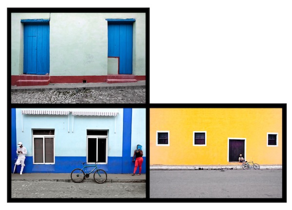
Lorne Greenberg’s solo show, Cuba, comprises photographic compositions, such as this one. (photos by Lorne Greenberg)

The origins of Lorne Greenberg’s solo photography exhibition Cuba can be traced back more than 35 years. “I had my MFA in photography from the University of Arizona in 1983,” he told the Independent. “In 1984, I began photographing Mexican street art.”

At first, he photographed on the American side of the border, but later visited Mexico several times, taking pictures of streets and buildings in many Mexican border towns. “I have an affinity for Latin American art,” he said. “I also read many Latin American writers.”

After a few years, though, Greenberg turned his artistic eye to other interests and new subjects. He only started refocusing on Mexico five years ago.

“In 2014, I began to photograph in Mexico again,” he said. “This time, I was interested in streets, buildings and yards, objects as artifacts of culture. I see it as the archeology of Man, a study of Man in his environment through the observance of objects and artifacts. There is no sky in my Mexican photos, but walls and doors and windows. Colours, shapes and lines, and where things are in relation to each other.”

He wanted to dig deeper in that direction, but, having been in Mexico multiple times, he turned to Cuba. “I had never been to Cuba before. I wanted to see it,” he said. “I heard that [Barack] Obama was going there, and I decided that I’d better go before Americanization.”

In spring 2016, Greenberg flew to Cuba for the first time. “Just me, my camera and my backpack. I came a few days after Obama left. I was there for about 10 days and visited three cities: Havana, Santa Clara and Trinidad.”

He wandered the streets and photographed doors and walls and windows, but with a new mode of expression. “I started seeing people,” he said. “Before, there were hardly any people in my photos. Now, I wanted to photograph them as part of the streetscape.”

He continued his Cuban exploration in 2018, on his second trip to the country. This time, he stayed exclusively in Havana. “When I was there, I ate, slept, photographed and listened to jazz,” he recalled. “It’s a vibrant place, with music a prevalent part of life.”

Again, he roamed the streets, without a plan, photographing houses and people. “Nothing is staged in my photos; nobody posed,” he said. “I just waited until I had a perfect image, and then I took it. I wasn’t trying to make a statement, didn’t have any preconceived idea. I just wanted to find what is there, discover the relationship between people and places, the coherence of individuals and their building backdrops. If some people didn’t want to be photographed, they would say it, and I didn’t take their pictures, but that happened only three times.”

photo - Lorne Greenberg in Italy
Lorne Greenberg in Italy. (photo by Lorne Greenberg)

In selecting the images to include in his solo show, from the hundreds he took in Cuba, he said, “I didn’t want to show just 10 or 15 large pictures. A single large image has a privileged status, and I wanted to create an experience of Cuba, to show people what I saw.”

Therefore, he compiled his photographs into compositions, which made it possible to increase the number of different images on display. Each composition is more than a collection of individual photos – it is a work of art on its own.

“There are 102 different pictures in the show, combined into eight compositions,” Greenberg said. “At first, I considered each composition as a tic-tac-toe grid, but it didn’t work. It was too orderly, too tight, didn’t give the sense of Cuba. Then I thought about the sculptures of Alexander Calder. I changed the layout of my compositions, opened them up, created a flow. They are not individual photographs anymore. They are installations, and they incorporate the gallery space as part of the experience. Each composition has a certain colour scheme, and its lines and shapes create a whole, simultaneously dynamic and static, random and structured.”

The arrangement of the compositions was as creative an endeavour as was taking photographs. “It was fun moving pictures around, seeing different possibilities. I could have done it for much longer, if I didn’t have a deadline for the show,” he joked.

Greenberg’s Cuban compositions reflect the political reality of the country. The lively colours of the buildings preen under the heat and light of the sun, while simultaneously exposing the peeling paint, dirty or moldy walls, and the rusty metal of fences and shutters, which hint at the poverty that exists in the country.

“I see beauty, aesthetics and humanity,” said Greenberg. “Poverty is more in the ethical dimension, and everything for me is in the aesthetic world.”

The show Cuba opened on Oct. 24 at the Zack Gallery and continues until Nov. 24. The opening reception was held on Oct 30. For more information on Greenberg’s work, visit lornegreenbergphotography.ca.

Olga Livshin is a Vancouver freelance writer. She can be reached at olgagodim@gmail.com.

Trees bring Zack to life

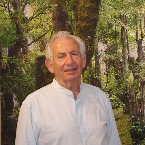
Michael Seelig is donating the proceeds from his exhibit Trees to the Zack Gallery. (photo by Olga Livshin)

Trees, Michael Seelig’s new solo photography exhibit at the Zack Gallery, opened last week. It is a fundraiser for the gallery, which is located in the Jewish Community Centre of Greater Vancouver.

Such philanthropic initiatives “are of ultimate importance to the gallery and the community, as everybody wins when the gallery is well-supported,” said Zack director Linda Lando. “We have approximately three benefits a year, and they come in different ways. Sometimes, they’re initiated by the artist, sometimes by myself or another staff member of the JCC.”

Seelig’s decision to donate all the proceeds came from the heart, and it’s not the first time. His previous show at the Zack, which was held five years ago, was also a benefit. “This is my way of contributing to the JCC,” he said in an interview with the Independent. “We have a longstanding connection to the centre. My wife was president of the JCC some time ago, and we’ve given several donations to the community over the years.”

Unlike his previous show, which focused on architectural images – Seelig was an architect before he retired – this show is all about trees. A cornucopia of greens dominates the gallery walls.

“When Linda asked me to do a show this year, I didn’t have much in mind,” he said. “I started going through my photographs, selected the best 20, and then realized that eight of them were photos of trees. Looking back, I’ve always photographed trees. Maybe I have an affinity for trees. So, I thought I’d make it the theme of this entire show.”

photo - “Garden Kyoto” by Michael Seelig
“Garden Kyoto” by Michael Seelig.

Seelig has been drawn to trees and their unique charm for a long time. “I think my love of trees comes from my childhood, when I was growing up in Israel,” he said. “Jewish people are the only ones I know who have a holiday dedicated to trees: Tu b’Shevat. During that holiday, we cherish trees, plant them, take care of them, so they can take care of us. That tradition probably influenced me from a young age to love trees and photograph them. I take photos of trees wherever I travel.”

In the Zack exhibition, there are pictures of trees from Israel and Scotland, Canada and Japan.

“There is a book I read recently,” Seelig said, “called The Hidden Life of Trees, by Peter Wohlleben. He is a German forester and writer and he knows trees. He says trees form communities. They communicate with each other and with us. It was a fascinating book, and I agree with the author; his book inspired me. Have you noticed that old stumps sprout new growth sometimes? That is because there are other trees around. Trees are life-givers; they create the air we breathe. Without trees, there would be no life on earth.… In Canada, and particularly in British Columbia, we often take trees for granted. Most of us do not pause to look at them and admire their beauty, solidity and permanence. We forget that, without trees, our planet cannot survive. This show pays homage to trees in many parts of the world.”

Seelig’s trees are all different; each one has its own shape and personality. Some are gnarled and twisted, while others stretch up in straight lines.

“I like it that they don’t talk to me,” he joked. “Trees are my models, but they’re more obedient than people when it comes to posing for a photo. I can take my time snapping pictures of trees. They are perfect photography objects. A tree just stands there. You can walk around it, see it from 360 degrees or from underneath. And every view is different. You can’t do this with a person.”

In addition to Seelig’s photographs of trees, the show includes several watercolours, most of which he painted specifically for this exhibit. Only two small works are exceptions. “When I was looking through my archives in preparation for this show, I found a small painting, created by my father in 1940. He painted a street in Haifa, and there is a tree in the image. The second painting is mine; I painted it in 2010, also in Haifa. Seventy years passed between these two paintings, but their colour schemes are surprisingly similar. And there are trees in both paintings.”

The sizes of the images on display vary greatly. While Seelig’s father’s painting would fit in a school notebook, and most of the photographs are the perfect size for a family home, a huge triptych on canvas of one of his Kyoto garden photos would enliven a hotel foyer or a corporate conference room. “I invited some designers to the show,” Seelig said. “Maybe one of them would like it.”

Seelig’s approach to photography is consistently organic. He doesn’t edit his photos with Photoshop, doesn’t even crop them.

“My pictures are exactly what I see,” he said. “And now you see them, too. There are other photographers who manipulate their photos with editing software, many of them wonderful artists, but I don’t do that. I don’t call myself an artist either, even though I use my creativity for many things in my life. I used artistic judgment for my work as an architect, before I retired. Now, I make greeting cards and wedding invitations with my photographs and my paintings. I illustrated a couple of children’s books, written by my daughter and her husband. Even making dinner for our friends is a form of art for me.”

The Trees exhibit runs until Oct. 20.

Olga Livshin is a Vancouver freelance writer. She can be reached at olgagodim@gmail.com.

About the cover art – Rosh Hashanah 2019

This year’s Jewish Independent Rosh Hashanah cover photo features a bumble bee on a heartleaf oxeye daisy flower – it was taken in Saanich, B.C., by David Fraser. Many native bumble bees are in decline, a concerning trend given the role they play in pollination of plants, including many food crops. Pesticides, habitat loss and introduced bee parasites and diseases are thought to play a role in this decline.

photo - Rosh Hashanah 2019 cover, by David Fraser

Apples are one of the main symbolic foods we eat on Rosh Hashanah, as we wish for a sweet year, with the help of some honey. Apples are the fruit of choice for this wish perhaps because Rosh Hashanah coincides with the sixth day of creation, when humans – Adam and Eve – were created and they ate the fruit (apple) of the Tree of Knowledge in the Garden of Eden. It could also be that apples symbolize the relationship between God and the Jewish people, as poeticized in the Song of Songs, or that the Zohar (kabbalah) describes paradise as a holy apple orchard.

Regardless of the reason for the fruit selection, apple production is dependent on bees and other pollinators. It would be fitting then for us to wish for more than a sweet, fruitful year, when we are dipping our apple slices into honey. We might consider our role in the decline of not only the bumble bee populations but of the environment at large, and what we can do to reverse it.

Marriage no fairy tale

“Kiss! Kiss! Kiss!” by Lilian Broca is part of the exhibit Brides: Portrait of a Marriage, which is at the Italian Cultural Centre’s Il Museo until Sept. 30.

In most romance novels and fairy tales, a love story ends in a wedding and the couple lives “happily ever after.” In real life, it’s not that simple. Marriage has its challenges.

The show Brides: Portrait of a Marriage, which opened at the Italian Cultural Centre’s Il Museo in Vancouver this summer, examines some of the aspects of marriage that fairy tales purposefully omit. The show incorporates the works of several local artists in different media: textile art by Linda Coe, photography by Grace Gordon-Collins, drawings by Jewish community member Lilian Broca and a tapestry by fellow Jewish community member Barbara Heller.

“I always wanted a show about brides,” Angela Clarke, curator and director of Il Museo, told the Independent. “We have weddings at the centre almost every week. There is so much energy, so many emotions. But the Roman goddess of marriage, Juno, was not a happy woman. Hers was not a happy marriage, and the controversy attracted me.”

Brides is part of the museum’s Gendered Voices series, and looks at marriage from a woman’s perspective.

“This exhibition places the institution of marriage under the looking glass,” said Clarke. “Each participating artist tackles the deep psychological complexity and immense social pressure involved in a traditional marriage. Historical perspectives and family dynamics, personal reflections and the impact of feminism are explored in the show.”

Each artist contributed her own personal outlook. Coe’s fabric panels belong to her Dirty Laundry series. Colourful and sophisticated-looking hangings were all created from fabric snatches that were once parts of women’s dowries, used and reused for several generations before they ended up in the artist’s stockpile.

“The eight fabric panels represent eight stages of a woman’s life,” explained Clarke. “Each one incorporates relevant texts from Renaissance romance novels and etiquette manuals. In the 16th century, such manuals were very popular in Italy, especially among the middle classes. They were written to instruct young brides in the proper comportment, in the ways to become a successful bride and mother.”

In addition, those eight panels reference the eight requisite parts of a romance novel, from the Middle Ages to the modern Avon romances. “Those stages have names, the same names as the panels,” Clarke said. “No. 1, Stasis (infant). No. 2, Trigger (young girl). No. 3, Quest (betrothal). No. 4, Surprise (courtesan). No. 5, Critical Choice (bride). No. 6, Climax (wife). No. 7, Reversal (matron). No. 8, Resolution (widow). Every love story published these days must follow this structure.”

Heller’s tapestry and Gordon-Collins’s photographs explore wedding dresses and the commodification of weddings. The tapestry shows a bride in a beautiful dress, but her face is blurry, unimportant, and the dress becomes the focal point, a uniform, a symbol.

The photos, in the photogram or X-ray style, lack faces altogether, only the wedding attires of four generations of women of the artist’s family can be seen.

“Grandmother’s wedding tunic was modest, especially in comparison to the artist’s daughter’s wedding dress, much more opulent and sensual, and designed for one-time use only,” said Clarke. “Here, we can trace how, through the generations, the weddings grow into an industry, and the wedding accessories become commodities.”

While neon-bright colours dominate Gordon-Collins’s images and Coe’s collages shimmer with the patina of gold, Broca’s contribution to the show is a sequence of stark black and white lithographs, all from her Brides series.

“My mother passed away in 1989,” Broca said, as she explained the roots of her series. “I was devastated by her death, although it was a blessing after suffering for years from cancer. Soon after her passing, I started dreaming about her as a young bride. I decided to draw my dreams.”

Her drawings reflect the dichotomy between the happily-ever-after concept and the fact that most marriages in the past were arranged, and not unions of love.

One of the drawings, “Kiss! Kiss! Kiss!” depicts a bride sitting in a chair, regarding a frog in her lap. A few more frogs – potential princes? – wait at her feet, expecting her to choose between them.

“I knew my bride would not kiss that frog,” said Broca. “So I added several other potential grooms. Some small, others big…. Still, I had a feeling she would resist them all.”

The work “Upon Reflection” is even more powerful. It shows a bride in a gown and veil looking into a full-length mirror. The image in the mirror depicts the bride, face and posture serene, as befits the occasion, but Broca has left the image of the bride herself white and, from within it, there is the drawing of a woman, the bride, trying to escape.

“That woman, upon reflection, discovers how much she doesn’t wish to be married, to be tied down. What happens next is up to the viewer’s imagination,” said the artist.

For Broca, black and white was the only possibility for the series. “It was the most appropriate way to describe what I felt…. After the first two or three drawings, I began to realize that many brides were not happy at the altar – I showed them. Only a very few happy brides appear in my drawings. Not because happy brides are a minority, but because happy brides are difficult to portray without slipping into a less-than-powerful mode. I may be wrong, I may be able to do it today, but, at that time, it didn’t seem possible.”

Clarke knew about Broca’s series and wanted to include it in its entirety in the show, but that wasn’t possible. “We couldn’t include so many that Angela wanted because they had been sold,” said Broca. “We couldn’t borrow them. The owners live in the U.S. and Eastern Canada. As it is, the two works in the exhibition were borrowed from local owners.”

Brides is at the Italian Cultural Centre until Sept. 30.

Olga Livshin is a Vancouver freelance writer. She can be reached at olgagodim@gmail.com.