Art House SF’s Max Khusid is one of several artists who will be at Art Vancouver May 4-7. (photo from Art House SF)
Once again, galleries and artists from across Canada and around the world will come together to exhibit their work at Art Vancouver, which takes place May 4-7 at the Vancouver Convention Centre West. At the annual fair, attendees can join the opening night party, purchase art, listen to various talks, take part in classes, and more.
Among the exhibiting artists are local Jewish community members Lauren Morris, Taisha Teal, Sky Lilah, Talin Wayrynen and Lisa Wolfin, who will also be teaching art classes during the fair. In addition to the stories you can find on jewishindependent.ca about these artists, visit their websites for more information: Morris (lmdesignsstudio.com), Teal (taishateal.com), Lilah (skylilah.com), Wayrynen (imtalin.com) and Wolfin (lisawolfin.com).
Other participating Jewish community members include Max Khusid of San Francisco gallery Art House SF (arthousesf.com) and a couple of the gallery’s artists, Tavalina (Rinat Kishony) and Max Blechman, who, with husband Kazu Umeki, comprises the duo BLECHMEKI (a portmanteau of their last names).
Khusid spent the first 20 years of his professional career in the world of technology, and plans to spend the next 20 years diving into the unknown and immeasurable world of art. He is inspired by the mystic art and adventurous life journey of Russian painter, explorer, archeologist and philosopher Nicholas Roerich (1874-1947).
Tavalina lives in Israel and her work “Jerusalem” was recently featured on the cover of a book by the late Amos Oz. A graduate of the Israel Institute of Technology with a bachelor of architecture, she worked in the field for several years. After a personal crisis in her 30th year, she began to paint, devoting herself to art. At the same time, she embarked on a journey of personal discovery and traveled many places, eventually returning to Israel, where she continues painting and presenting her work, as well as teaching art.
Blechman, originally from New York, lives in San Francisco. He and Umeki use mass-produced American pottery from the 1930s to 1980s to create photo tableaux. At first glance, the individual pieces of pottery appear identical, but closer inspection reveals variations both in form and colour. Indeed, the Japanese concept of wabi-sabi (appreciating beauty that is imperfect, impermanent and incomplete in nature) reverberates throughout their pottery.
For the full list of Art Vancouver artists and classes, as well as tickets for the fair, visit artvancouver.net.
Artist Anna Marszalkowska stands in front of “Levi,” which is part of her Tribes series, which is on exhibit at the Zack Gallery until May 4. (photo from Anna Marszalkowska)
The challenge of visually depicting the tribes of Israel has attracted many famous artists over the centuries. For example, on the 25th anniversary of the state of Israel, Salvador Dali, inspired by descriptions in the Torah, created a series of watercolours, “The Twelve Tribes of Israel.” Before that, in 1962, Marc Chagall made his famous stained-glass windows, “The Twelve Tribes,” for a synagogue in Jerusalem. Anna Marszalkowska, a local Vancouver artist of Polish origins, fits easily into this august company. Her solo show, The Tribes, opened at the Zack Gallery on March 29.
Marszalkowska grew up in Poland, but studied graphic design and worked as a graphic designer in London, England. “Diversity is what made my design path exciting,” she said in an interview with the Independent. “I started my career as a freelance web and graphic designer and then moved to video design and editing, as well as motion graphics and animation.”
Five years ago, she and her husband moved to Canada, but they lived and worked in the eastern part of the country. They relocated to Vancouver two years ago.
“We came here during the pandemic,” she said. “We wanted to try something different. For an outdoor person like myself, this is a great place. The nature is beautiful, and everyone is very friendly.”
She also changed the direction of her professional life. “I work with artists in the movie industry, but not as an artist myself,” she said. “I understand artists because of my past as a graphic designer, but I wanted less time at the computer screen. I wanted to free my creativity for more personal projects, which was hard to do while working as a graphic designer. Then, my creativity was fully engaged in my professional activity, but, on the other hand, I was limited by clients’ requirements. After a full day of work … I was often tired, I wanted to relax. Now, my creativity is freed. I have more time for my artistic experiments. I started abstract painting and I love it. Just me and a painting – it calms me.”
But even while working full time as a graphic designer, she still found energy to search for her individual style and themes. One of them was her Tribes series. “In 2010, I completed a print production course, and this series was the result.”
The series consists of 12 large digital prints, each one corresponding to one of the tribes of Israel. Although Marszalkowska’s version is an entirely modern take, it involves ancient symbolism, which originated in the Hebrew Bible. The artist conducted deep research for this project, and the end results are simultaneously stunningly simple and visually compelling.
“I had a blog before and, when I put the images online, many people expressed their interest. They wanted to buy one or several or all of the images.”
For the artist, this body of work has meaning beyond its commercial success. “It was a personal journey. I was searching for my Jewish ancestry. My grandmother grew up in a town in Poland where most citizens were Jewish before the war. She might have been part Jewish herself, but after the Holocaust, I had no one to ask.”
Instead, she studied the Bible and tried to interpret the narratives within a cultural context. “The symbols of the tribes are by no means fixed,” she explained. “Every artist could have their own interpretation, as the biblical texts describe the sons of Jacob allegorically.”
In her interpretation, the traditional symbols are given a contemporary, stylized appearance. “I explored the relationship between geometric shapes and lines,” she said. “I used repetition and symmetry to keep balance in each individual design and all 12 together.”
She also leaned towards a minimalistic approach, where a symbol of the tribe is centred on a one-colour background, with no other embellishments to attract a viewer’s attention. “In the original design, I had an ornamental frame around each image, but I got rid of them. I think less is more,” she said. “COVID made me realize that my focus should be the meaning, not the decorations.”
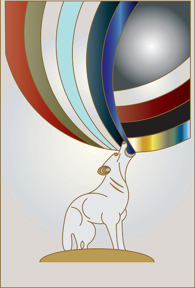
“Benjamin” by Anna Marszalkowska.
In most images, the background colour palette reflects that of the tribe, except for Benjamin, the youngest. “His symbol is a wolf,” Marszalkowska said. “He represents all colours of all tribes. To reflect that, I placed a ‘rainbow’ above the wolf. I think it is his spirit or maybe his song, Or his breath. It would depend on your own interpretation.”
In some of the designs, she incorporated photography for texture. “I used Adobe Illustrator to combine my photographs with my digital illustrations,” she said. For Simeon, her symbol is a tower, and she put her photos of bricks to good use in her pictorial tower construction. For Zebulun, whose symbol is a ship, she employed photos of water. “Issachar’s symbol is a donkey with a burden,” she said. “I used my photos of wood for the donkey’s load.”
When different sources offered different visual symbolisms for a tribe, the artist’s scholarly touch led her towards her own esthetic. For example, in the case of Levi, some documents don’t count him as a tribe and don’t offer any symbols for him. Historically, the Tribe of Levi wasn’t given any land, but its men served as religious leaders and teachers. Maszalkowska decided that Levi’s description as God’s Chosen Tribe warranted its own image: a breastplate of a high priest. The breastplate is embedded with 12 gemstones, each inscribed with the name of one of the tribes in Hebrew.
“Overall, the series is an invitation for everyone to embark on their own journey, to reflect on their own purpose and fulfilment,” said Maszalkowska. “Ultimately, I hope that my art will connect with the viewers and inspire them.”
Tribes runs until May 4.
Olga Livshin is a Vancouver freelance writer. She can be reached at [email protected].
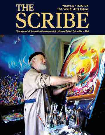
Mordechai Edel is among the artists featured in the latest edition of The Scribe, which will be released April 19 at VanDusen Botanical Garden. (photo from JMABC)
The Jewish Museum and Archives of British Columbia (JMABC) is releasing its 40th issue of The Scribe, which celebrates the lives of B.C. Jewish residents by focusing on one sector each edition. The official release of the Visual Arts Issue will take place on April 19, 7 p.m., at VanDusen Botanical Garden, in the Floral Hall.
The 2022/23 issue features a cross-section of the province’s Jewish visual arts community, including painters, sculptors, mixed media artists, illustrators, textile artists, art educators, art consultants, an art curator and a gallery owner. Features are based on interviews recently documented for the JMABC and interviewees represent several cities and many islands. They include Ron Appleton, Miriam Aroeste, Hinda Avery, Suzy Birstein, Tanya Bub, Olga Campbell, Janis Diner Brinley, Mordechai Edel, Janet Essevia, Jessica Freedman, Linda Frimer, Monica Gewurz, Lori Goldberg, Pnina Granirer, Barbara Heller, Jeannie Kamins, Stacy Lederman, Julia Lucich, Anna Lutsky, Cynthia Minden, Suzy Naylor, Joyce Ozier, Nora Patrich, Marcia Pitch, Jack Rootman, Sidi Schaffer, Phyllis Serota, Elizabeth Shefrin, Carla Stein and Mia Weinberg.
“The Visual Arts Issue of The Scribe is surely one of the most dynamic and visually stunning publications in its 40-issue history,” said Daniella Givon, JMABC president. “Jewish individuals have made significant contributions to our province’s arts and culture sector throughout our history in B.C., and 2023 is a fitting time to take an historical snapshot of artists who are working and thriving here.”
Carol Crenna, managing editor of The Scribe Visual Arts Issue, added, “It’s been an extraordinary experience to meet this group of talented Jewish artists, many internationally known. They are fearlessly innovative, inspiring individuals with the strength and ability to push boundaries and bridge beliefs. They’re also wonderful storytellers with rich life experiences. I found their personal stories fascinating, and often entertaining, but, most important, they made me think differently.”
The publication’s launch will include a silent auction of artworks donated by many of the artists highlighted in the issue. The keynote speaker of the event will be journalist Marsha Lederman, Western arts correspondent for the Globe & Mail. Refreshments will be served. All proceeds are in support of the JMABC.
“Nostalgia” by Lovena Galyide (photo by Olga Livshin)
Community Longing and Belonging, the fifth annual exhibition in celebration of Jewish Disability Awareness and Inclusion Month, is now on at the Zack Gallery.
Curated by Leamore Cohen, coordinator of Jewish Community Centre of Greater Vancouver’s Inclusion Services, the participating artists demonstrate a range of artistic levels, abilities and social affiliations, but they all strive to answer the same questions in their artwork: What does community longing look like? How to find a place to belong in our ever-changing world?
Cohen has been the driving force of this show for five years. For her, an unjuried exhibition is the best way to honour the commitment to remove barriers and celebrate community members’ creativity. If an artist wanted in, they were in, professional artist or amateur, Jewish or non-Jewish, young or old. Cohen stressed that inclusion is the basic principle, and participation is what counts most.
Many artists in the current show have participated in the Inclusion Services exhibit before. Although most of the works on display are paintings, there are also photographs and drawings. There are portraits and landscapes, figurative and abstract imagery. Some items are for sale, while others are not.
Many of the portraits are disturbing in their naked emotional anguish. The faces are jagged or crooked, angular or cubical. One of them is clearly inspired by Picasso, but all of them portray loneliness, a search for belonging.
Most of the abstract images are similarly angry or sad. Very little figurative recognition manifests, but the emotions explode out of the pictures, multiplied by dark colours and sharp lines. They depict the pain of isolation, the desire for acceptance.
Not every work is bleak. Clare Palmer’s photograph “Red Maple” is full of natural serenity, as if the photographer found her community in nature and recommends it to everyone.
Roi Alexander M. Sanchez’s painting with a long and winding title starting with Clean Environment shows a man and a woman cleaning the land, collecting garbage into sacks, together with their friends in the background. The cleaning they are doing is obviously a community event, and the artist emphasizes this with bright colours and cheerful composition. The painting radiates gladness, with a child-like flare. The author seems to say: we clean our home together.
Togetherness also seems to be the main meaning of Aileen Leong’s untitled piece, where two hearts are pierced by one arrow. Connected by this arrow of love, the hearts fly above the mountains on the golden wings of joy.
Lovena Galyide, on the other hand, doesn’t speak of love in either of her two paintings. Both are larger than most of the others in the exhibit. Both feature a single woman. In one, called “Say Yes to Your Open Door,” a girl lifts the curtain of night above her head, allowing in the light of the morning. She welcomes a new beginning and abolishes darkness. The painting thrums with hope. The girl is alone, with her back to viewers, but maybe the new day will bring her a new friend. Or a new love is waiting for her on the sunny side.
Another of Galyide’s paintings is “Nostalgia.” It is less exuberant than the first. The woman in this canvas stands in the rain outside the window of a flower shop. The viewers are “inside,” looking out. All they see is a blurry female silhouette under an umbrella. But, inside the shop, flowers bloom. Is that pensive, lonely woman going to enter? Buy flowers? Or is she just passing down the street? So many stories could start with this painting, all going in different directions. It is up to viewers to finish those stories.
Flowers are also the focus of Sandra Yuen’s “Bias.” This painting is large, and the close-up flowers are accordingly huge and gloriously pink, blooming in splendid isolation on the blue background. The painting is reminiscent of Georgia O’Keeffe’s gigantic flowers, capturing the beauty and vastness of nature.
Unlike Yuen’s exposition of colour, another large painting, by Rodrigo Perez Parra, seems composed mostly of melancholy, echoed by its subdued, earthen palette. Its title, “The Dance in the Dream,” reflects its subject: a woman standing thoughtfully beside an open door. Does she dream of a dance in her past? Does she hope to dance again? Where is her partner? Only a hat, hanging beside the door, reminds us about them. Are they coming back? Again, stories abound from this painting, some of which might even have a happy ending.
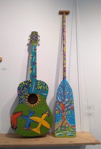
“Folk Guitar” and “Tree of Life Paddle” by Andrew Jackson. (photo by Olga Livshin)
In the middle of all the images on the gallery walls, two 3-D exhibits stand out. Andrew Jackson’s “Folk Guitar” and “Tree of Life Paddle” are tongue-in-cheek, almost goofy. Both are real-life objects, painted in a distinctive folksy style. The guitar flaunts soaring gulls gobbling fish. The paddle is painted with the Tree of Life. Although the guitar lacks its strings, perhaps the artist considers music our inescapable community. Or sports (for the paddle)?
Another unique item on display is a small clay tablet called “The AHA Community.” The artists who created it belong to the Artists Helping Artists (AHA) collective. The plaque doesn’t list any names, but Cohen said each of the 11 little colourful figures placed on the tablet’s surface, all engaged in different artistic activities, were made by different members of the collective. They are merry self-portraits, making the tablet itself a representative of all the artists in this show.
According to their website, AHA is an art studio collective in Burnaby, where artists of all abilities and skill levels are encouraged to come together to make art – visual art, music, writing, anything goes. The studio provides space, affordable materials and the opportunity to pursue the individual artist’s aspirations. A large percentage of their membership is artists with complex needs.
Like the JCC Inclusion Services, AHA believes that art is a vital element in our lives, and that inclusion is mandatory. Their mandates are congruent – each invites people to share their feelings through art.
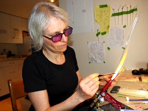
Lindsey Tyne Johnson (photo from Lindsey Tyne Johnson)
Returning from a Birthright trip to Israel in 2019, artist Lindsey Tyne Johnson was inspired. Learning the aleph-bet, she made a laser-engraved spirit board in Hebrew, but accidentally arranged the letters left to right, as they would be in English, and not right to left, as Hebrew is read. The mistake spurred her not only to create the exhibit Hebrew Spelled Backwards, which is on display at the Kamloops Art Gallery until April 1, but to explore her cultural heritage, from which she had been estranged, and learn more about Judaism.
The other, more sombre, inspiration for the Hebrew spirit board and the exhibit was, Johnson writes in a blog post, a “desire to feel closer to my brother after the events that left him homeless and his eventual passing.”
“Born with the name Liam, my brother changed his name to his chosen Hebrew name, Noah as an adult,” she writes on her website (lindseytynejohnson.com). “My mother had mentioned our Jewish ancestry to us as children, but my brother was the only person to explore it…. I can still remember it as what my mother called ‘one of his many phases’ in his late teenage years. She chalked it up to a phase, but it’s the string I use to tie memories of my brother together.”
“My brother was the first person I witnessed who explored their Jewish heritage,” Johnson told the Independent. “When he moved to Vancouver in his early 20s, he legally changed his name to his Hebrew name, Noah. He struggled a lot with his mental health, and there were times when I felt like I was losing the brother I grew up with. It was an attempt to feel closer to him that I went on Birthright and had a bat mitzvah. I wanted to remember the part of him that was happy, passionate and excited about life.
“My brother lost his life to fentanyl in 2021. It was devastating and broke my family apart,” said Johnson, who has two other siblings. “Many struggle to understand substance abuse/mental illness’s connection to generational or cyclical trauma. It’s unfair to look down upon those who might suffer from those things. I try my best to advocate for the destigmatization of mental illness where I can, though I’ve had to be careful not to let others’ ideas also negatively affect my mental health.”
While not a large exhibit, Hebrew Spelled Backwards is powerful, thought-provoking in a serious way, but also using humour. For the exhibit’s images, Johnson explains on her website, “The sandy colour palette was chosen as a tribute to the desert, a significant location in Jewish history and culture. I use digital media to blend traditional Jewish motifs with modern techniques, creating a dynamic visual experience.”
Johnson said, “Like many artists, my process is sporadic and requires a particular head space to create something I’m happy with. I often have ideas for pieces while doing mundane daily activities; if I don’t write them down, they’re lost forever. I practise a lot of sequential art, which is usually silly comics about everyday life, but they’re generally never seen by other humans. My style reflects the graphic novels I like to consume. I can’t help but be inspired by artists like Craig Thompson and Marjane Satrapi, both visually and thematically. My dream is to produce a graphic novel one day.”
The Hebrew Spelled Backwards exhibit comprises not only Johnson’s artwork, but her voice. Each picture has a QR code and viewers can hear Johnson give explanations of the Hebrew words and some context for the images, making the exhibit more accessible and inclusive. The illustrations variously include Jewish symbols and/or Hebrew text, supernatural elements, pop art iconography (a Warholesque can of Birthright’s Instant Bat-Mitzvah, for example) and current topics of concern, like rapper Ye’s antisemitic comments, poignantly drawn as a short series of cellphone text messages from a mom to her child that ends with the child asking, “mum, why is ye mad at us?” This is one of the works that, as the exhibit description reads, “examines the complexities of identifying as Jewish and the fear and uncertainty that often come with it.”
“I have a couple of fears about identifying myself as Jewish,” Johnson told the Independent. “Initially, when diving into Jewish culture and Judaism as a religion, I was afraid people might not think I was ‘Jewish enough,’ since only one of my parents has Jewish ancestry. My siblings and I were raised without Jewish traditions or education…. Having a bat mitzvah really helped with that fear, though. I’m also grateful that I’ve never really encountered anyone from the Jewish communities I’ve belonged to that has made me feel that way.
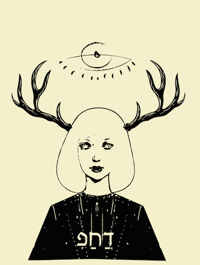
“RaeF” by Lindsey Tyne Johnson
“The other part of that fear was that people would think differently of me or assume certain tropes or ideologies about me if I publicly identified myself as Jewish. This is an unfortunate reality I’ve experienced, even if subtly. Most commonly, people think I’m OK with antisemitic jokes or jokes that involve the Holocaust. It’s an exhausting thing to experience.”
Putting together the exhibit has allowed Johnson not only to explore her fears, but also her own biases.
“Creating these pieces required me to reflect on the experiences of people like Batsheva Dueck (aka Cynical Duchess, a modest fashion content creator) or more conservative Jews, who experience more assumptions made about them based on their dress or religious beliefs,” she said. “Since working on this exhibition, I’ve been more sensitive to times when I’ve excused antisemitic values expressed by my peers or acquaintances. When I lived in Brooklyn, I lived with someone who spoke quite negatively about Hasidic communities. This has been an excellent opportunity to witness my biases and encourage others to reflect on their biases or assumptions, too.
“It’s also allowed me to tie other pieces of my identity together,” she continued. “I’ve been able to connect my Irish ancestry with my Jewish ancestry, for example. It has given me a sense of wholeness or completeness and I’ve accepted that I can be many things all at the same time and I’ve accepted that that’s OK. We all contain multitudes.”
Johnson went to Ireland this past summer to visit where her Ashkenazi family moved to in the 19th century, and “to visit the Irish Jewish Museum and Waterford treasures.”
“I was probably in the fourth grade when my mother talked to my siblings and me about it,” said Johnson of first learning about her Jewish heritage. “It was after I had come home and talked about how we were learning about World War II at school. It was surreal to hear my mother, an immigrant from England, talk about a side of our ancestry that had never really been discussed before. I didn’t understand what it meant at the time.”
Johnson herself has lived many places. She was born in Edmonton in 1993, but her family moved to Saskatchewan and then Prince George, B.C., shortly after.
“I spent most of my youth in Prince George but moved to Dawson City, Yukon, as soon as I could save up enough money to attend the Yukon School of Visual Arts,” she said. “Yukon SOVA is a one-year foundational arts program. Still, I decided to stay in the Yukon upon completion and remained in the territory for about five years before I moved to Brooklyn in 2018. I was in Brooklyn for only half a year before moving to Kamloops to be closer to my family, but it made a lasting impression. Going from a territory of 35,000 people to my neighbourhood in Williamsburg with four times that amount was dizzying.”
Johnson said she loves the Kamloops Jewish community. “I joined shortly after moving to Kamloops from Brooklyn and felt incredibly welcomed,” she said. “The [Okanagan Jewish Community Centre] president, Heidi Coleman, is a huge inspiration and comfort to me. It’s pretty relaxed in terms of how often we have gatherings. We don’t have a synagogue or a place to meet, so we usually celebrate holidays at someone’s house. The ‘younger’ (20 to 30 years old) of us have a close bond, and I often have a group of us over for various holidays, too.”
Johnson is currently in her third year at Thompson Rivers University, where she is doing a bachelor’s in criminology. “I’m most interested in victimology,” she said. “I think Canada and most of the world fail victims of crime to an astronomical degree. It’s wild to think about how much attention we give criminals without considering how we could better support the survivor or victims of their crimes.”
Artistically, she is planning a piece that more specifically honours her brother Noah. “I want to educate the general public about how the consequences of generational or cyclical trauma can lead to mental health struggles like substance abuse,” she said. “I would like to highlight that it’s not specifically someone’s ‘fault’ for struggling the way they do.”
An archival photograph of Andrzej Jan Wroblewski explaining the mechanics of one of his kinetic sculptures, a predecessor of Opus 6. (photo from cicavancouver.com)
During the six decades of his professional life, industrial designer Andrzej Jan Wroblewski contributed to almost every area of artistic expression and human consumption. A list of his works includes cutlery for an airline, an excavator, tapestries, computer software, children’s books, kinetic sculptures, an iron, and a portable shower in a suitcase. His retrospective show, Andrzej Jan Wroblewski: Invisible Forces of Nature in Art and Design, opened Jan. 26 at the Centre of International Contemporary Art (CICA) in Vancouver.
Wroblewski graduated from the Academy of Fine Arts in Warsaw, Poland, in 1958. A year before, as a student, he participated in his first major sculpture competition – for the Auschwitz-Birkenau Memorial. The committee received 426 entries from many countries. Wroblewski and his friend, architecture student Andrzej Latos, designed a way for a visitor to walk through the camp’s horrors, to understand them on a visceral level. Their design used the existing landscape, while the authors acted as composers of the visitors’ experience.
“Our submission was one of only seven selected for the short list,” Wroblewski said in an interview with the Independent. “Before I submitted, I didn’t even tell my sculpture professor. I thought he might have submitted his own concept and I didn’t want him to think I was competing with him, especially if I didn’t win. I was right. He did submit his own proposal and he was one of the seven shortlisted as well.”
After that, there was no more hiding. “But my professor was a wonderful man,” Wroblewski recalled. “He told me that my presentation was so good, I should use it as my diploma project. He also offered me the position of his assistant after my graduation.”
Wroblewski started teaching sculpture, but he doubted the artistic medium would be his future. “After my project didn’t win the Auschwitz competition, someone tried to comfort me,” he said. “They said I could use the idea for some other project, and it made me angry. Re-using that idea felt wrong. The whole concept was created for a special place and purpose; it didn’t belong elsewhere. And that led me to thinking that maybe sculpture wasn’t what I wanted to do. Artists rarely decide what happens to their creations; bureaucrats decide. But if I switched to industrial design, I would have many more chances to give my creations to people: industrial designers create with their users in mind.”
He switched to industrial design and became one of the pioneers in the field in Poland. He submitted proposals for several international competitions and worked on many objects on contract with production companies. An excavator, a scooter, and a set of thin steel cutlery for a Polish airline all originated from that period of his life. He became the first dean of the faculty of industrial design of his alma mater.
“Industrial design changes our behaviour,” he said. “If I design a cup and it goes into production, it could change how people drink. Good industrial design is supposed to make our lives easier.”
Wroblewski was one of the first industrial designers in Poland to use a computer, and even developed special software to help other industrial designers. By 1987, he was a rector of the Academy of Fine Arts in Warsaw. Cracks in the Iron Curtain were already emerging, and the academy started cooperating with one of the best schools of industrial design in the United States. In 1988, Wroblewski received an invitation to teach at the University of Illinois.
“I taught there for 13 years, before I retired,” he said. “After retirement, in 2000, my wife and I moved to Vancouver. Our daughter was already here, working at UBC. I taught at Emily Carr, but for one semester only. I still had too many ideas, too many projects in my head, and I wanted time. Retirement gave me that time.”
Some of his ideas are on display at the CICA gallery. All of these installations employ various forces of nature, which lent the show its name. “In the past,” Wroblewski said, “the division in the arts was much more rigid. You either did sculpture or you painted or you drew. Now, the dividing lines are dissolving. The artist uses what he needs to express himself. One installation might involve several artistic forms in various combinations.”
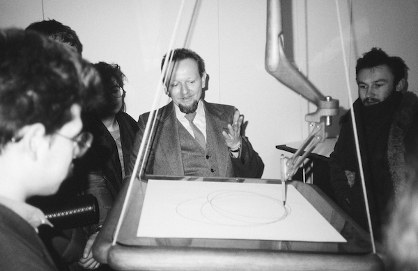
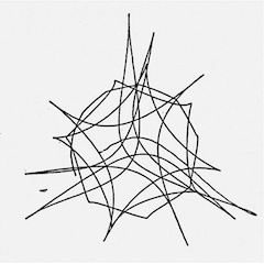
One of the pieces is an interactive kinetic sculpture called Opus 6. It explores kinetic energy and gravity. There is a moving part with a tablet and a stationary part with a suspended pen. If you put a piece of paper on the tablet and give it a nudge, it begins swinging, and the pen produces a unique abstract drawing on the paper underneath.
A doodle created by Andrzej Jan Wroblewski’s Opus 6. (photo from Andrzej Jan Wroblewski)
For Wroblewski, Opus 6 was a reconstruction. His original installation was called Opus 5 and it was bought by a museum in Poland. “I decided it was much cheaper to build it from scratch here, in Vancouver, than to transport the original from Poland and back,” he said.
Another installation explores gravity and viscosity and concentrates on water. “I studied music before the art academy [and] I used my own music for the water installation,” the designer shared. “I also built a special maze of Plexiglass to be able to see how a drop of water flows, and then I recorded it all in a light projector and created a video. This installation is a tribute to water, one of the most powerful forces of nature.”
In a separate corner, made dim by the enclosed walls, Wroblewski situated a series of light sculptures. His chandeliers hang from the ceiling or stand on the floor, their radiance interweaving. The shapes and sizes are all different, but the material used is the same: paper-thin strips of light-coloured wooden veneer.
Wroblewski’s desire to explore new materials and new approaches for his work always drove him towards experimentation, towards the unknown. “When I came to the States, I was fascinated by computers,” he said. “I used a program called Paintbrush to create some abstract compositions, but, at that time, there were no printers big enough to give me the large size I wanted. I decided that a tapestry would be the best medium to enlarge those digital paintings. I built a special loom and made a tapestry for each of those paintings. Every pixel in the digital paintings corresponds exactly to one knot in the tapestry. It took me about six months to complete each of the large tapestries. It is how I operate. When I have an idea, I find a way to achieve it.”
Demonstrated side by side with the printouts of his digital paintings on standard-sized paper, his couple-metre-wide tapestries look impressive.
One of his most recent projects is a series of 10 children’s picture books. Each book is about a specific animal, with the amusing pictures by Wroblewski and the text by his daughter, University of British Columbia professor Anna Kindler. “We did it when my great-granddaughter was born, three years ago,” he said.
His latest sculpture dates from about the same period, 2019. “I saw a tree grown through a fence, as if the wires sprouted from inside the tree. It was near UBC. I cut it down and installed it in a wooden frame. It demonstrates how nature could absorb civilization.”
In 2018, for his lifetime contributions to the field of industrial design in Poland, Wroblewski was awarded the Officer’s Cross of the Order of Merit of the Republic of Poland. He was also named one of the three most influential Polish designers of the 20th century.
The retrospective runs until March 3. For more information, visit cicavancouver.com.
Olga Livshin is a Vancouver freelance writer. She can be reached at [email protected].
Photographer Jason Langer’s perception of Germany and its capital, Berlin, is a complicated one, and his current exhibition at the Zack Gallery, Berlin: A Jewish Ode to the Metropolis, reflects those complexities. Organized in partnership with the Cherie Smith JCC Jewish Book Festival, the exhibit is Langer’s first show in Canada.
“Boys” (photo by Jason Langer)
Langer’s newly published book, Berlin, includes 135 black and white photographs. A selection of these images forms the exhibit at the Zack, which has an emotional sophistication of its own, even though the show is being promoted as a prologue for the book festival. Both the show and the book catalogue the artist’s several trips to Berlin and his explorations of the city. They also provide visually compelling commentary on Langer’s contradictory and evolving feelings for Germany.
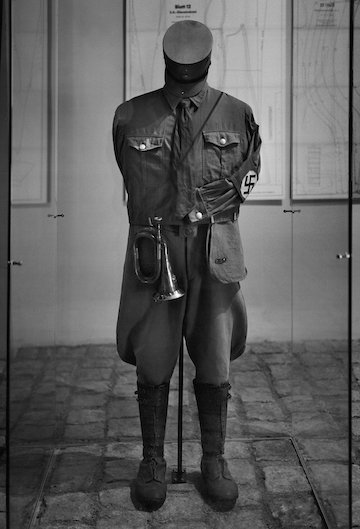
A Nazi uniform in the Sachsenhausen concentration camp museum in Berlin. (photo by Jason Langer)
As in life, the then-and-now overlap and, occasionally, the juxtaposition of the past and the present are jarring in Langer’s imagery. On the one hand, Germany is the country where the Holocaust originated, the country that erased its Jewish population almost entirely and spearheaded the destruction of the Jews of Europe. On the other hand, it is a modern country of laughing kids, hardworking people and beautiful architecture, a country that acknowledges its past actions and tries to make amends to the Jews. It is a country inspiring fear, hatred, respect and admiration in varying measures.
Langer writes in an essay about his relationship with Germany and its progression from total negativity to growing understanding. When he was 6 years old, his family moved from his native United States to Israel, where he spent his formative years, until age 11, on a kibbutz.
“Every year, each children’s house would visit the Holocaust memorial, located on the kibbutz property, during Yom Kippur…. We were asked to walk silently and led into a courtyard with one building and three short walls,” writes Langer. “I remember the walls were made of large, rectangular stones, grey in colour and a bit rough and oddly shaped. We learned about how the Jews had suffered, first as slaves in Egypt and then in the Holocaust by the Germans.”
Later, as an adult, he “vaguely remembered having heard fearful stories of German people from my mother and grandmother, though my mother also made jokes about Germans, putting on a comic fake accent. She died in 2003 and I inherited her books, among other things, including a kind of illustrated encyclopedia titled The Wonderful Story of the Jews, written by Jacob Gewirtz. It was published [in 1970], not long before our move to Israel. The text refers to the Germans’ ‘unspeakable crimes’ against the Jews, as well as the ‘unending ravages of war, persecution and tyranny’ they had faced. Some of the illustrations are quite scary, showing buildings on fire and Jewish people menaced by gun-wielding Nazis. The book presents Israel as a place of refuge, the kibbutzim as almost unique.”
After being exposed to such ideas during childhood, Langer’s predominant feeling towards Germany was aversion. But then, in 2008, when he was already an established photographer, one of his friends suggested he photograph Berlin.
“He thought the city would be a good match for my sensibilities but I met his suggestion with trepidation and fear,” Langer recalled. “I harboured many preconceived ideas about Germans and Germany. I imagined Berlin as a vast, cold, unfriendly, gritty place, but, at the same time, it seemed exciting and sexy somehow.
“I decided to see Berlin for myself, keen to challenge my existing ideas and also uncover reminders of the Jewish people who had lived there, until they fled or were hunted down and killed by the Nazis.”
Photographer Jason Langer’s exhibit at the Zack Gallery runs to Feb. 16. (photo from Jason Langer)
In the next five years, Langer visited Berlin frequently. “From 2009 to 2013,” he said, “I made five trips for two weeks at a time. I stayed in a flat with about six people. When they were going on vacation, they would let me know, and I would fly over and occupy their rooms. They would also give me advice on where to go.”
During those visits, he took multiple photographs and strived to form a new narrative regarding his feelings and associations regarding Germany and its people.
“This work is an attempt to remember, confront and unwind my attitudes about Germans, Germany, Berlin and my Jewish inheritance; these images are part discovery, part remembrance and part fantasy,” he explained. “They’re my attempt to stand where Jewish people were rounded up and deported, to remember but also reassess. They’re an effort to confront my internal attitudes and prejudices, to look into people’s eyes and find a continuation of kindness, to be open to the happiness of contemporary life in Berlin.”
Some photographs in the gallery are full of anguish and terrible beauty, like the Holocaust Memorial, consisting of 2711 concrete slabs (stelae) of different heights, or an ornate door of the Stiftung Neue Synagogue, built in 1865, the only synagogue in Berlin to survive the war, though its interior was burnt.
The horror of the war is also reflected in the image of an old, dilapidated shed, the “goat house,” where one Jewish family, a mother and a daughter, hid for several years to survive the Nazis’ attempt to exterminate Jews. No water, no heat, no electricity, just the women’s indomitable spirits and relentless wish to live.
Every photo has a story to tell. Many a story of heroism and tragedy. But there are other pictures, too, reflecting modern Berlin, the city of now. Laughing boys, a tired-looking woman, an anti-fascist demonstration, various streets and buildings.
Langer writes: “It was a strange mix of death and life.… There was a sense of youth, freedom and joy I felt in Berlin.… Whenever I wandered, I took it as a gift of prolonged, uninterrupted time for reflection.”
The artist’s wanderings and reflections led to the creation of the photobook Berlin.
“This book is not a document,” said Langer. “It is a dream within a dream within another dream. Berlin is immense, there was no way I could cast a wide enough net to what it’s like. Instead, I have painted a picture of then and now, pain and pleasure, some people who died long ago and those who are living and young, all from my own perspective.”
Berlin: A Jewish Ode to the Metropolis opened on Jan. 6 and will continue at the Zack Gallery until Feb. 16. For more information, visit jasonlanger.com.
Olga Livshinis a Vancouver freelance writer. She can be reached at [email protected].
Earlier this year, Claire B. Cohen published a book of her 30-plus years as an artist. She made it for family and friends, as a record of her artistic legacy.
“Art is a powerful and a creative force of self-expression. To create art is to develop an ability to communicate visually what cannot be expressed in words.
“By creating the process of art, we change the way we see the world,” Claire B. Cohen told the Independent. “In understanding ourselves, we find areas where we feel limited. In understanding ourselves, we stand up for ourselves and can present ourselves authentically to others. An artist’s creation is unique and original to their work.”
Earlier this year, Cohen published a slim volume, mainly with images that burst from the pages, outlining her 30-plus years creating art. We glimpse the range of her work – landscapes, portraits, semi-abstracts, flowers, multimedia collages and a compartmental series, in which colourful abstract canvases were “connected sequentially in a zigzag for using piano hinges.” Flow and fun describe this series, her portraits – both colour and black and white – capture the personalities of her subjects, her landscapes and collages are bold and full of movement but also balance. The book touches on her work as an art therapist.
Originally from Israel, Cohen came to Canada in 1964. She studied fine arts at York University in Toronto and the University of Ottawa, and later earned her master’s in art therapy and counseling from U of O in 1987. She had many solo exhibits and group shows in Ottawa, and elsewhere, over the years. The book takes readers to 2006, with an exhibit list to 2009. She moved to Vancouver in 2012.
“I continued to paint after moving to Ottawa, but my move to Vancouver changed my focus, since joining my family had taken much of my time, being richly involved with newborn grandchildren,” said Cohen. “However, I still continued painting and showing new work in Vancouver galleries, as well as donating paintings to different organizations in Vancouver, such as hospitals, Louis Brier [Home and Hospital], friends, and creating more collages and multimedia-based work. I participated in group art shows and sold some to the public.”
Cohen said her reason for producing the book “was to create a place to keep all of my art as a legacy to leave to my family inremembrance of my story. COVID times were affecting my spirit, my mood was down and … the idea came about to focus on creating the book for my family and friends.”
During the pandemic, Cohen said she started to lose her connection to creativity.
“Friends cut off from each other, as much as children and family,” she said. “I slowly lost my energy and interest, as well as the need I once had to be close to my easel. The paints, the brushes, the colours all lost their meaning and the need I had to paint slowly deteriorated.”
She began to look back at her past, which, she said, “led me to wake up from my dormancy and questions such as ‘what is my meaning of life?’ I discovered my paintings in storage and wanted to create a book.
“I reflected further on my body of work and questioned: why did I dedicate my years to painting? Was there any purpose to it? The answer eventually arrived – yes. There are many purposes to be alive, and work as an artist, investing my life in art. In my case, most of it was to leave a memory to my next generation.”
Cohen’s most recent exhibit and sale was at Britannia Community Centre in 2021. Art can be cathartic, whether one is making it or experiencing it.
“The process of creating art has a great intensity and full force of emotions that lead to a freedom and release when the piece is complete,” she explained. “Looking at these pieces that I created many years ago leads to a sense of nostalgia and a softening of that intensity. These pieces have followed me through many moves and lives, and have a story of their own that has evolved with the emotions that once created them. The language of art cannot be explained in words, the language of these emotions is form, line, colour and brush strokes.”
This language can help heal, as Cohen well knows from her art therapy practice.
“The more we know about ourselves, the more we learn to grow and develop our abilities to stand our ground,” she said.
Describing art as “a powerful and unique way to explore our creative forces,” she explained that people who participate in art therapy use the “materials to express the self and communicate visually,” composing stories. In a group setting, they “collaborate and share with others … connect and integrate parts of his/her inner self, gain confidence and reduce stress in a supportive environment, with the aid of the instructor.”
It was both a dream and a need for Cohen to do art therapy and counseling.
“I realized that art is not just for selling and decorating homes, rather it was a way to find myself, to grow and see who I am, and to help others with their healing.”
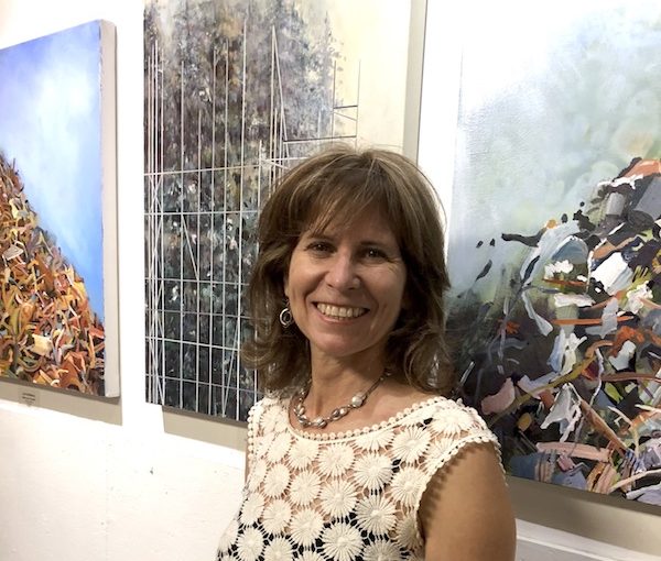
Lori Goldberg’s artwork reminds viewers that “that which we discard doesn’t disappear.” (photo from Lori Goldberg)
If you attend a performance at Queen Elizabeth Theatre, you will see the artwork of Lori Goldberg. She is one of the artists whose creations are at the theatre for another couple of weeks. The exhibit opened Oct. 29.
“Queen Elizabeth Theatre has a program for exhibiting artwork by local artists,” Goldberg told the Independent. “There was a call that was sent out a few years ago and I responded. I was accepted and the work was to be installed just when the pandemic began, so it was postponed until this year.
“It is an ideal venue,” she continued, “as thousands of people a week attend events at the Queen E. My art has a message about climate change and it is important that it gets seen by as many people as possible. My pieces are on exhibit until Dec. 19, and people are only able to see it if they have a ticket to an event. Alternatively, I am available to take anyone interested on a private tour.”
The paintings in the exhibit come from three ongoing series: Plasticity, Poetics of the Discarded, and Reconstructing Nature.
“For many years, I have been investigating what happens when two opposing places – cities and nature – collide, connect and transform,” said Goldberg. “Through more awareness and experience firsthand, many of my works have ultimately been about the precarious relationship that we have with our natural world. Seeded in environmental advocacy, an animating factor in my practice has been reclaiming, recycling and reimagining refuse.”
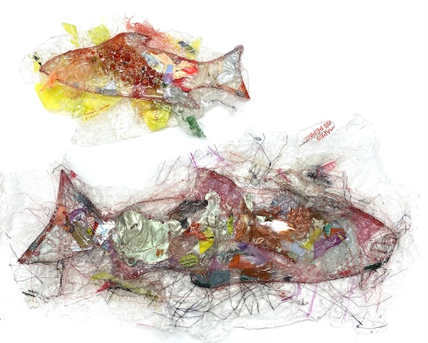
“Rogue Fish” by Lori Goldberg (photo from Lori Goldberg)
In the description of Plasticity on her website, Goldberg mentions her discovery that ink can be transferred from, say, a plastic bag, to canvas. Her creative process invites such discoveries.
“I am a diverse artist and my ideas dictate my art,” she explained. “My practice has primarily focused on painting, but I have had to explore other mediums to adequately express my concept. Besides paint, I have explored photography, assemblage and sewing. I have worked with clay, glass, so-called ‘trash’ from my studio, single-use plastic bags that I fuse on canvas, and I have stuffed lost socks with fabric remnants given to me by tailors.”
For Goldberg, the camera is her “sketchbook” and a photo is generally the starting point for her painting.
“My work references the physical world at one point in my creative process,” she said. “When I research and gather information, I look for source material that is usually filtered through my own photo documentation. Other photo images can come from friends, the internet or by random discovery. I also use memory, dreams – and always my imagination. I take parts of photos that resonate for me and incorporate that visual language – usually recontextualizing and altering it – in my work.”
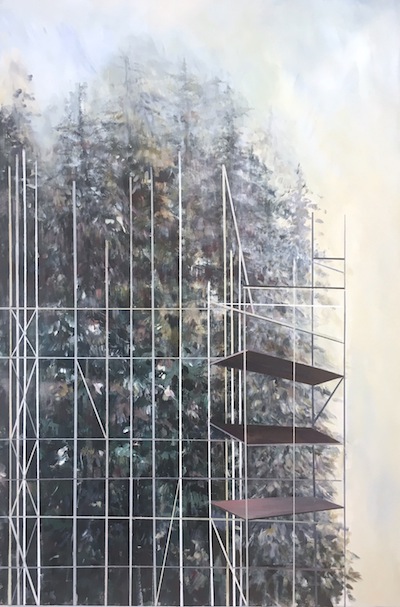
As an example, Goldberg spoke about the series Reconstructing Nature, which references nature/urban tensions found in Vancouver. “There is no lack of trees here and our city is in constant state of flux, with the demolishing of buildings and the construction of new ones, so I take photos of the nature that is all around me, but also of the scaffolding and cranes that are so prominent in the city as well,” she said. “In the Poetics of the Discarded series, I started by visiting a number of refuse sites, with an interest in memory and objects. Within the refuse, there were mounds and mounds of history: the detritus of days spent, life and death, business, conveniences used, sentimental things and so much more. I would photo-document these toppling heaps of refuse and re-contextualize and resurrect them as a visual reminder of the ongoing narrative between humans and their environment, reminding us quietly: that which we discard doesn’t disappear.”
“Reconstructing Nature” by Lori Goldberg (photo from Lori Goldberg)
While Goldberg does not paint on location often, she said, “My creative process is to go out into nature or the city, experience it, document it and return to my studio. Having said that, making work outdoors is becoming more interesting to me and it is a future direction that I plan to spend more time doing.”
With her art, Goldberg said, “I would like to think that I am creating work that is impactful to the viewer and especially the younger generation, that they will be empowered to take action towards making a difference as they engage with the world.
“The works are meant to be educational and I hope that they impart to the viewer a sense of personal responsibility – that they put to action what they feel and be one small ripple of change to create a better future for themselves.”
An educator for more than 30 years, Goldberg has taken her classroom outside and into the public arena, where, she said, “I create hands-on workshops using materials that address repairing the planet and healing ourselves. I created a project titled Lost Socks, where the public stuffed and sewed lost socks together to create a long tubular form that stood for connection, diversity and difference. Recently, I have used single-use plastic packaging to create wearable art. What I enjoy about these workshops is that they attract all ages and so it is intergenerational and accessible to all.
“Artists are essential in our communities,” she stressed. “Some of us choose to create work that challenges topics that are highly charged and sensitive, but, without venues in which to work and to exhibit, the messages cannot be passed on. I appreciate the exhibits I have had over my life at the JCC – I cannot imagine what would happen if we lost such a significant public space as the Sidney and Gertrude Zack Gallery. It is a venue for Jewish artists and Jewish content. It reinforces Jewish identity, conversations and connections. It is a gallery that has assisted me in my journey as an exhibiting artist and has given me opportunities to work with preschoolers, seniors and poets.”
Goldberg believes in giving back and donates her work frequently to different organizations, such as Big Brothers. “My recent donation was to Tikva Housing,” she said. “I gave them three paintings from my Judaica series. There is a satisfaction that is hard to explain, but it is a joy to be able to offer something of value to make others feel uplifted.”
Goldberg is currently applying for artist residencies in different parts of the world.
“I am interested in responding to the environment that I would be in and allowing it to dictate the direction of my work,” she said. “I want to contextualize my work in such a way that I am creating awareness about our healing of our planet but indirectly, through healing ourselves. Artist residencies offer opportunities for new perspectives and fewer distractions, so you can shed the restraints and discover what is there, but has been hidden.”
Margaux Wosk makes pins, magnets, necklaces and other items. (photo from the artist)
Last year’s Affordable Art Show at the Zack was such a success that the gallery is repeating it in 2022, just in time for the winter holidays. Gallery director Hope Forstenzer hopes it will become an annual tradition.
Everything in the show is less than $250, and the selection is wide enough to appeal to a variety of tastes. The participating artists are a mix of repeat appearances and newcomers. Some of the newcomers have exhibited in Zack group shows before. For the others, this is their first event at the gallery.
Margaux Wosk is one of the new artists. Their company, Retrophiliac, produces pins, magnets, necklaces and other items, many of which are priced below $20.
“I’m an autistic, self-taught artist, designer, writer, entrepreneur and disability advocate,” Wosk said. “I have been a ‘retrophiliac’ for a long time. I am inspired by retro and vintage styles, but I also want to celebrate neurodiversity.”
In addition to their company’s distinct merchandise, Wosk creates vibrant, retro-inspired paintings and mixed media work. “I hope to break down barriers and eliminate the stigma of neurodiversity,” they said. “With my art, I want to open a dialogue about what autistic and disabled people are capable of.”
Aimee Promislow, another new artist, works with glass. Her company, Glass Sipper, produces reusable drinking straws. “I met Hope [Forstenzer] a number of years ago,” she told the Independent. “We were both members of the same glass co-op. When she joined the Zack Gallery, she began reaching out to me for various events and shows. Last year, I participated in the Hanukkah show here. I’m excited to be part of the Affordable Art Show this year.”
Aimee Promislow works with glass, making reusable drinking straws. (photo from the artist)
Promislow summed up her creative path and why she chose it. “I have always, since a young age, dabbled in art,” she said. “My mother is an artist, Nomi Kaplan. She had introduced me to various art forms. After high school, I tried pottery, then glass enamel, then I played with resin. Eventually, about 15 years ago, I started melting coloured glass. I love colour and I love watching things form in fire. Glass is hard when cold, but, once heated, it is malleable, and I love moving it around.”
At first, Promislow made glass beads and sculpted little animals out of glass: dogs, cats, turtles. “At the same time, our family enjoyed smoothies,” she said. “The kids wanted straws for their smoothies, but the only smoothie straws I could find were plastic ones.”
Concerned about the environment, she combined her passion for glass with her care for nature. “I had a ‘eureka’ moment,” she recalled. “I realized that, instead of making glass beads, I could make reusable glass drinking straws and decorate them with my tiny creatures. That night, Glass Sipper was born.”
She also makes glass mezuzot and yads (the pointers used to read Torah). “They are perfect gifts for bar and bat mitzvah,” she said. “And everything I make is under $100, ideally suitable for the Affordable Art Show.”
Another glass artist in the show is Sonya Labrie. Her company, SML Glassworks, produces vases and other elements of home décor, as well as jewelry. “I’ve always created pieces that could be in anyone’s home,” she said. “The idea that art is to be loved and available to everyone in our community is very important to me.”
With such a mindset, when Forstenzer invited her to participate in this show, Labrie’s answer was an unequivocal yes.
“I started working with glass in 2005,” she said. “The first glass class I attended was at Red Deer College in Red Deer, Alta. Then I went on to complete a three-year advanced diploma in craft and design at Sheridan College, majoring in glass. I’ve also had the opportunity to study glass at the renowned Pilchuck Glass School in northern Washington.”
Glass artist Sonya Labrie creates vases and other elements of home décor. (photo from the artist)
Labrie said she can’t imagine her life without creating beautiful things out of glass. “My body of work includes blown glass, flamework and kilns-cast items,” she elaborated. “Glass has endless possibilities, it is a challenging medium, and I keep discovering new ways of working with it.”
She also teaches glasswork for the Vancouver School Board. “I teach students grades 8 to 12 and I teach continuing education workshops for adults at the Terminal City Glass co-op.”
Unlike these company-owning creators, fibre artist Deborah Zibrik doesn’t consider herself a full-time artist. Not yet.
“I am a registered dietitian,” she said. “I’m still working part time, finishing a career that started in 1975. I will retire soon, after a research project at the B.C. Children’s Hospital Research Institute is completed. Until then, I simply don’t have enough time each day to work as a full-time artist. However, I consistently carve out ‘me time’ every day to complete some stitching. Ideas are constantly percolating in my head. Typically, many pieces are framed up or in the sketchbook phase at any one time. Perhaps the best descriptor for me is a part-time artist.”
Zibrik makes elaborate embroidered pieces. Some of them are like miniature tapestries, landscapes emerging out of fabric and threads. Others are tiny blossoms, beetles and butterflies that could be used separately or together, each one a delightful surprise. She also does golden embroidery.
“Smaller pieces are often whimsical and stitched quickly, with a minimum of stitches. On the other hand, my gold work requires hours to complete, and the materials are much more costly.”
Zibrik started learning needlecraft when still very young. “Like many girls growing up in rural Canada, I was taught by my mother and grandmother. They wanted to make sure I had all the critical homemaker skills, from crocheting blankets to mending socks…. Later, after 10 years of part-time study at Gail Harker Creative Studio, I completed Level 2 Design (based on a City and Guilds of London Institute in the U.K. curriculum) and Level 4 Diploma for stitch. Luckily for me, the studio is located in La Connor, Wash. That made it possible for me to attend sessions in-person to complete the evidence-based curriculum.”
Fibre artist Deborah Zibrik makes elaborate embroidered pieces. (photo from the artist)
After receiving her diploma in 2015, Zibrik decided to share her skills with others. “Time permitting, I have been teaching workshops for specific needlework techniques,” she said. “Guild members are my usual students. There is currently a discussion among the guilds about the lost generations of children who haven’t learned any of the needle arts, including embroidery; they haven’t had the exposure. Because of that, membership in the guilds is declining, as members age. I am considering ways to fix that. Perhaps I could offer embroidery classes to youngsters, maybe at the community centre level, to teach basic skills and prime creativity to future artisans.”
When asked where they see themselves on the scale of art versus craft, artists’ replies varied.
“I’m an artist and a designer,” said Wosk.
Promislow said, “I am a craftsperson. I use my medium to make things that are functional and beautiful.”
“My work rides a fine line between both,” said Labrie. “There is a fluid movement in my practice.”
“My personal journey suggests that, especially for women, craft and art are inextricably linked,” offered Zibrik. “More, they have been connected for thousands of years. They are but different places on the same continuum. In that sense, I am privileged to say: I am an artist.”
The Affordable Art Show continues until Dec. 30. And, if you’re visiting the exhibit Dec. 5-7 or 12-14, check out the Jewish Community Centre of Greater Vancouver’s Chanukah Marketplace, which takes place in the centre’s atrium.
Olga Livshin is a Vancouver freelance writer. She can be reached at [email protected].